Detroit Garden Works has a milestone of note in its immediate future. It was the evening of the 28th of March in 1996 that we announced the opening of the shop via an evening reception to loyal friends, family, and clients of Deborah Silver and Company. That following morning, we welcomed anyone and everyone with a big love for the garden to visit and see what we were all about. It is hard to believe that this was 25 years ago, but there you have it. A vintage machine shop provided a home for the dream. In the months leading up to the opening, we decided to paint the concrete floor in the entrance room. That concrete was from an addition made in the 1940’s, and did not match the exposed aggregate character of the original floors dating back to the 1920’s. That floor would be a way of saying welcome. I am happy to say that the floor would need repainting every six years or so, necessitated by ever increasing foot traffic. The third floor painting was quite worn, and we had an anniversary coming up. It was time to get going on the fourth floor.
Dan’s crew cleared the decks. Drew scraped off what was left of the loose paint. Dan laid out the space for the base coats from a sketch. Drew painstakingly painted most of the base coat shapes, and I rolled the rest. We were underway. How I decided on the design has lots to do with making a simple reference to being in a garden. Equally important is a realistic assessment of what would be possible to paint – given my age, and the fact that we would need to have access to that floor as soon as possible. 6 containers from Europe were due in at any moment. What was in those containers would need homes. But I did want to celebrate what the Works had done such a great job of over the past 25 years – offering passionate gardeners a way to express themselves through meaningful objects for their landscapes. Gardeners of all descriptions, I might add. Lookers and doers. Those that swoon over any object imbued with history. Cottage gardeners as well as those seeking a clean contemporary look. It took years of plowing the proceeds from every sale into amassing an inventory with both diversity and depth. The Works is packed.
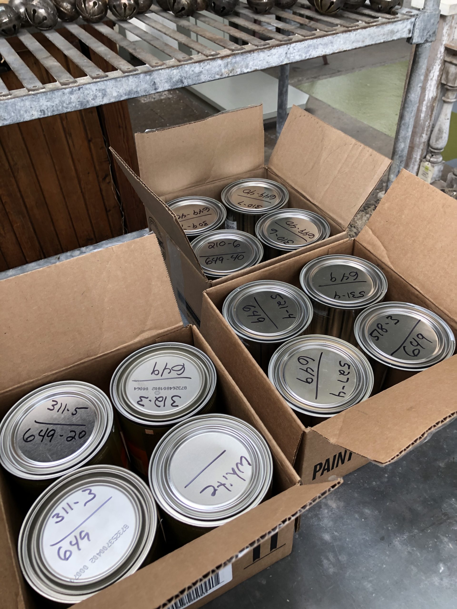
 This picture clearly shows the largest area of wear sustained by the previous floor. Part of our concrete block wall sprung a leak, and water had been sitting in this spot on and off for several years. The rest of that floor was in remarkably good condition. I ascribe that in total to the quality of the paint. Porter Paint, routinely used by sign painters, comes in a 100% acrylic formula which hardens much more than latex paint. Owned by PPG, Porter’s exterior Acri-Shield paint is exceptionally durable and comes in a vast number of colors. It is eminently strong enough to use as a floor paint. Happily, one of a few paint stores in Michigan that carries this paint is near us. See more about this great paint store here: https://www.pontiacpaint.com/
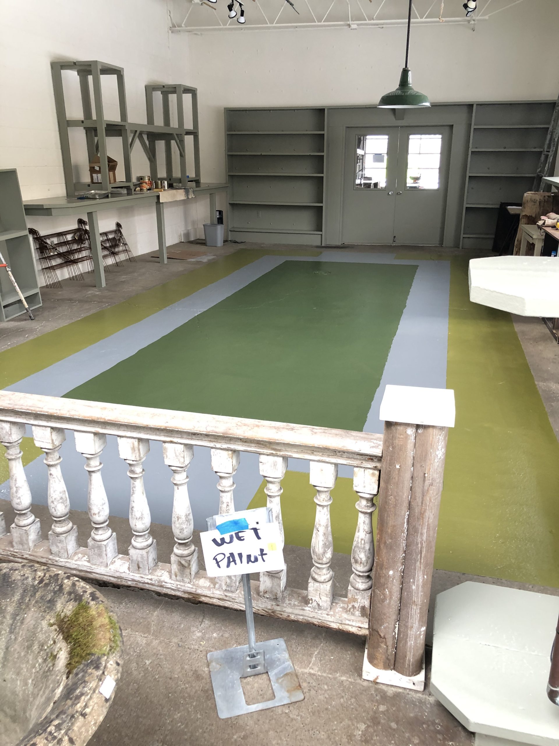
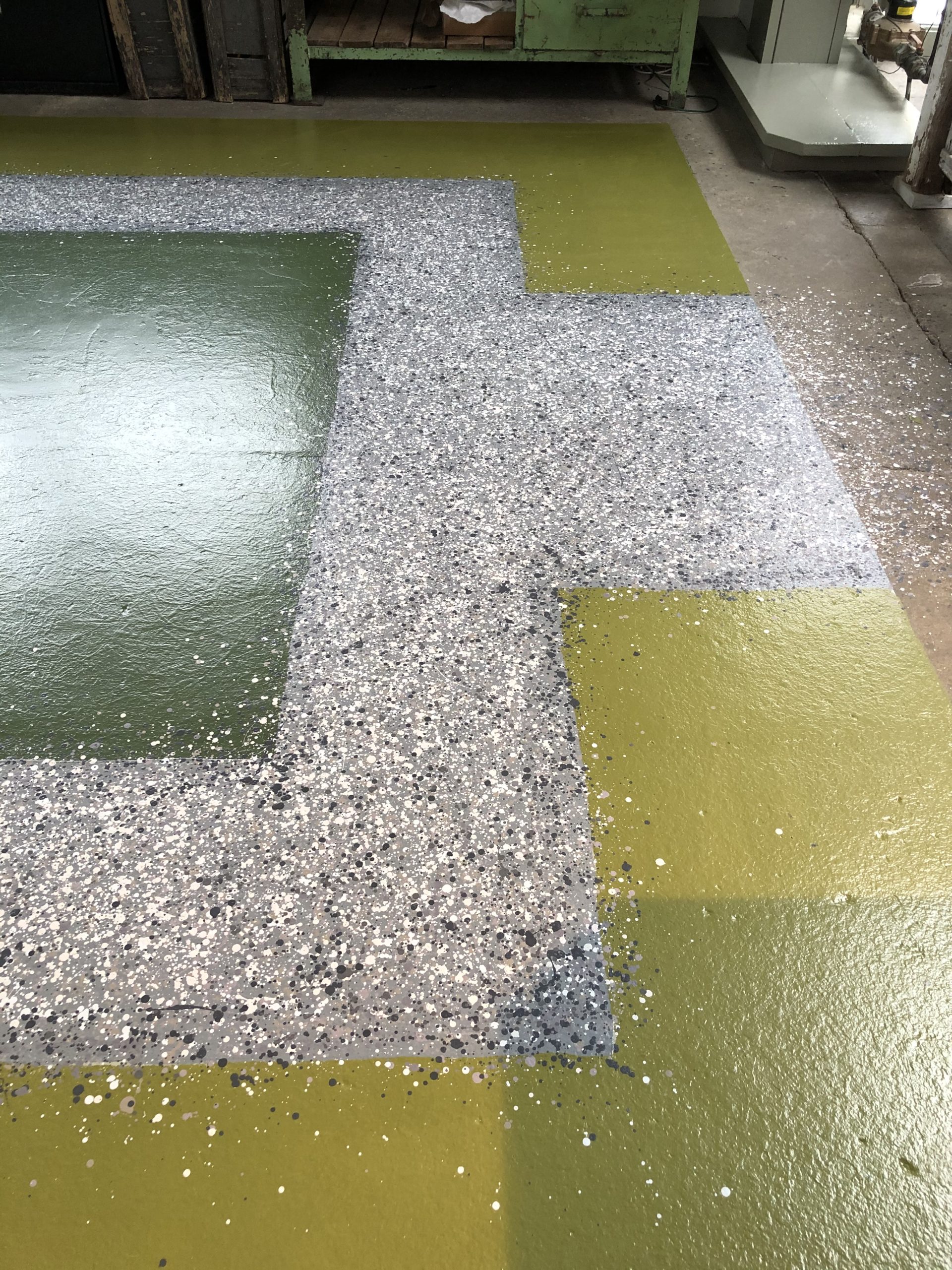
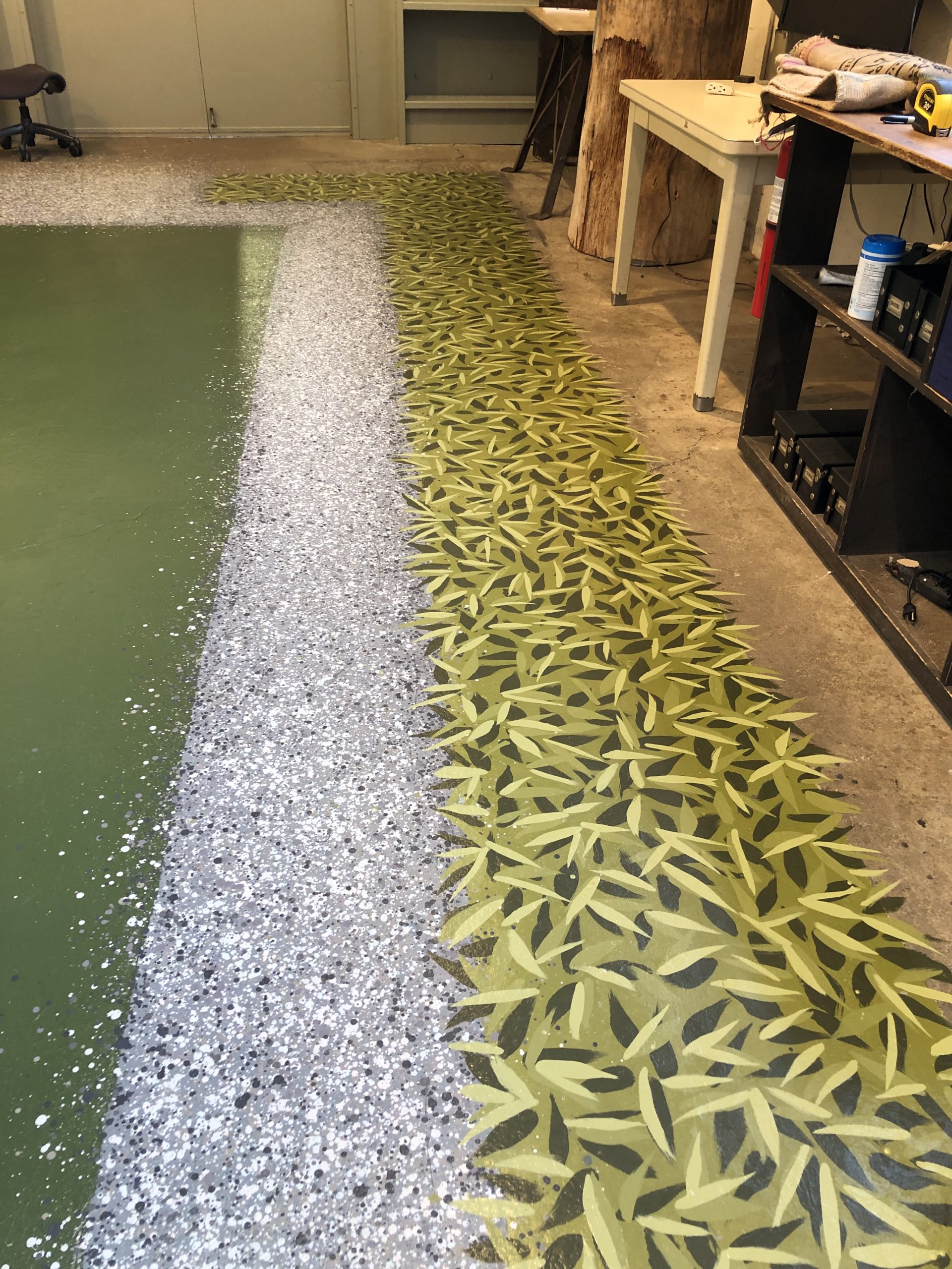
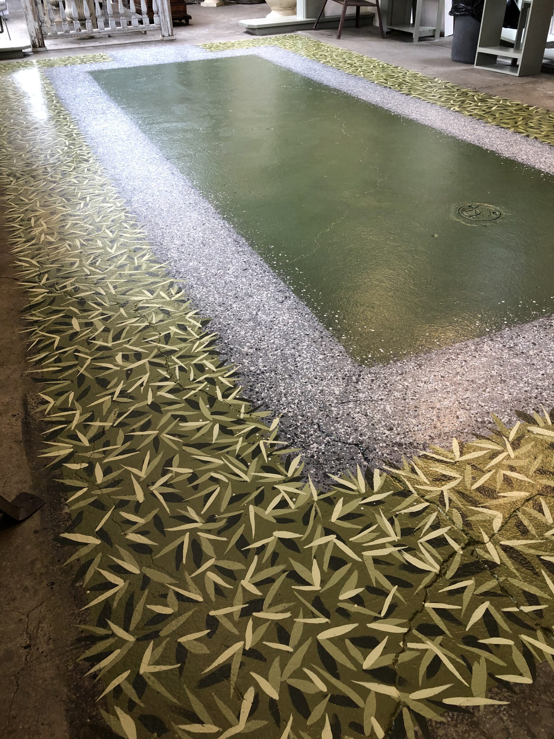
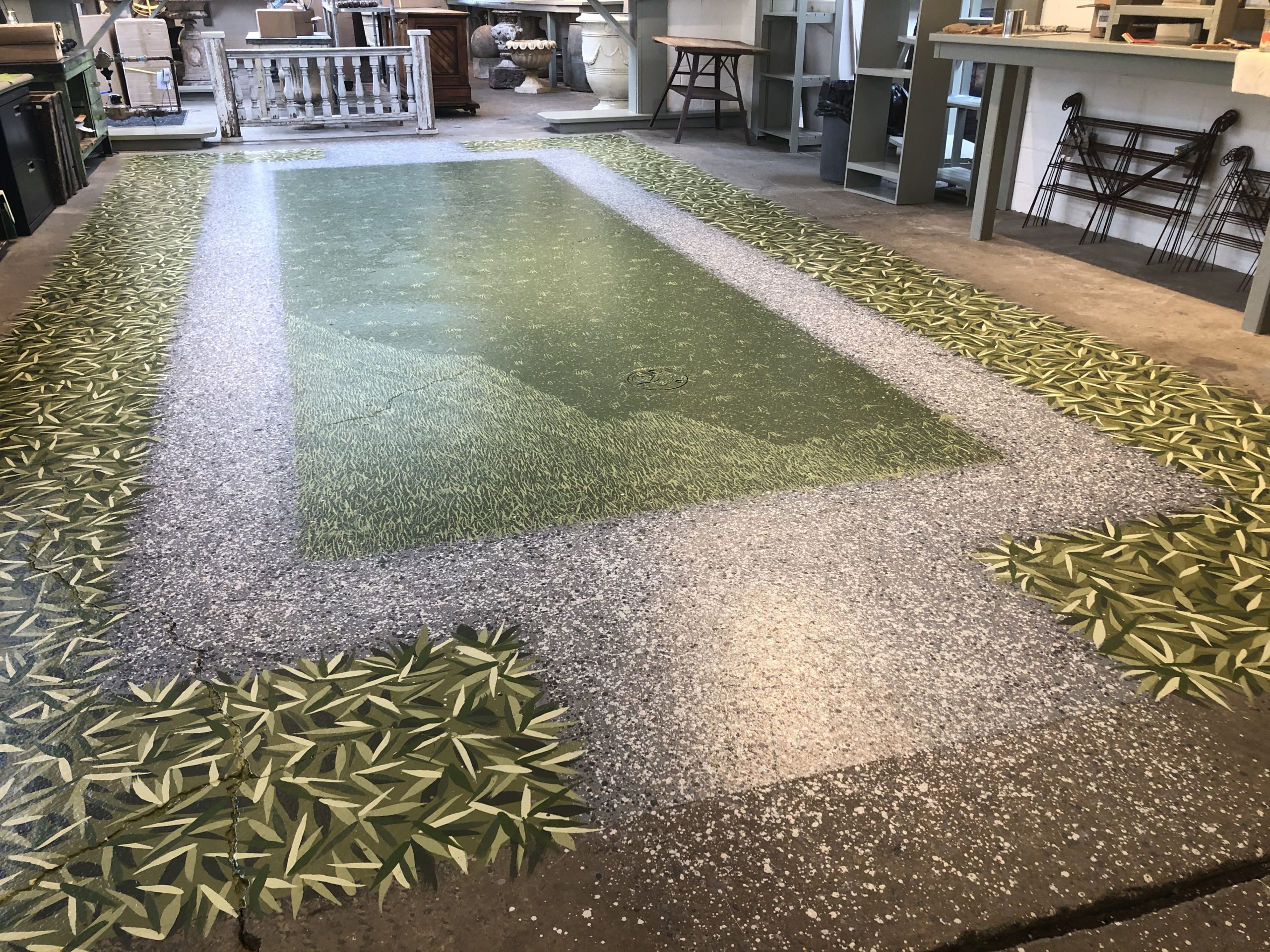
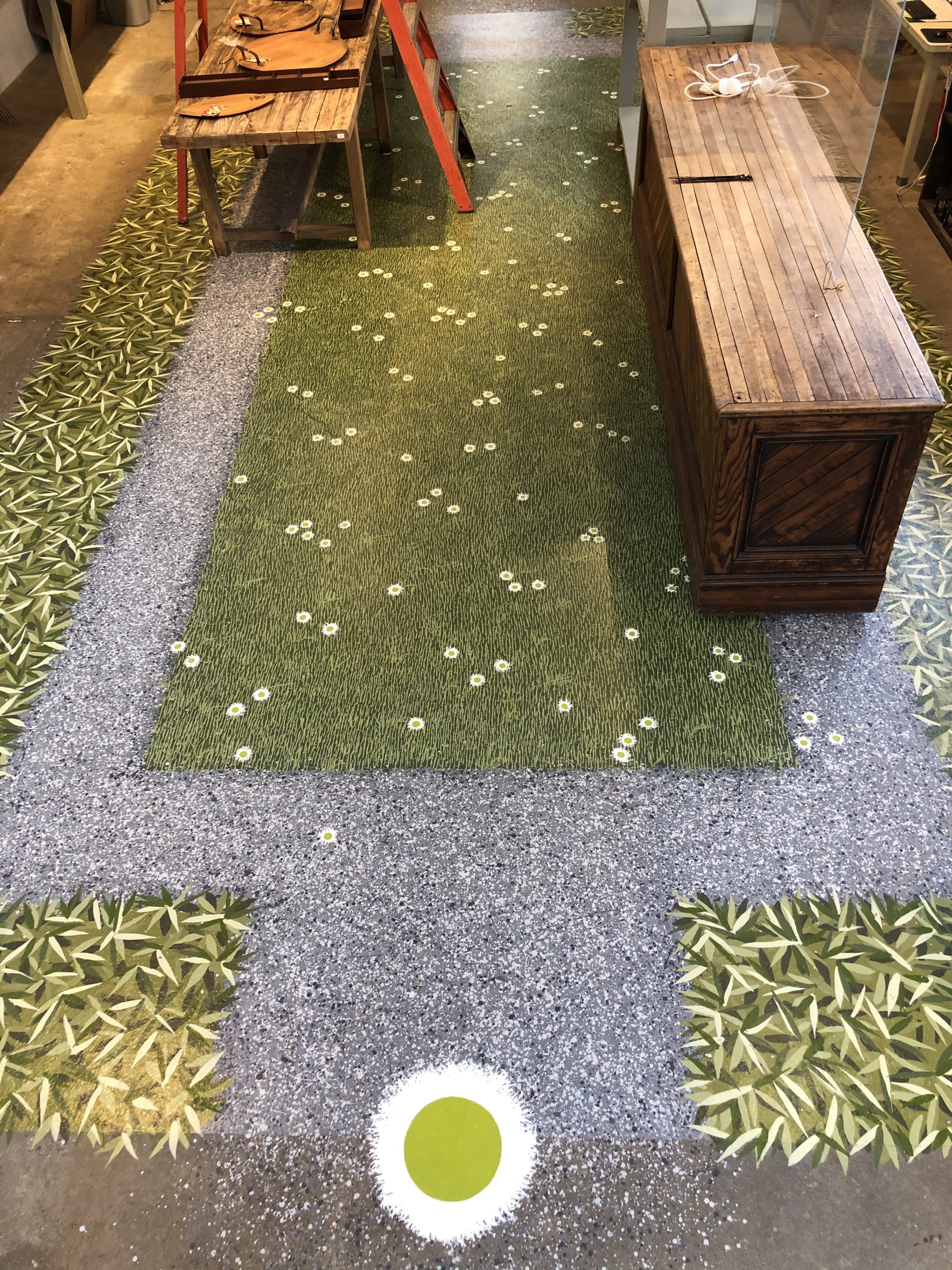
 The floor would have but a few elements. A grassy plane, admirably described by the French as a “tapis vert”, is as elemental a garden as any. And it is the starting point for any number of more elaborate expressions. That green square is a prominent part of the logo for the Works. In additional to the green plane, there would be a surrounding gravel path, and a planted area marked by large leaves to enclose that gravel. Painting the gravel was the first order of business, as plants from both sides would likely overlap onto it.
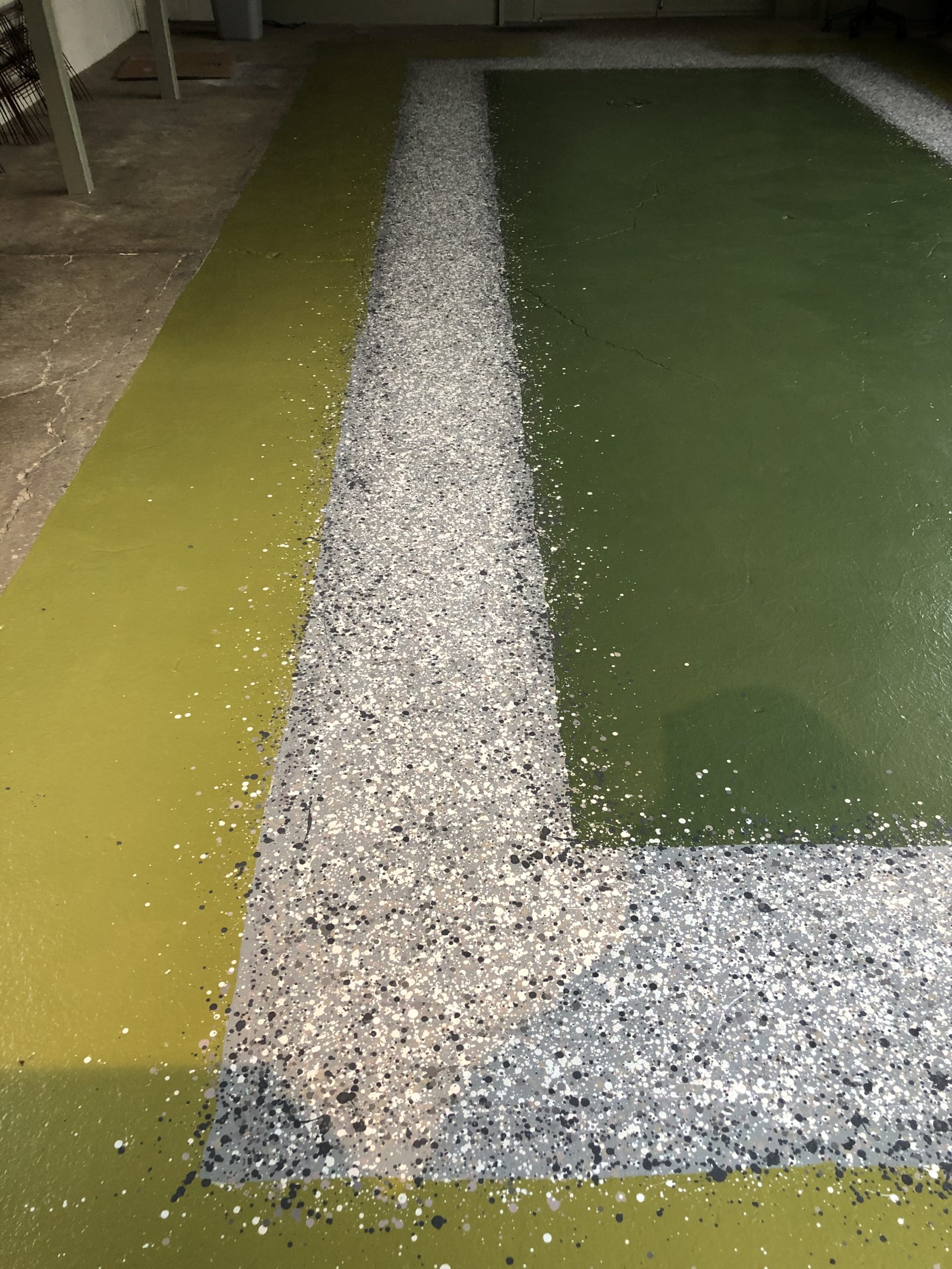 This would be the easiest part of the painting. A series of colors would be dripped on to the floor surface from a wood plant marker. The only finesse to this part would be slowly thinning the paint so it would drip at a reasonable rate-not too slow, and not too fast. Of course there was plenty of wrist and shoulder action, so the drips would be spaced out.
There were 4 colors to start with, and more colors created by mixing those initial colors. I did remember to use a pinkish taupe color reminiscent of the decomposed granite we use in our garden installations. It’s a subtle color variation, but it is there. As for the random drips over the edge, has not every gardener dealt with gravel moving around? It goes with the territory that there are limits to what a gardener can impose on nature.
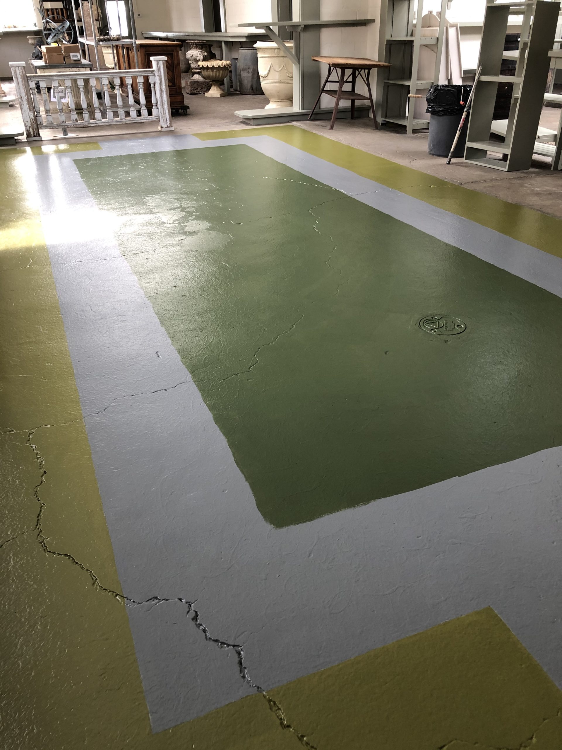
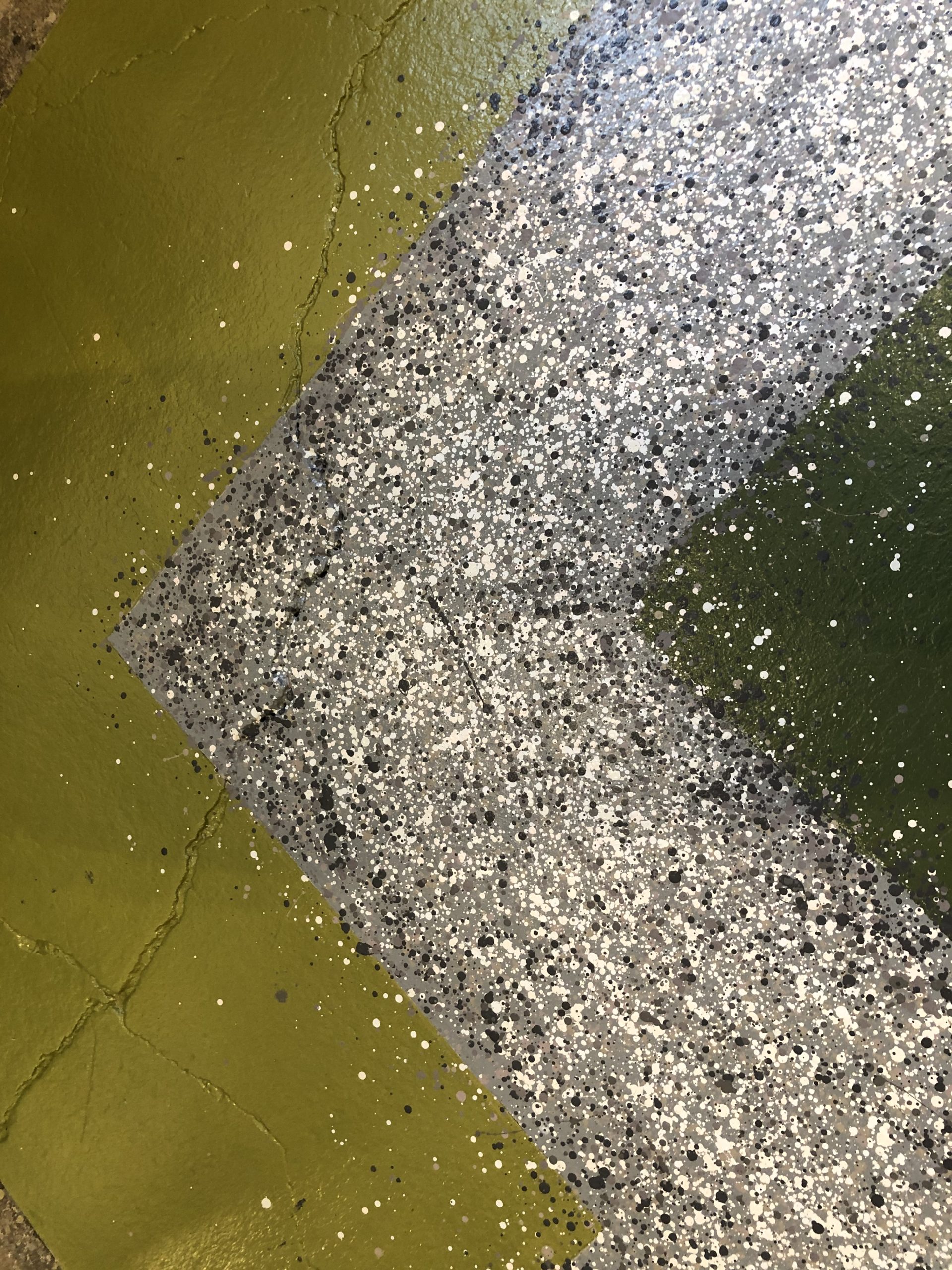 Some effort was made to keep the gravel darker and less detailed on the edges. Once the leaves to come were painted over the edges, that would help create a little sense of depth. This is decorative painting-not fine art. But a nod to composition and technique gives the mural a little more polished look.
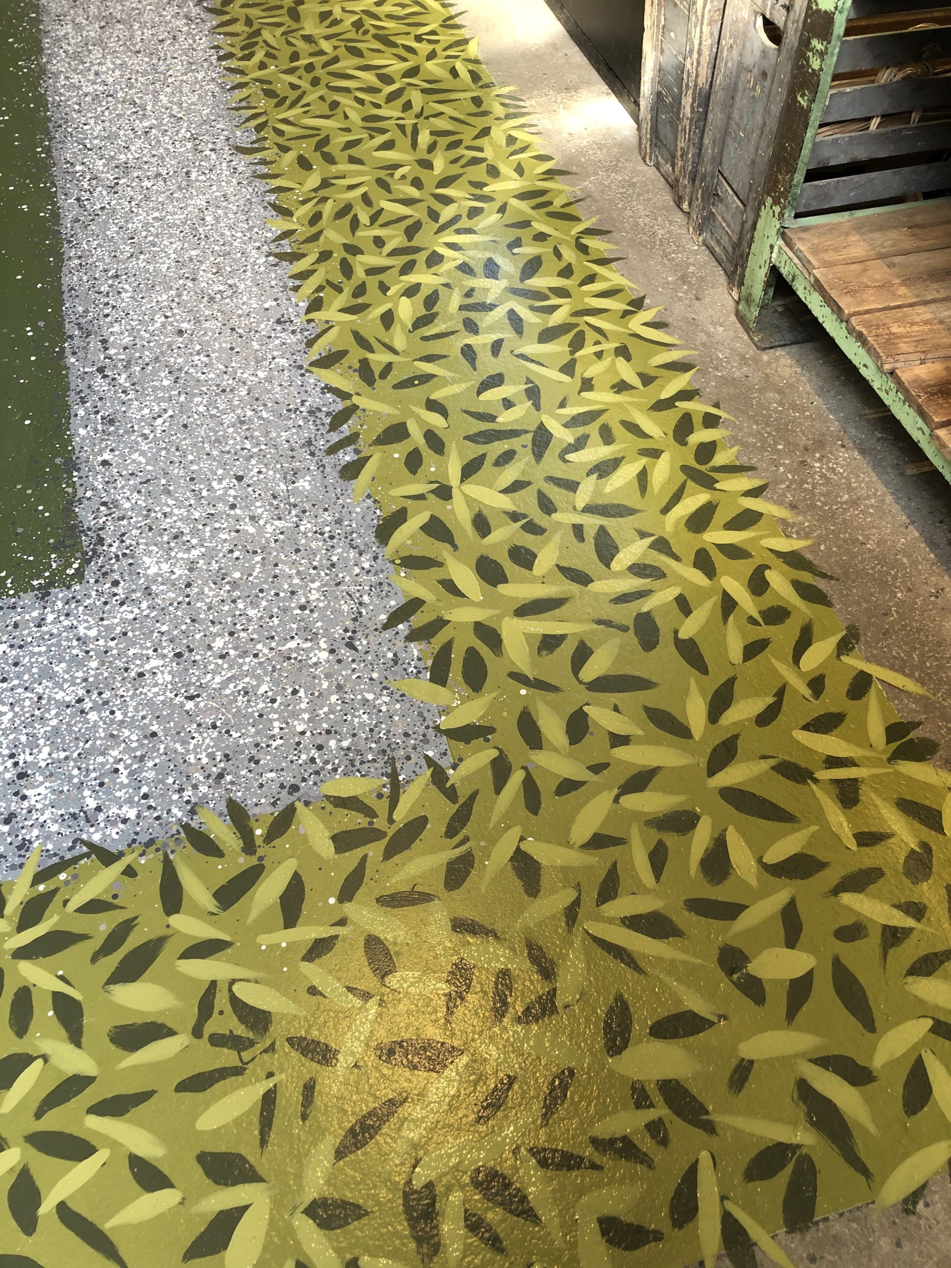
I have never painted large scale leaves on the floor before, and it took some experimenting to find the right tool. I finally settled on a 1″ sash brush. The bristles are arranged on a steep angle. With the longest bristles closest to me, I would set the brush on the floor, deposit some paint, and push the brush away from me. 1 stroke, 1 leaf. No going over or redoing. A stroke laid was a stroke played. Once I got that action down, The large leaves went fast. Of critical importance was a finely engineered three legged saddle topped stool with an adjustable seat height. I was able to paint and push along to the next location.
Positioning the work is an essential element for any successful project. Trying to work in an awkward position adds so much time to a project. Painting gracefully is dependent on establishing a rhythm. Sunne made sure I had music playing all day long.
Some of the two weeks it took to paint the floor was absorbed by watching paint dry. Our concrete floor in winter never warms up much, so the drying time was considerable.
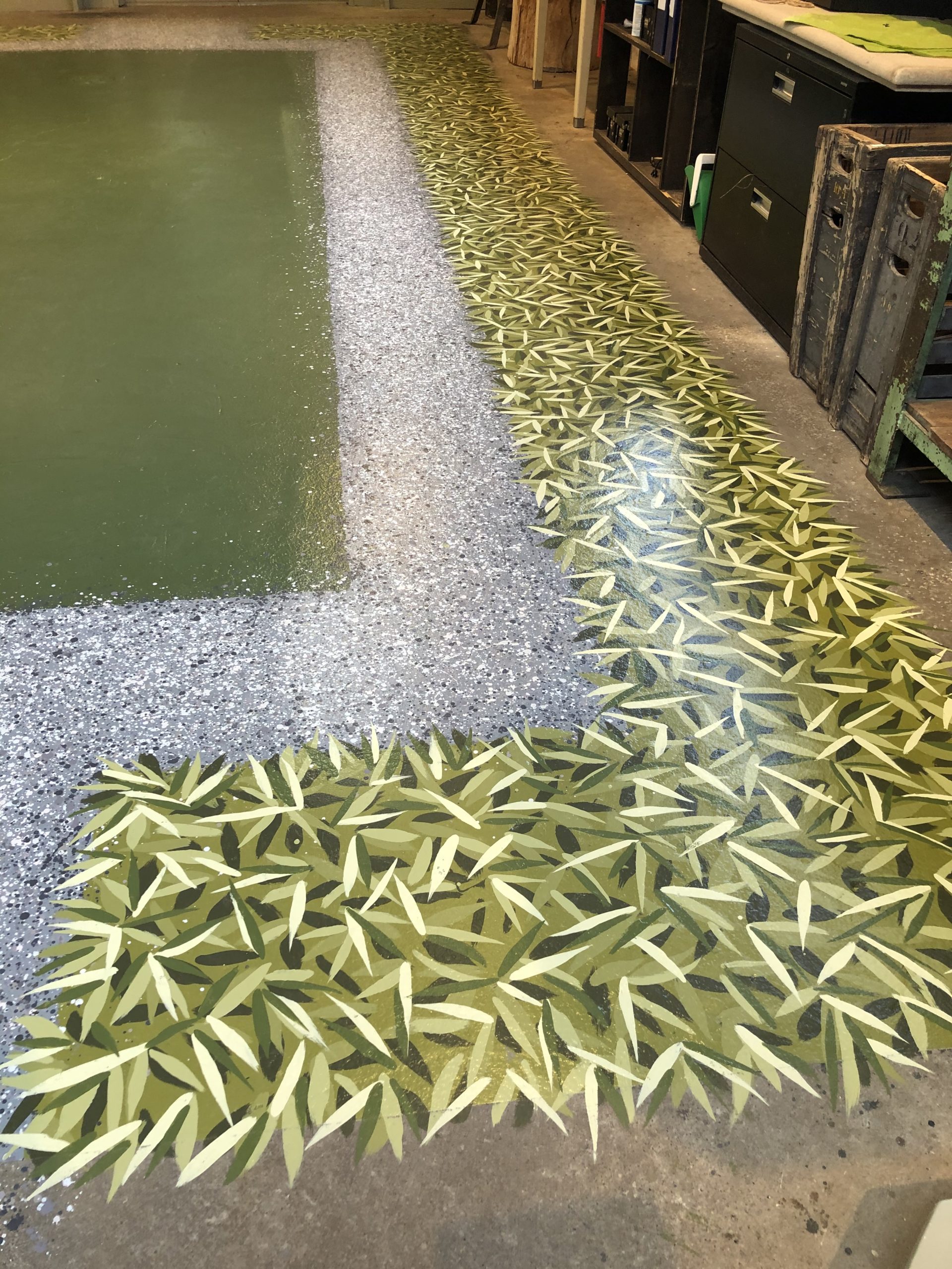
At some point it seemed like there were enough colors of those big leaves. The gravel and lawn areas would be so finely textured that a contrast would be welcome. I did want to establish the mass and size of that border before tackling the interior. By no means was any of the application of paint established in advance. Just an outline of the shapes.
What now?
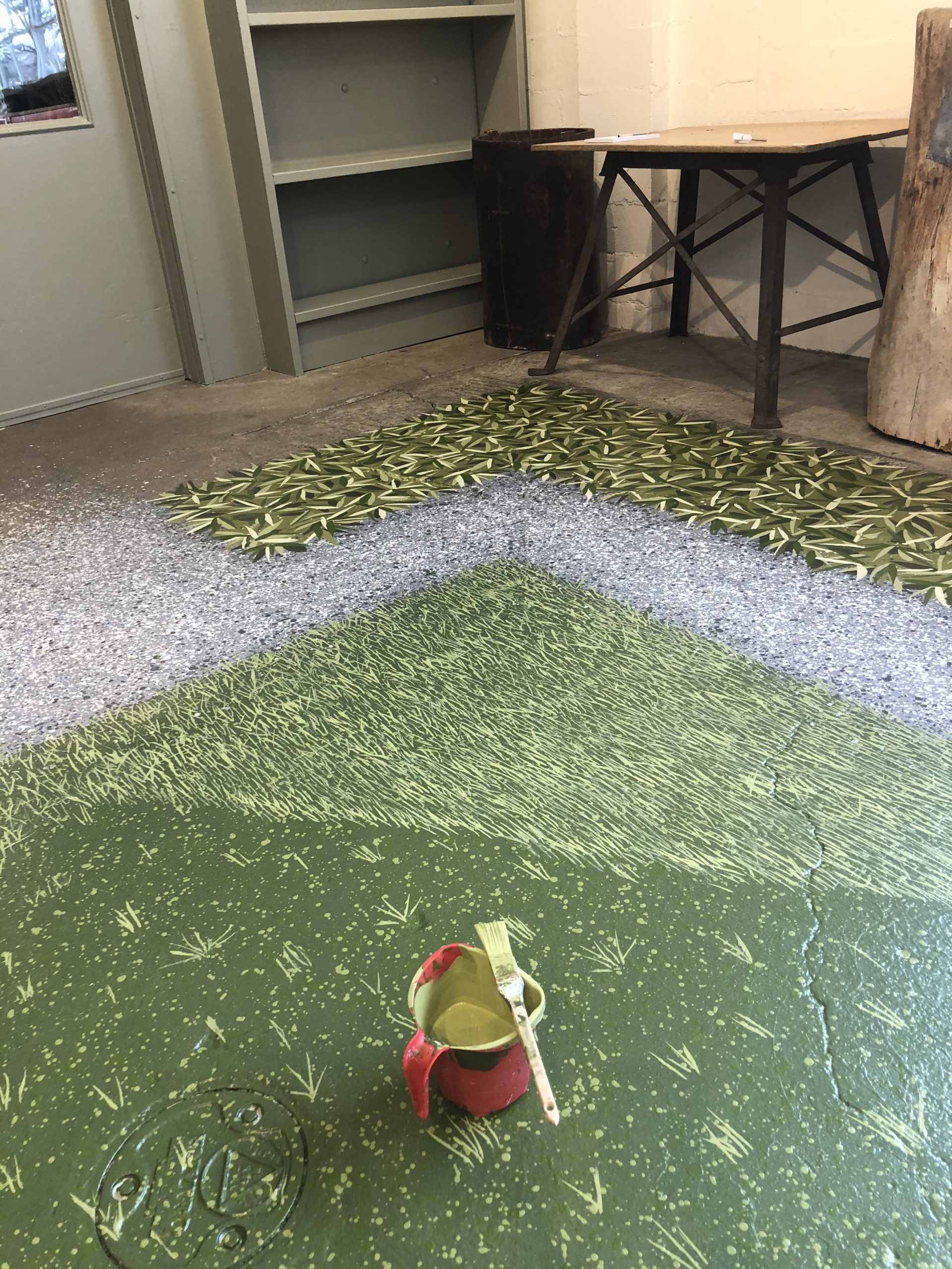
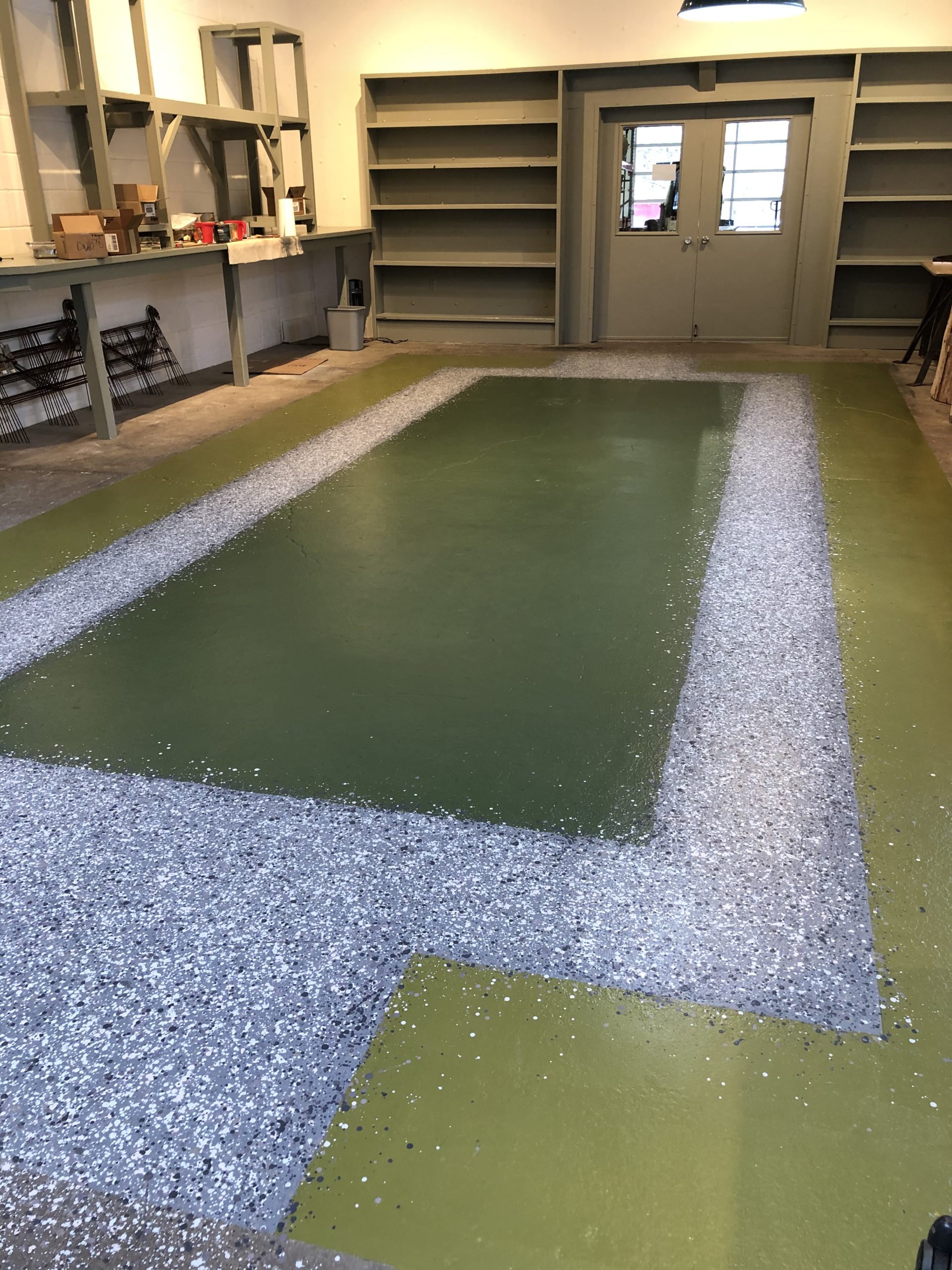
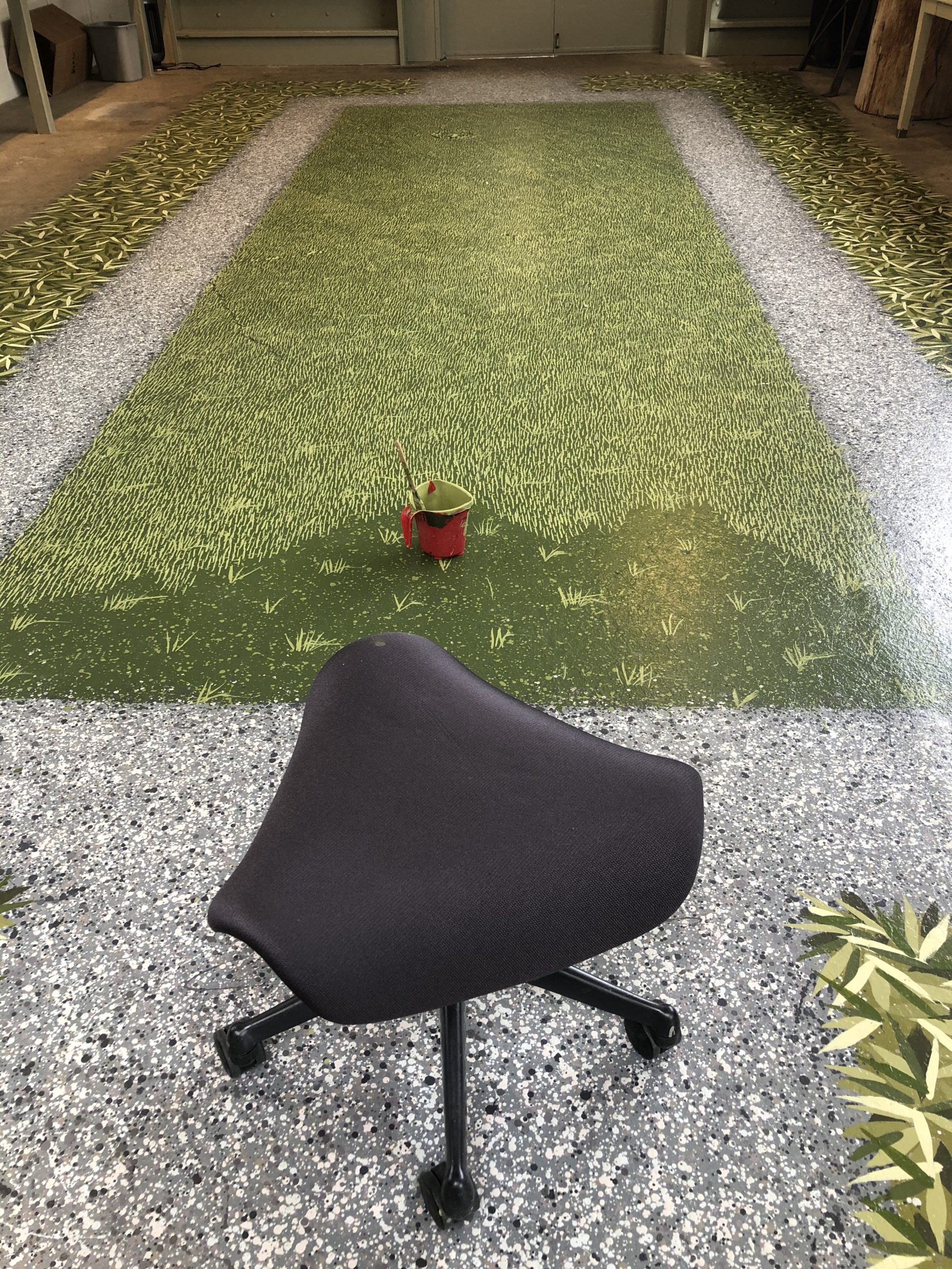
I thought I might get away with just a suggestion of grass here and there, with some accompanying drips, but that looked like I was loosing interest, or energy, or both. I resigned myself to making thousands of grassy marks with that sash brush held backwards, and settled in to the job. It took more time to do this one step than any of the other elements, but it was well worth it.
 Those marks were very lively. They brought the dark center up to the same visual plane as the gravel. Eventually I settled in to the job, and two days later that portion was finished.
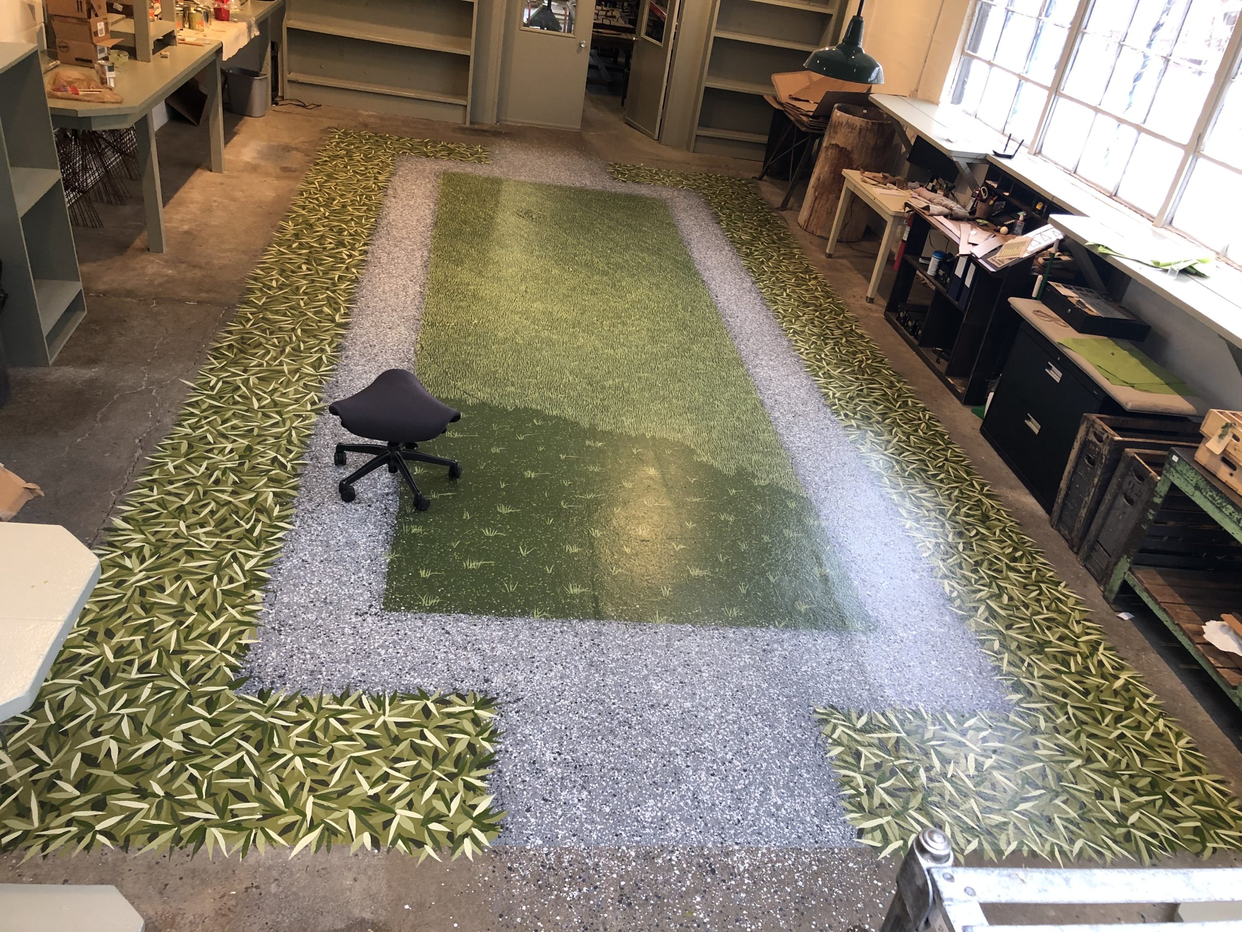
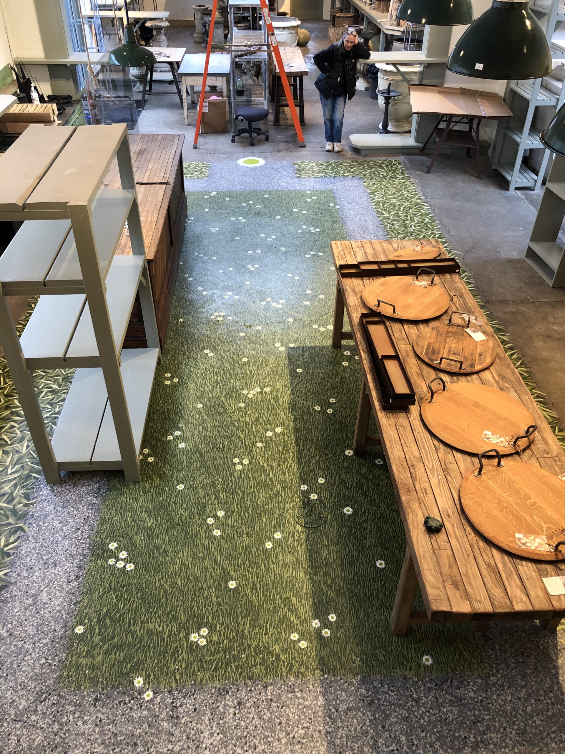
Drew was in charge of the aerial snapshots, which helped to give an overview of how the floor looked in its entirety.
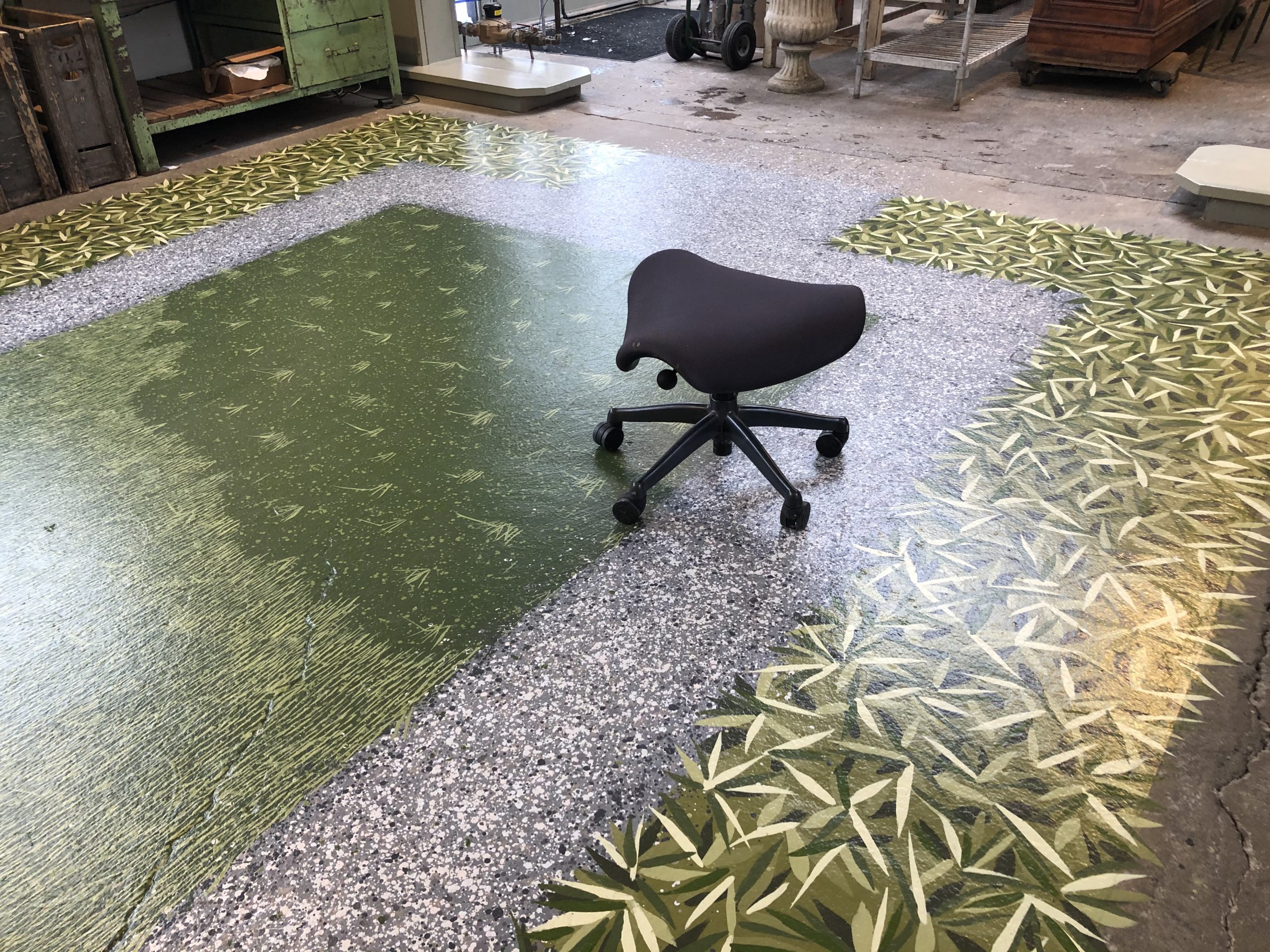
The brush strokes were deliberately styled on an angle. Grass does not grow in horizontal rows. It grows every which way. Painting the blades on varying angles helped to create an overall look, as opposed to a linear look.
It is easier to see the grass marks undulating in this picture. I like the action of the pattern.
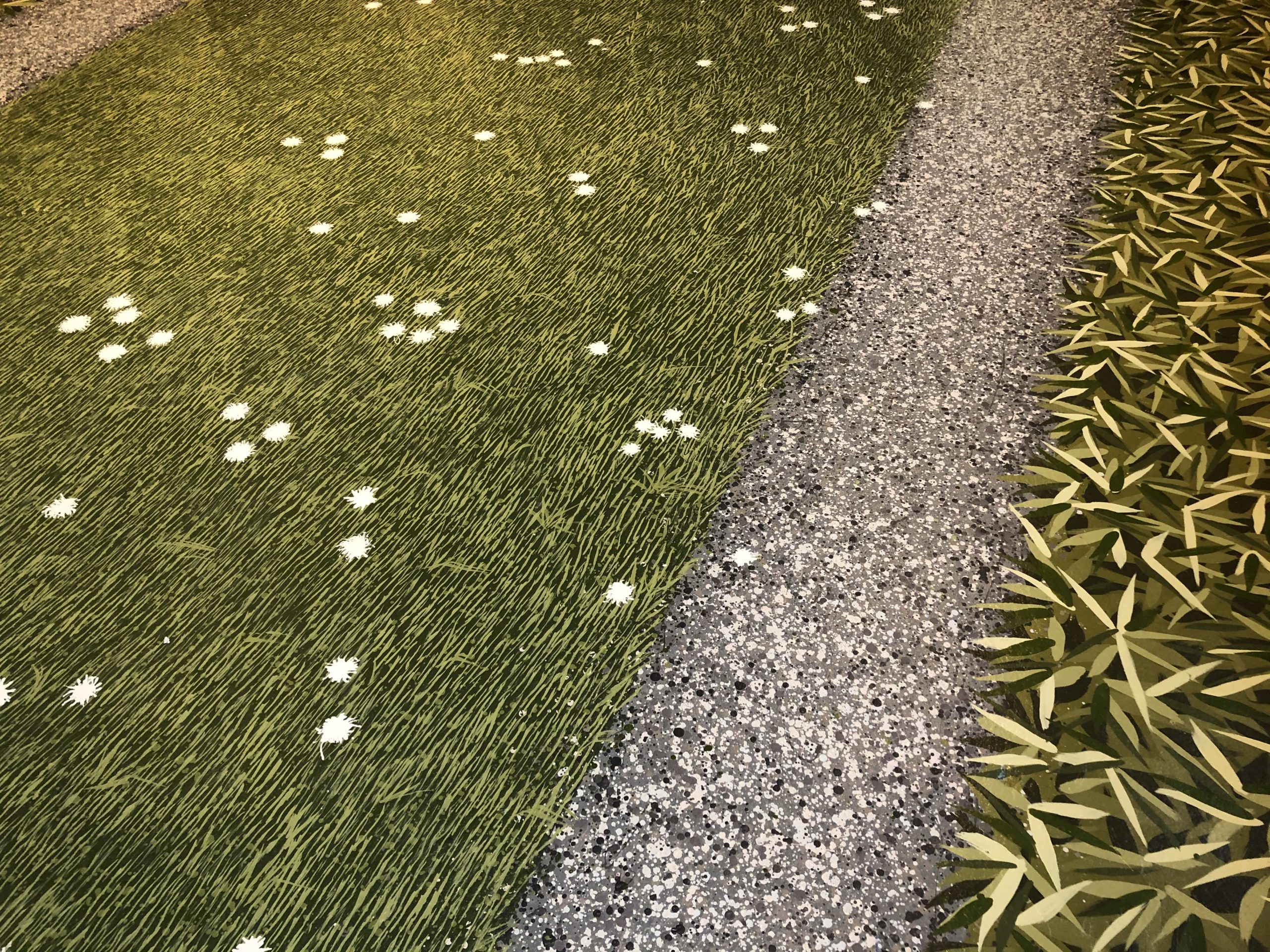
The English daisies on the previous floor was a favorite finishing touch, so I wanted to repeat that. A generous blob of white paint had its edges feathered with a wood garden stake. This gave the flowers a much more windblown and casual look, in contrast to the grass blades and stylized leaves.
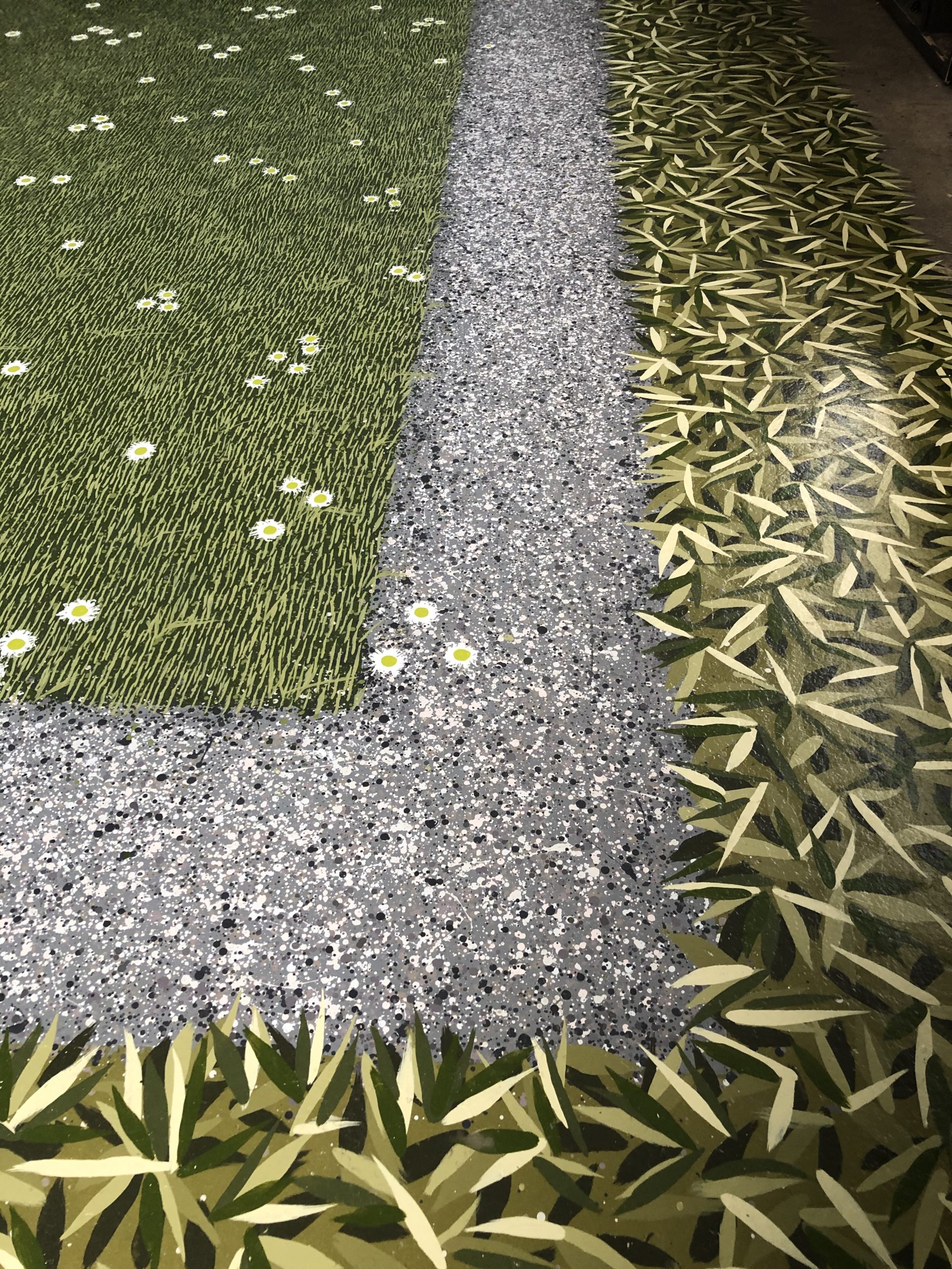
The centers of the flowers were done in our signature lime green color.
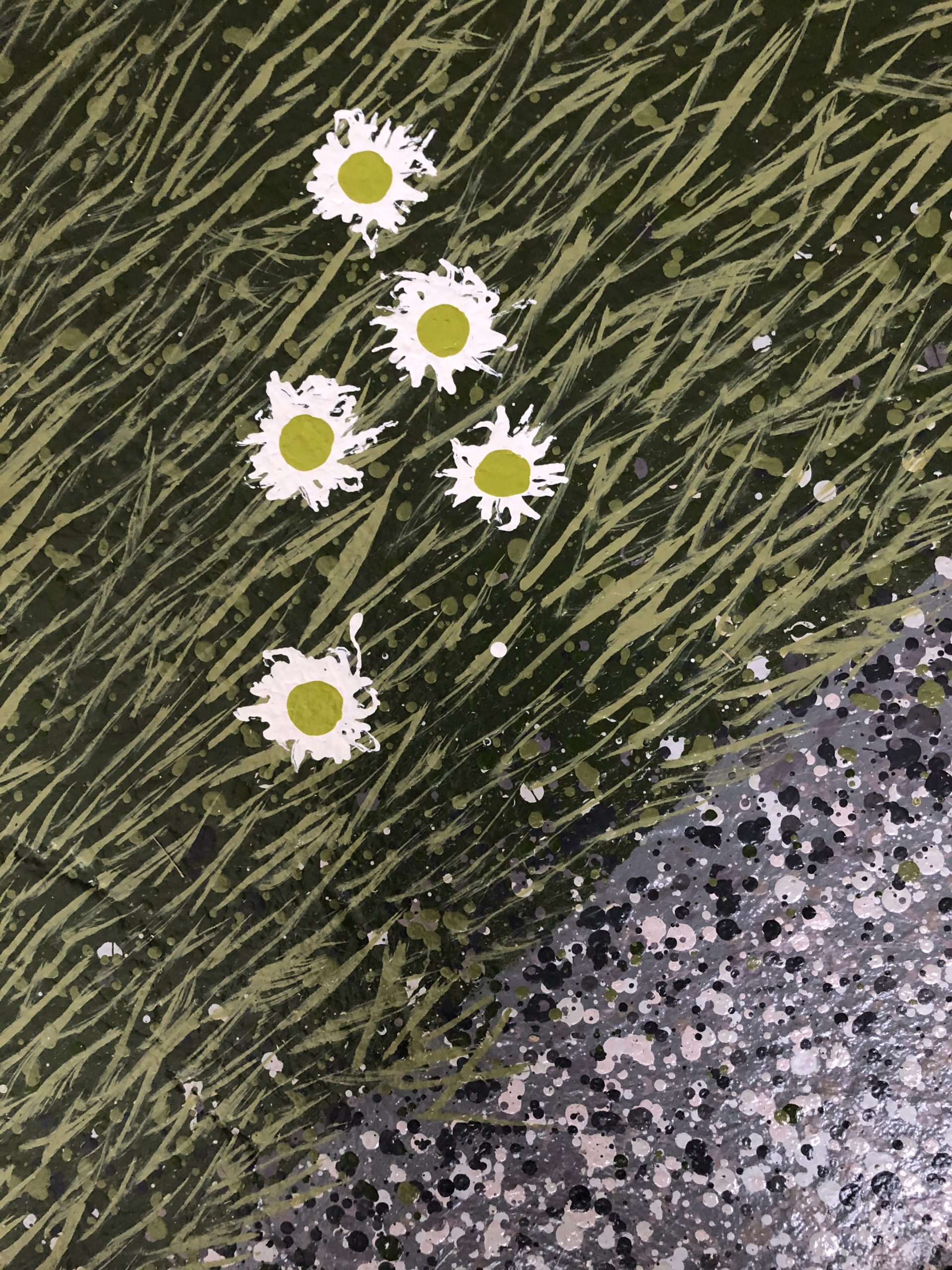
Due to the transparency of yellow pigment, it took 3 or four coats to get the color to represent clearly.
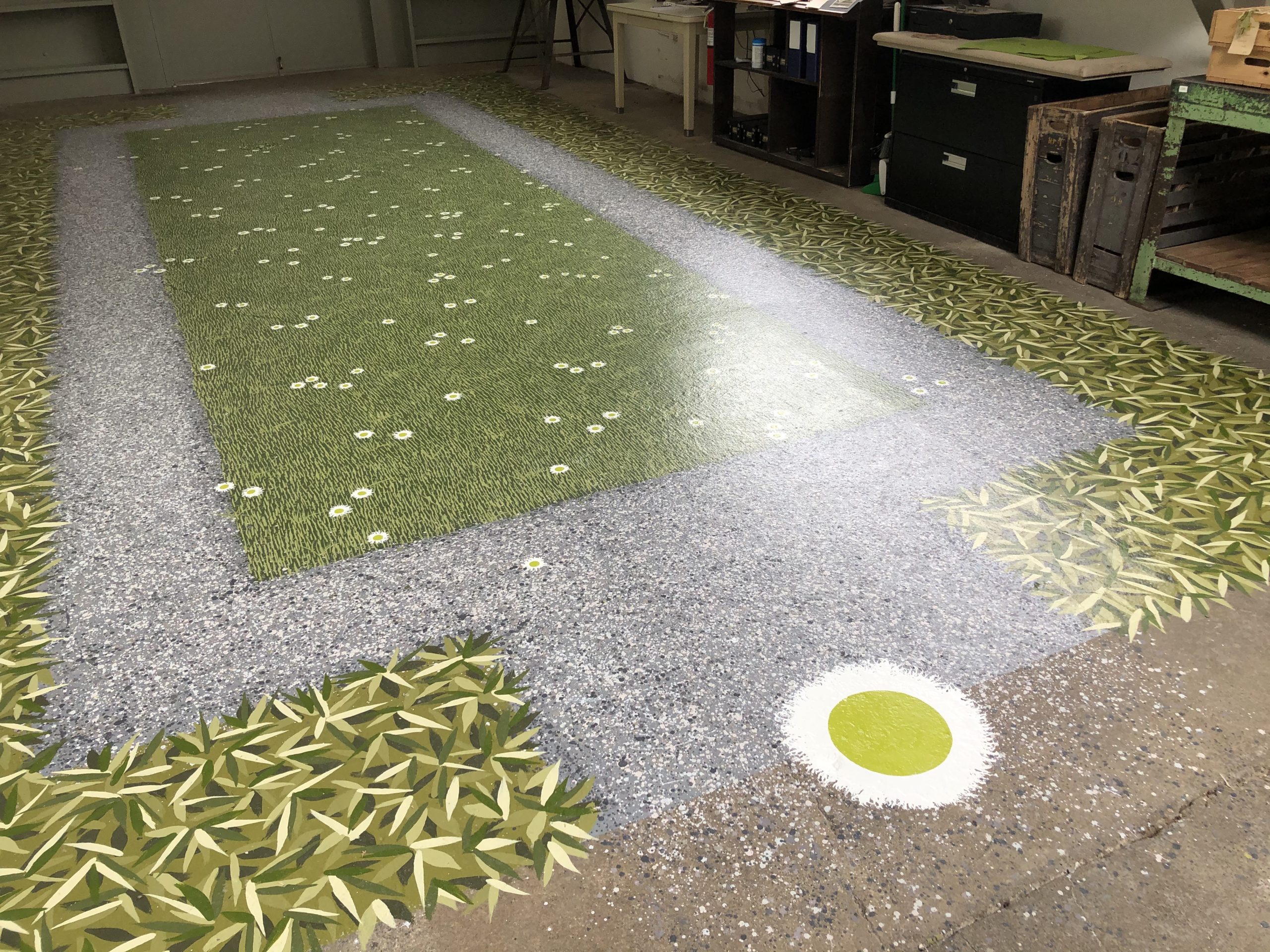
The largest daisy medallion is a nod to our anniversary. You have to look very close to see the the 25 in the very center, as it is painted in the same lime color as the disk. That was deliberate. There will be many years to come for the Works after this one.
It was a good day, the day the room started to come back together.That floor grounded the space, and would compliment whatever went in there.
One of the fabricators at Branch said it the best. He called Detroit Garden Works a passion project. Yes, it is.
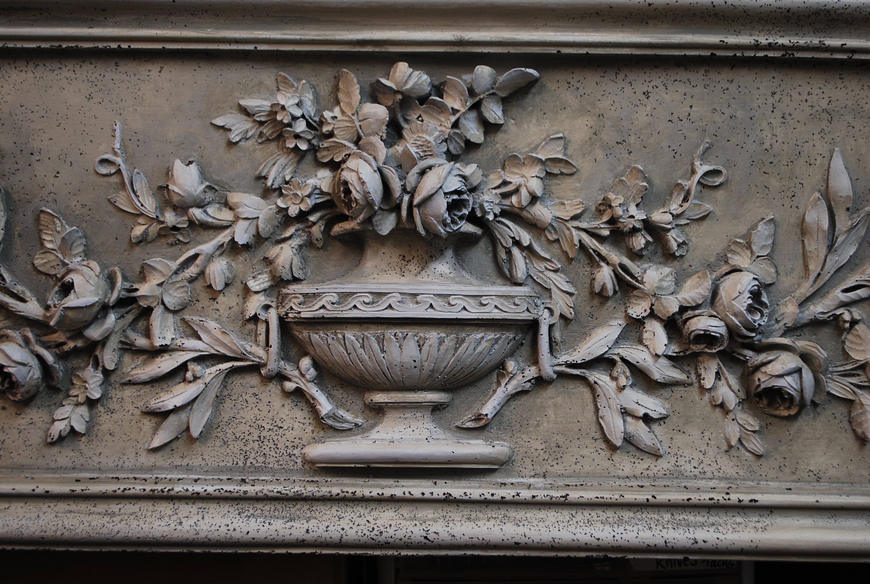
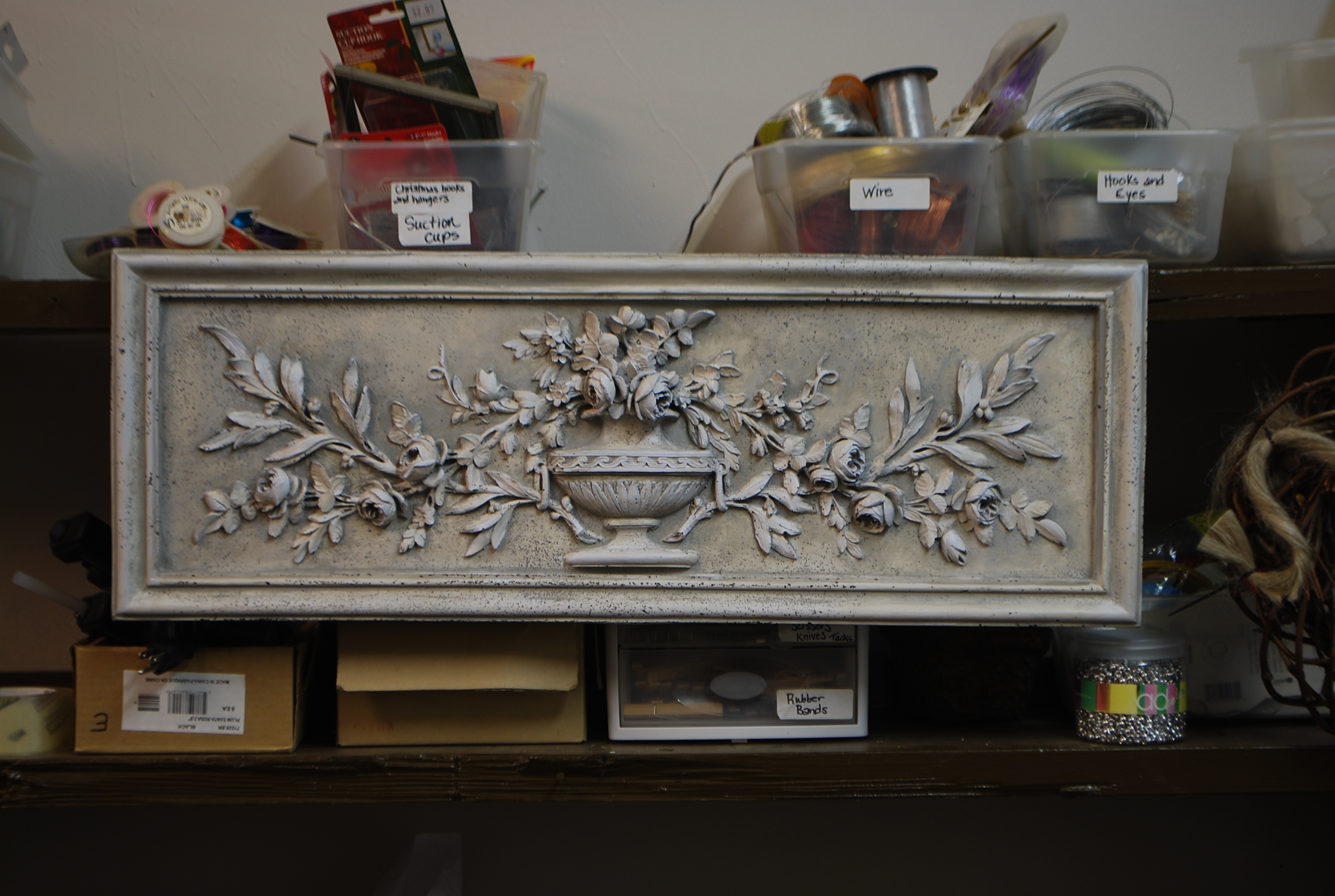


 The walk culminates in a covered porch; the front door is at right angles to the walk, and not visible until you are right up there. All of this makes the brick wall they see coming up the walk an important element in their landscape. We started with pots, as there is no ground to plant in; this part looks great. But I thought that wall needed what all walls seem to need-a sculpture, a painting, a mirror?
  As my clients have quite a collection of art, they were receptive to the idea of a painting. Paintings that survive the weather need to be made of different materials that what an artist ordinarily would choose. I paint on extira board, which is used for making exterior signs. It does not absorb water, nor does it deteriorate outdoors. Porter Paint is a 100% acrylic paint; it is color fast, very tough and hard, and sheds any weather. As this paint is actually exterior house paint, and does not have the body of artist’s colors, I decided I would pour the painting. A beaker was the perfect tool.
 I poured the painting over the course of about 4 hours. Some areas I wanted to blend colors. In other areas, I wanted colors to sit distinctly side by side. All in all, I poured one and a quarter gallons of paint-a big fluid situation, to say the least. I supported the extira board underneath on 8 quart cans of paint, so if the board sagged from the weight of the paint, it would be evenly supported.
 Within 3 days, the surface of the paint had skinned over sufficiently that I could stand it up to take a look. While I was happy with the color and the shapes, I wanted more texture. The painting would be viewed from some distance coming up the walk. The near view, on the porch, would present a different look. I wanted to address both views.
 Using a carpenter’s awl, I poked, scratched, lifted up and pushed around that partially dry paint. The areas of paint I lifted off the surface, I stuffed with pieces of bamboo. At this fairly wet stage, I needed to support the paint until it dried. Once the paint was thoroughly dry, I stuffed those shapes with preserved reindeer moss.
 �
� The close view I like. All the elements are different, but they look good together. The Italian terra cotta plaque is so much more important visually than when it had no company.