Learning

July 14 2014 (11)Lots of people ask me about how I work with color in the garden.  How I decide on a color scheme for a container.  I have tried to write about my process, but I always have the nagging feeling that the discussion falls short.  Frustrating, this.  Though I know that any creative process cannot be quantified, or reduced to a step by step, I would teach, if I could.  I had occasion recently to view a video of a TED talk, thanks to Buck.  TED, if you are familiar, is a forum for presenting speakers who have something to say about ideas worth spreading.  Interested?  www.ted.com.   He keeps up better than I do-about what there is out there to learn.  Her had me listen to a talk given by Joi Ito.

July 14 2014 (12)In March of 2011 he was interviewing for the directorship of the MIT media lab. Late that night, a magnitude 9 earthquake struck off the coast of Japan, just several hundred kilometers from his wife, children and family.  In the terrifying hours that ensued, he discovered that he could not reach his family.  Nor was any government or news agency broadcasting any information about the damage to nuclear reactions by the earthquake. Frantic for information about his family, and for all the other families besieged by a disaster of this scale, he went to what he knew.  The internet.

July 14 2014 (5)In the following hours and days he contacted friends, hackers, scientists and families and put together a citizen science group he  called Safecast.  Over the next few months this group of amateurs with no scientific or governmental standing managed to invent a process by which to measure the radiation levels.  They put geiger counters on the ground; they measured the radiation.  They made available at no charge information that people could use.  Information for anyone for whom this earthquake had devastatingly personal consequences.

July 14 2014 (4)In his talk, he speaks eloquently of how his drive to get the information he wanted and needed was enabled by the internet.  The volume of information out there that can be accessed is limitless.  The internet allows people who have similar interests to meet digitally.  His discussion of how the internet makes it possible for citizens of certain groups to meet and solve problems which transcend any map or country interested me.  Most certainly passionate gardeners are citizens of a country all their own.

July 14 2014 (3)Joi Ito went on to discuss in simple terms the process of learning. What stood out to me the most?  “Education is something that someone else does to you.  Learning is something one does to/for oneself.”   I like this idea.  In fact, I like it a lot.  If anyone would ask me what was most valuable part of my college education, I would have to say that I learned how to learn about what interested me.  Of course the world has changed immeasurably since 1970.

July 14 2014 (14)
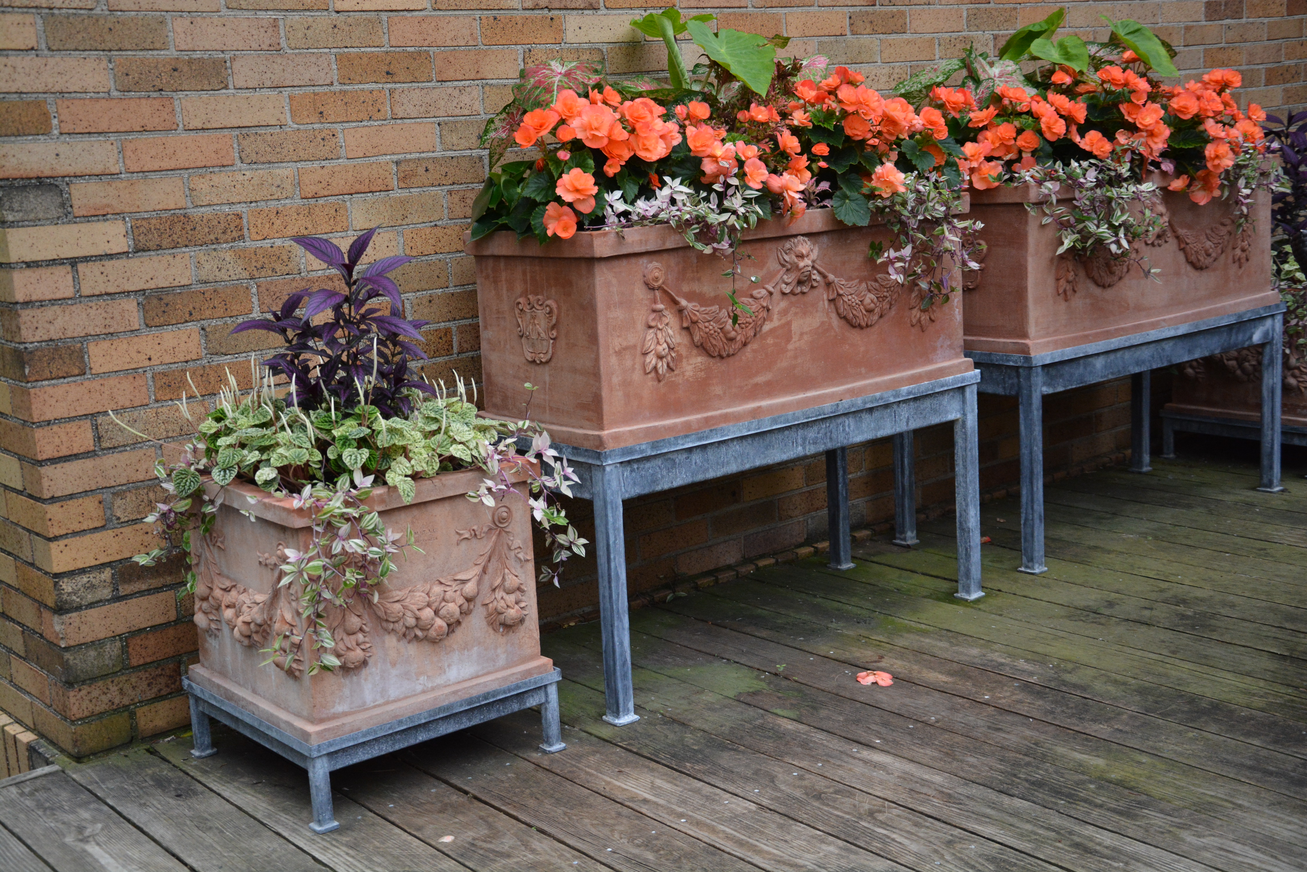
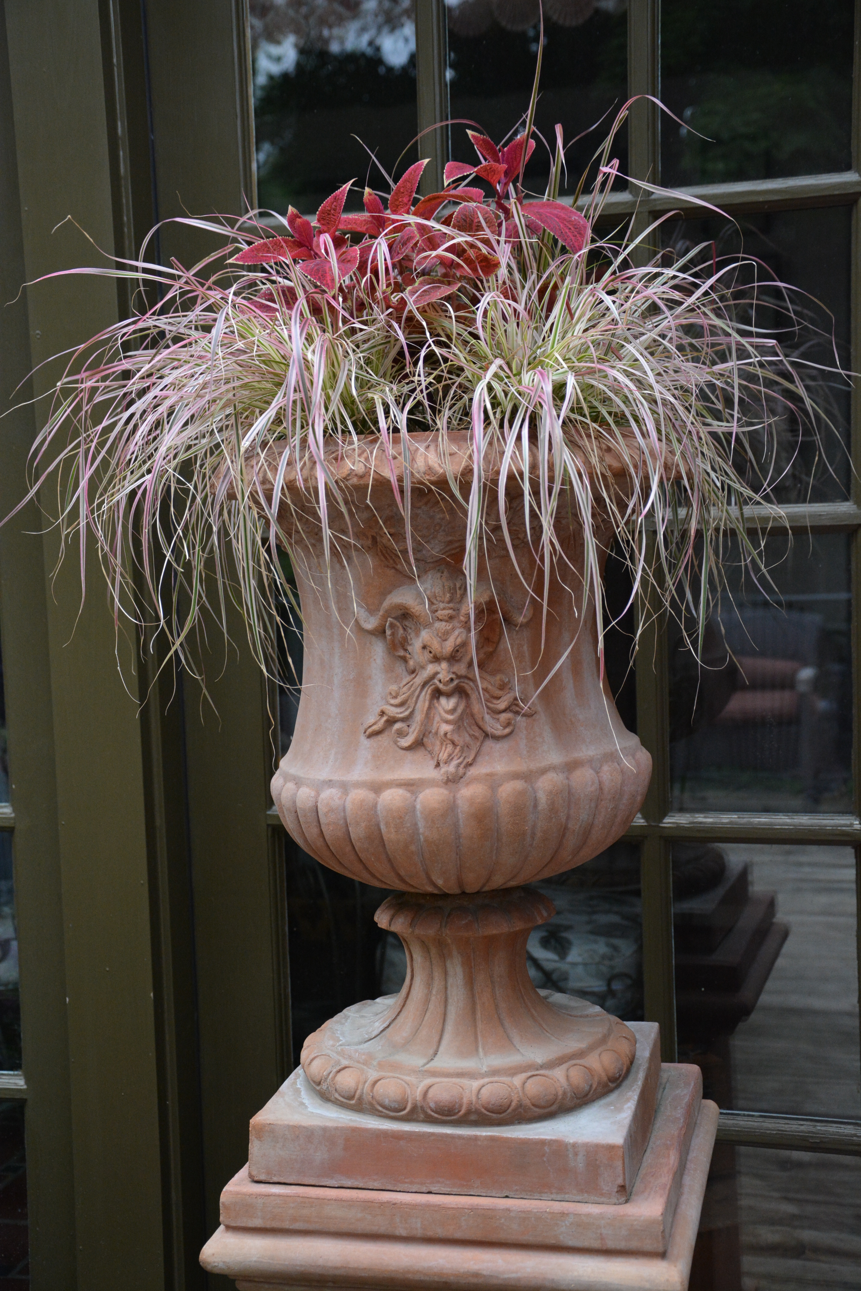
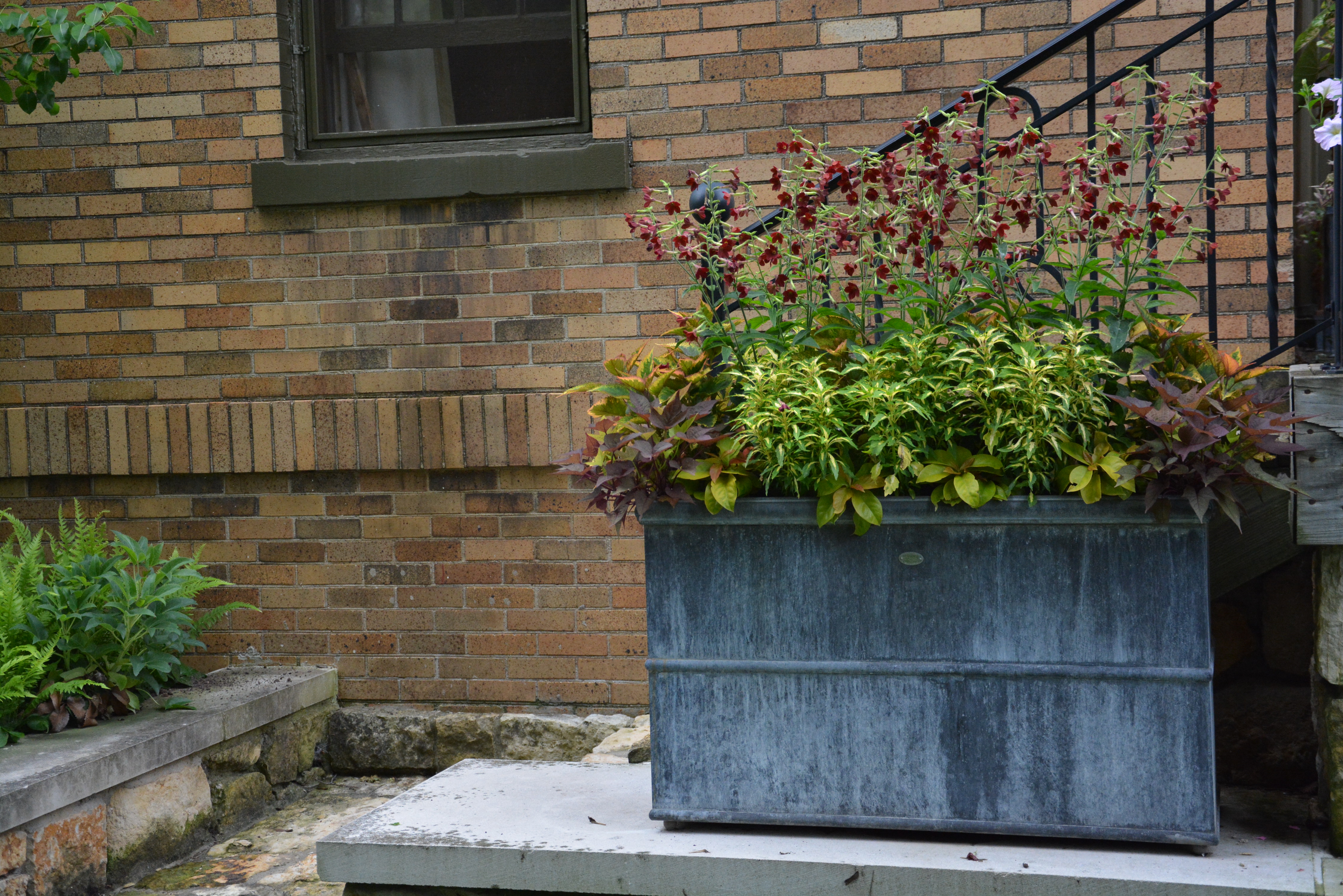
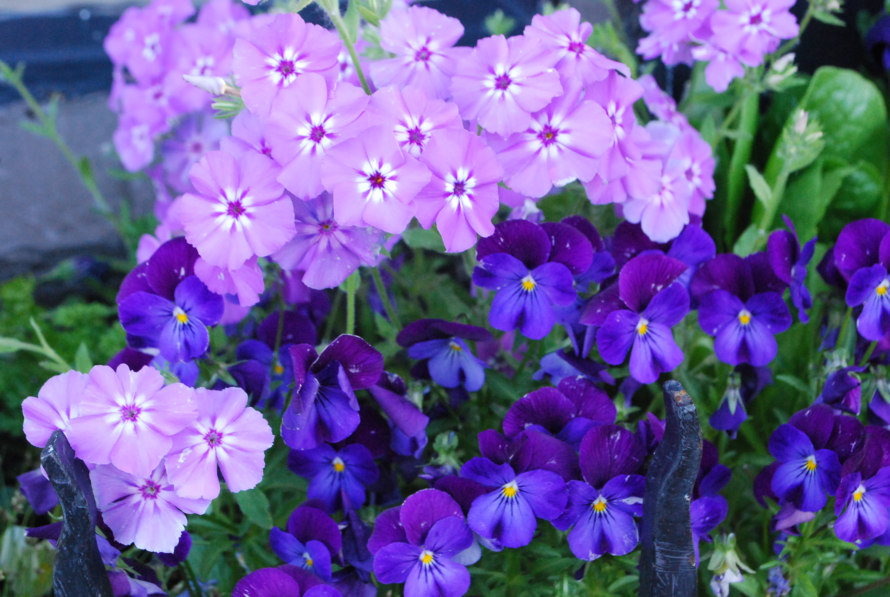
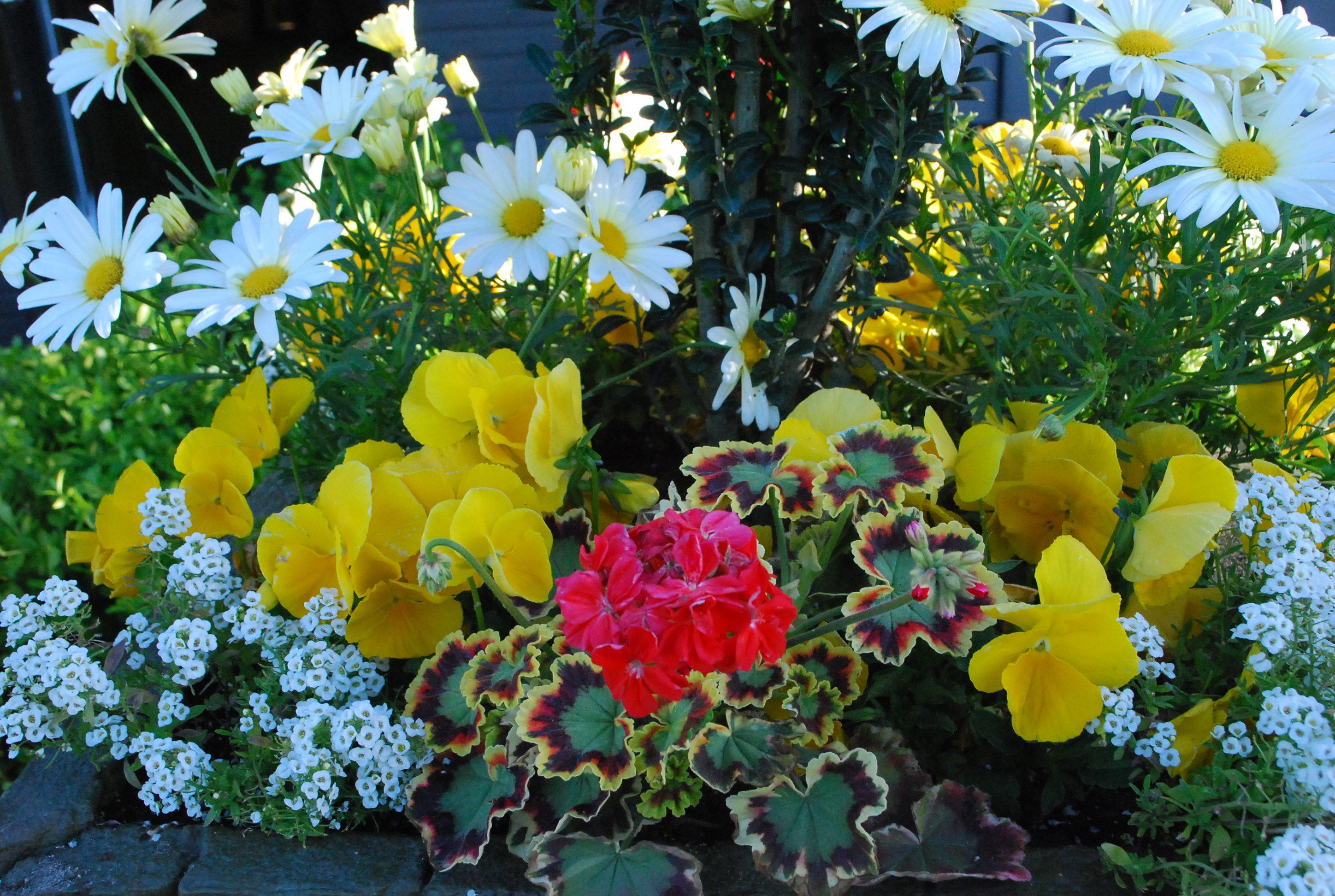
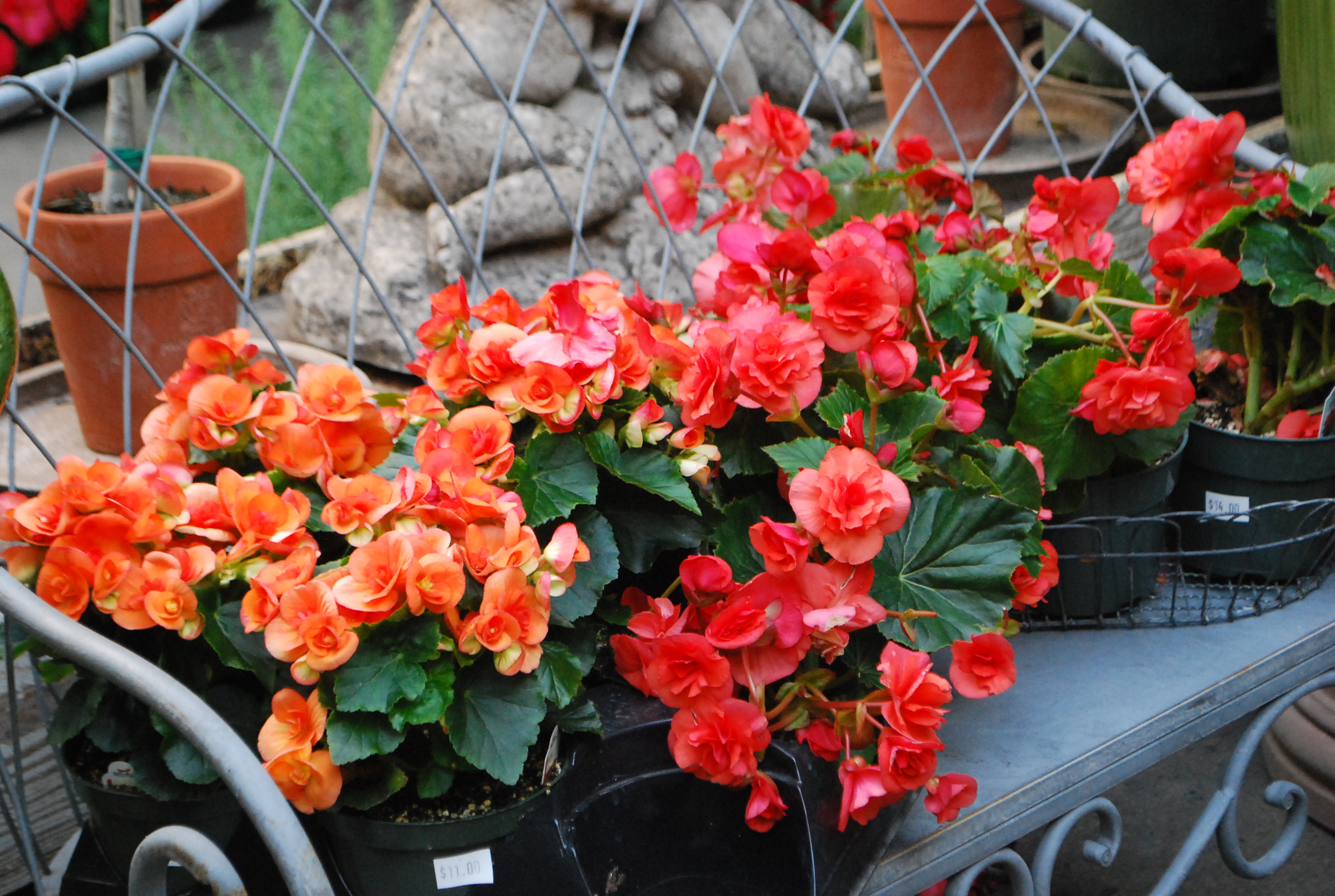
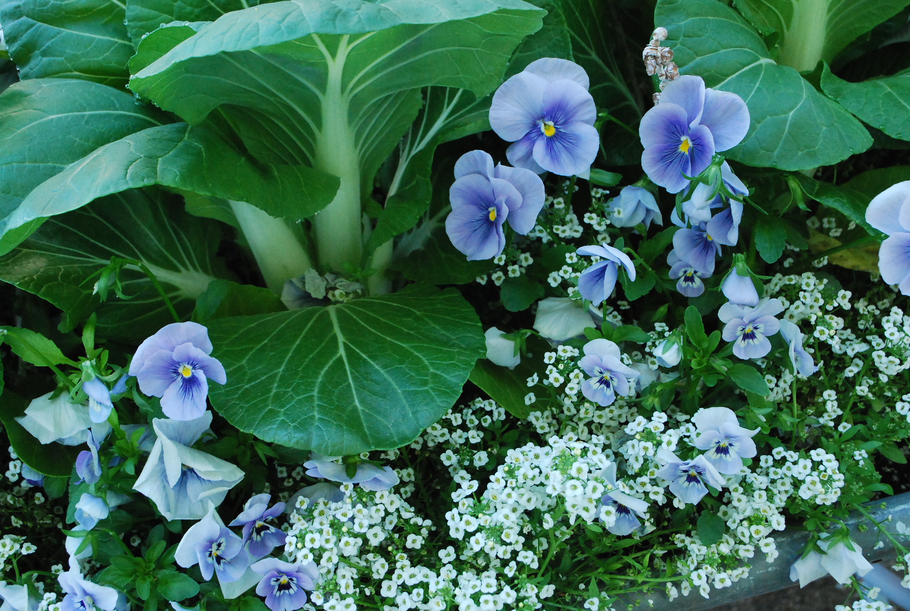
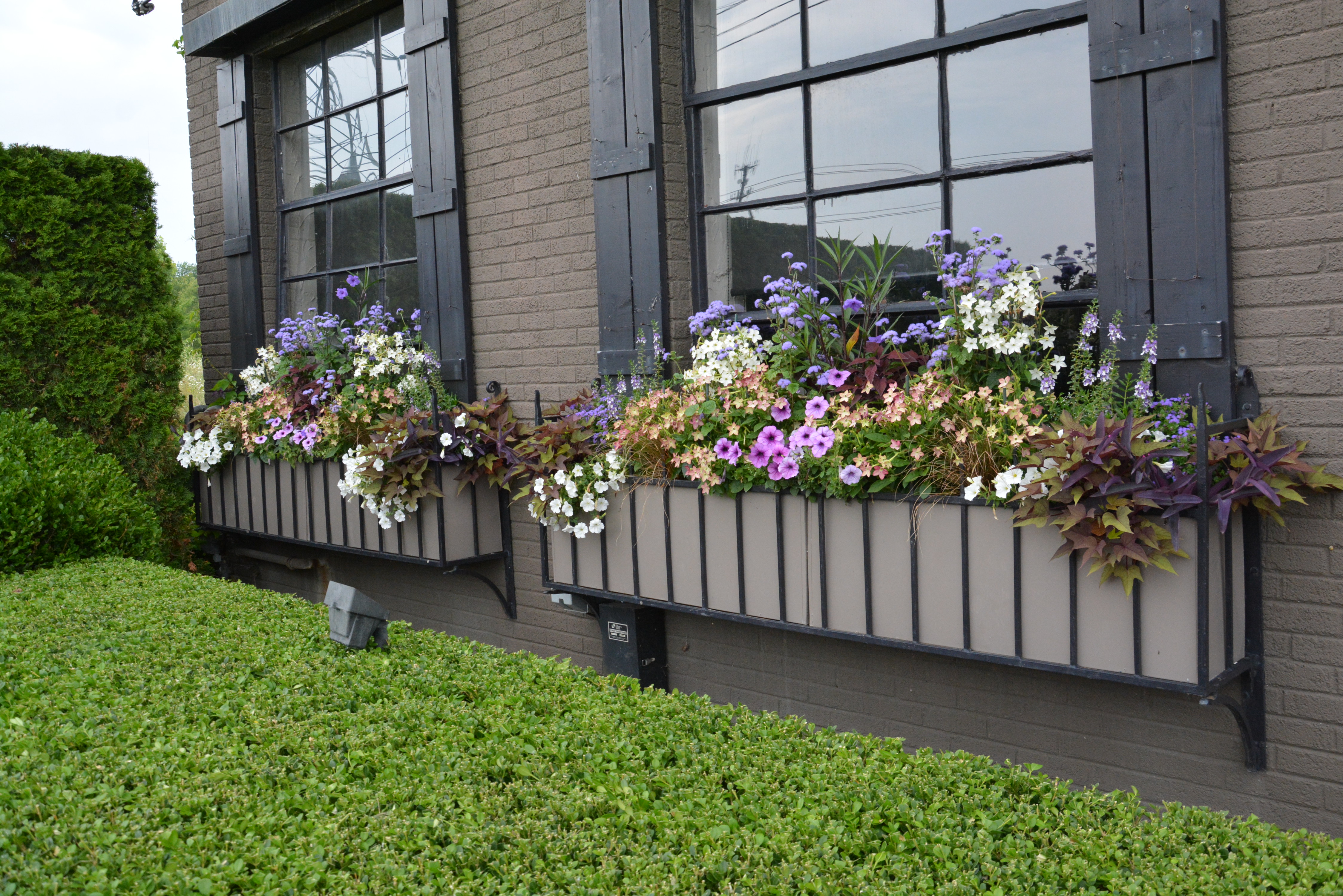
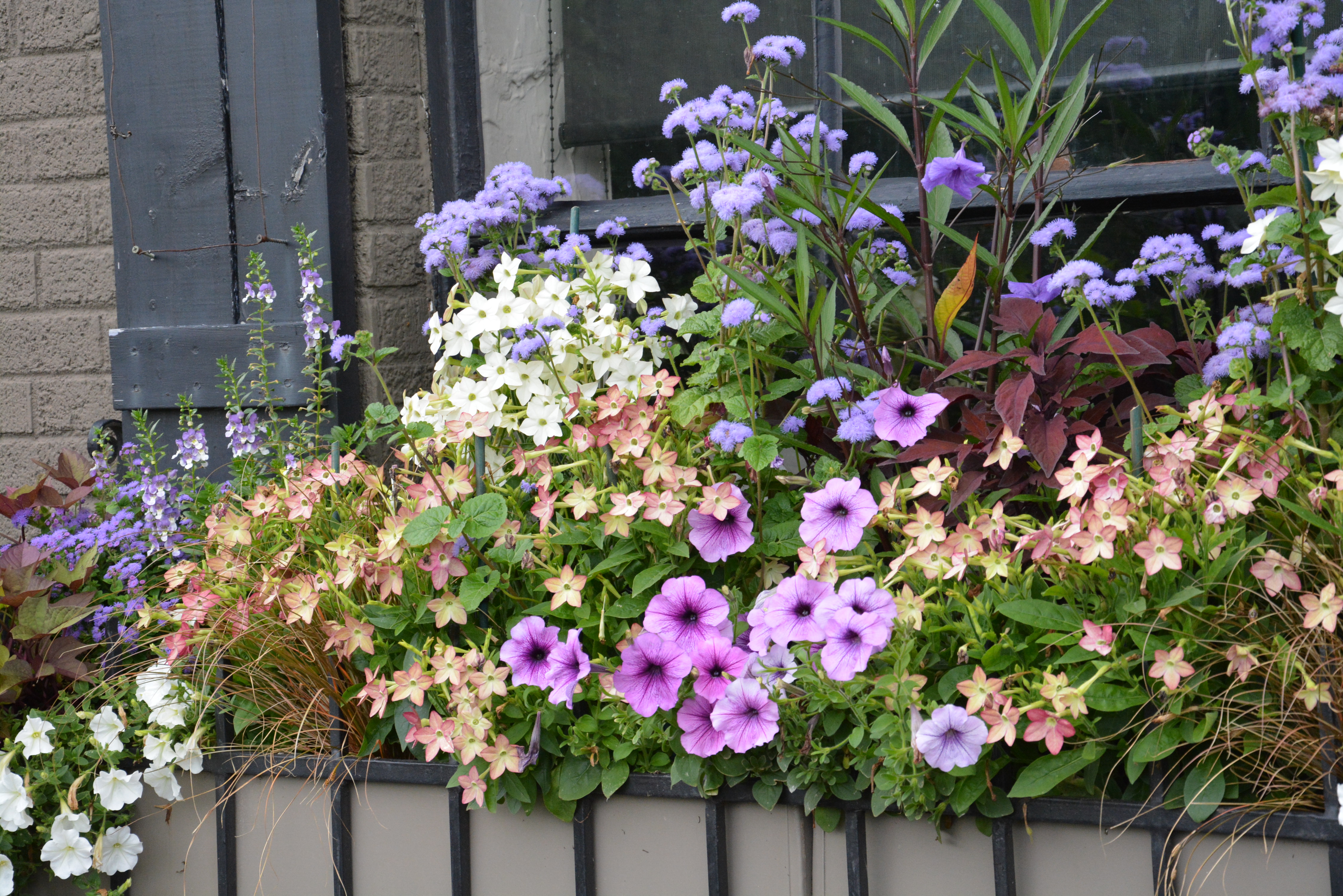
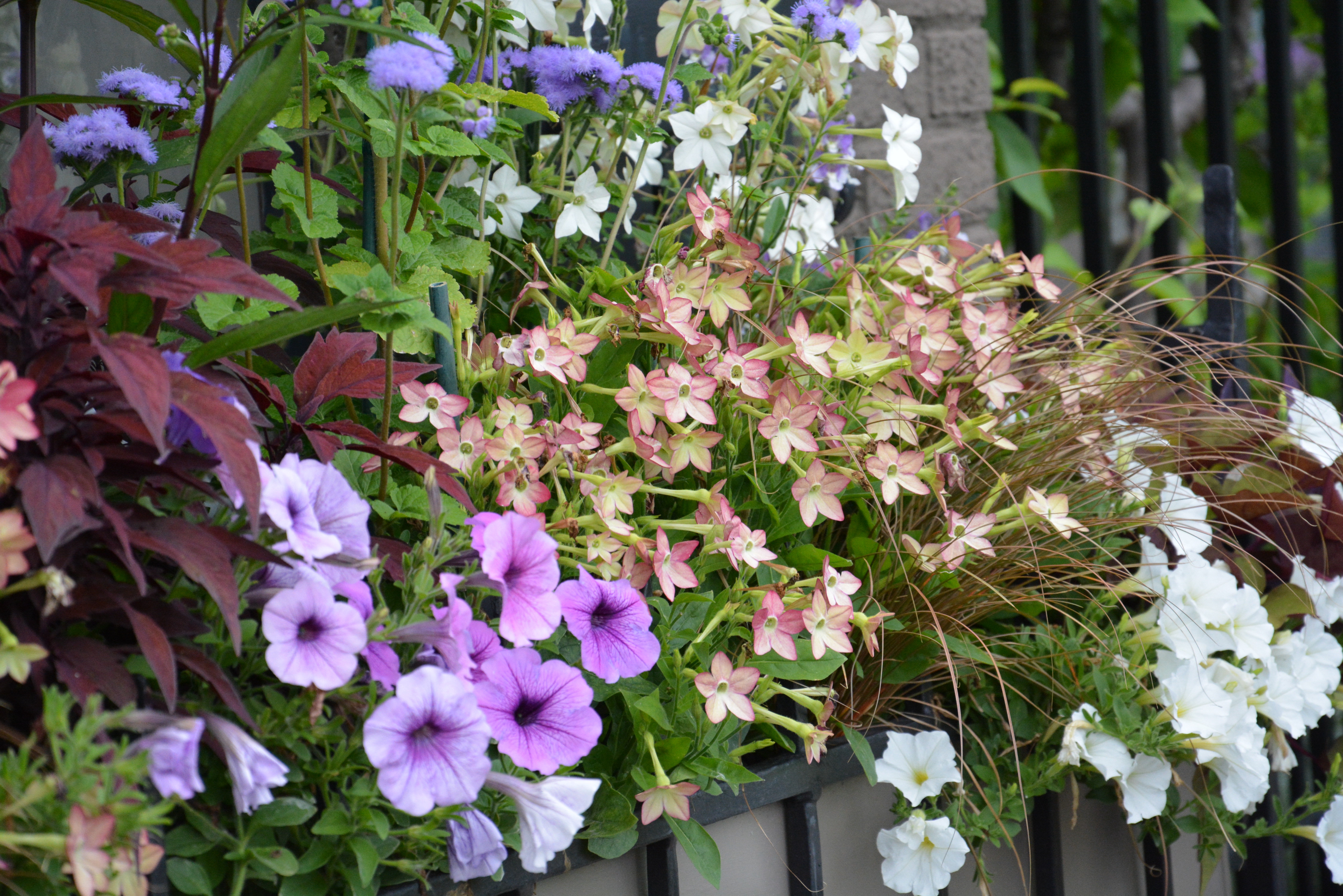
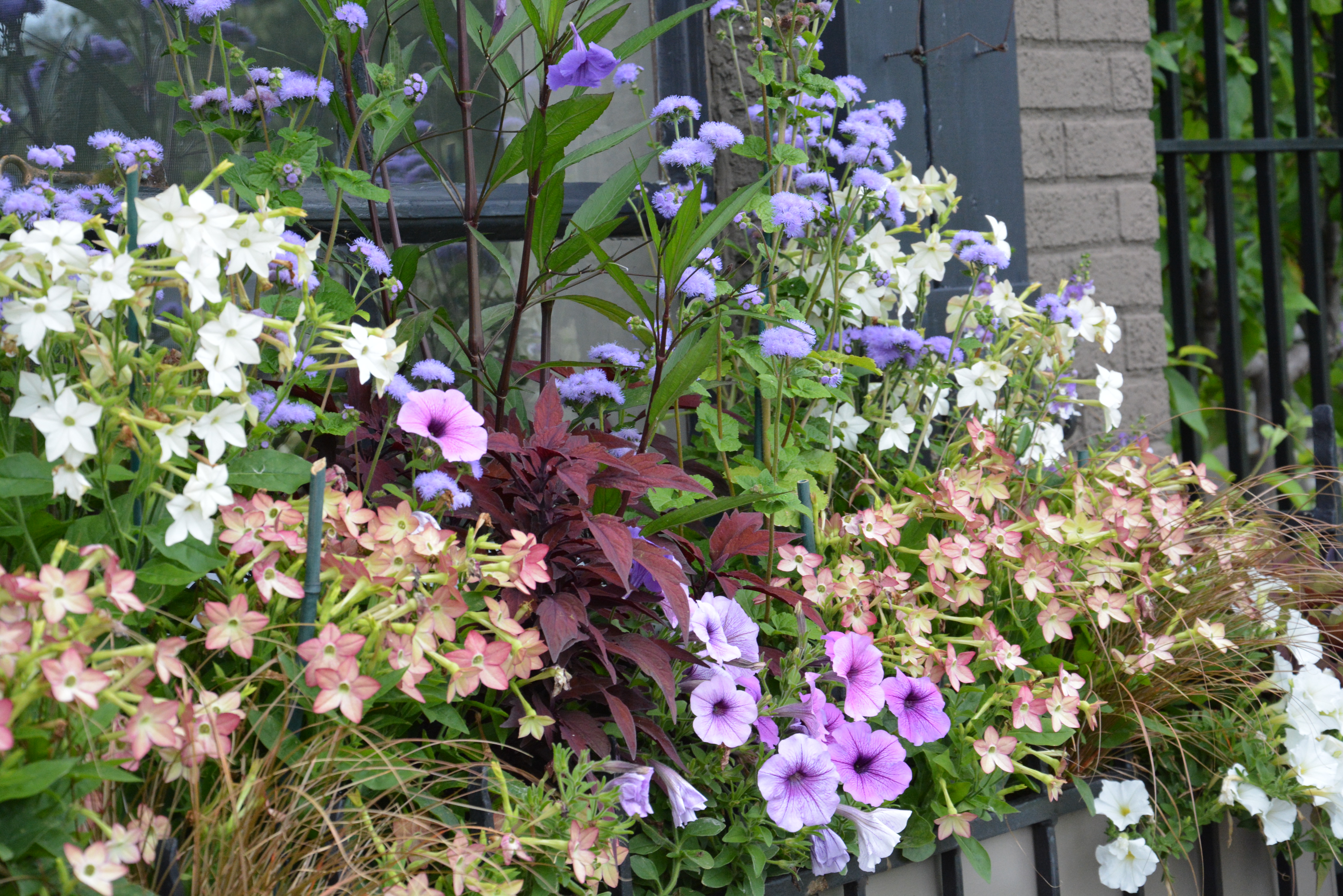
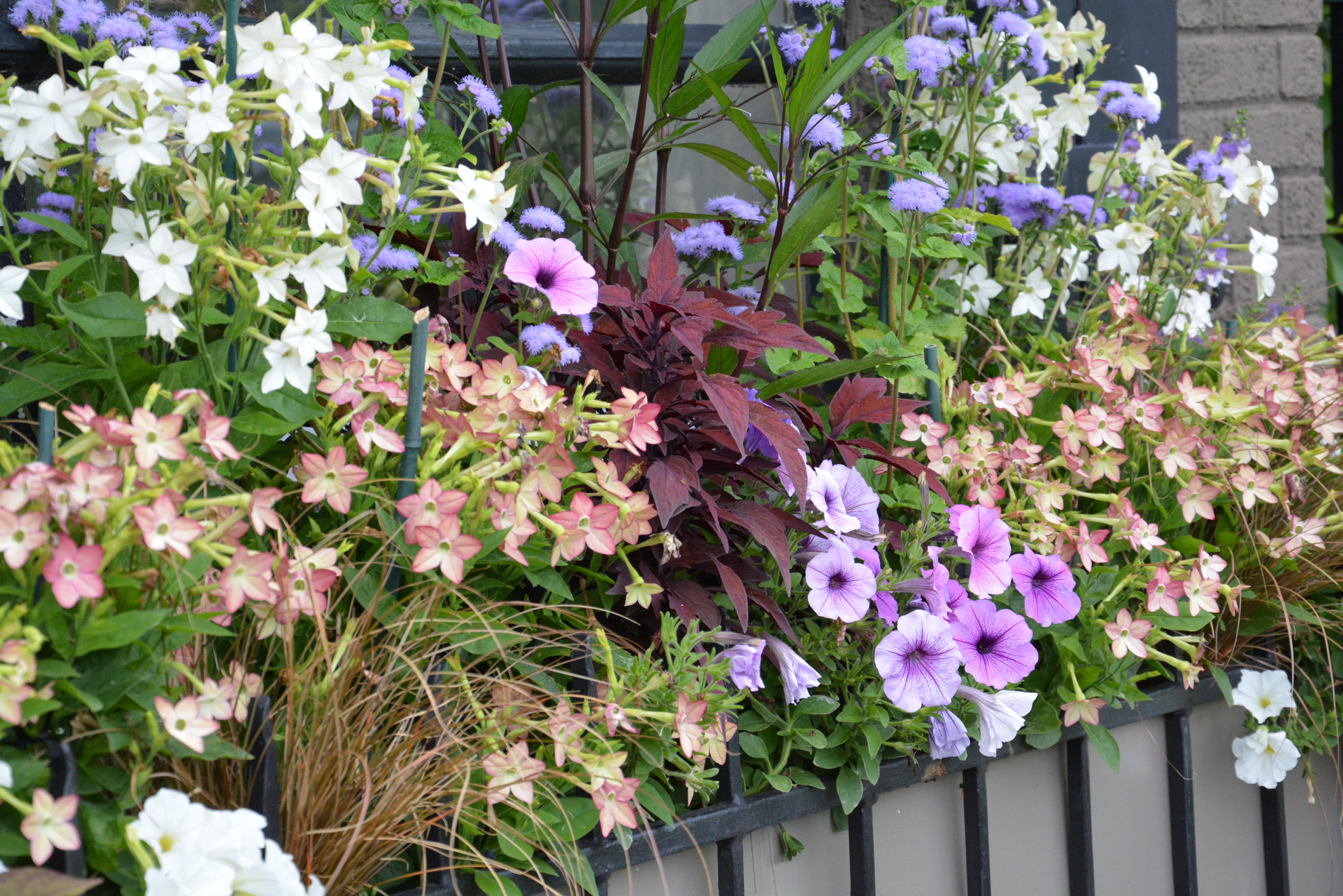
One can access an seemingly limitless amount of information with a computer or a smart phone.  Anyone can learn whatever it is that they truly want to learn.  As far as developing a personal sense of how to user color in containers-I did not study this in school.  I was interested enough to learn. That learning process, which is still ongoing, and still of great interest to me, was all about the doing.  Plenty of color combinations did not work out so well. But their is as much to learn from those combinations that do not work out, as there is from those that do.

July 14 2014 (14)
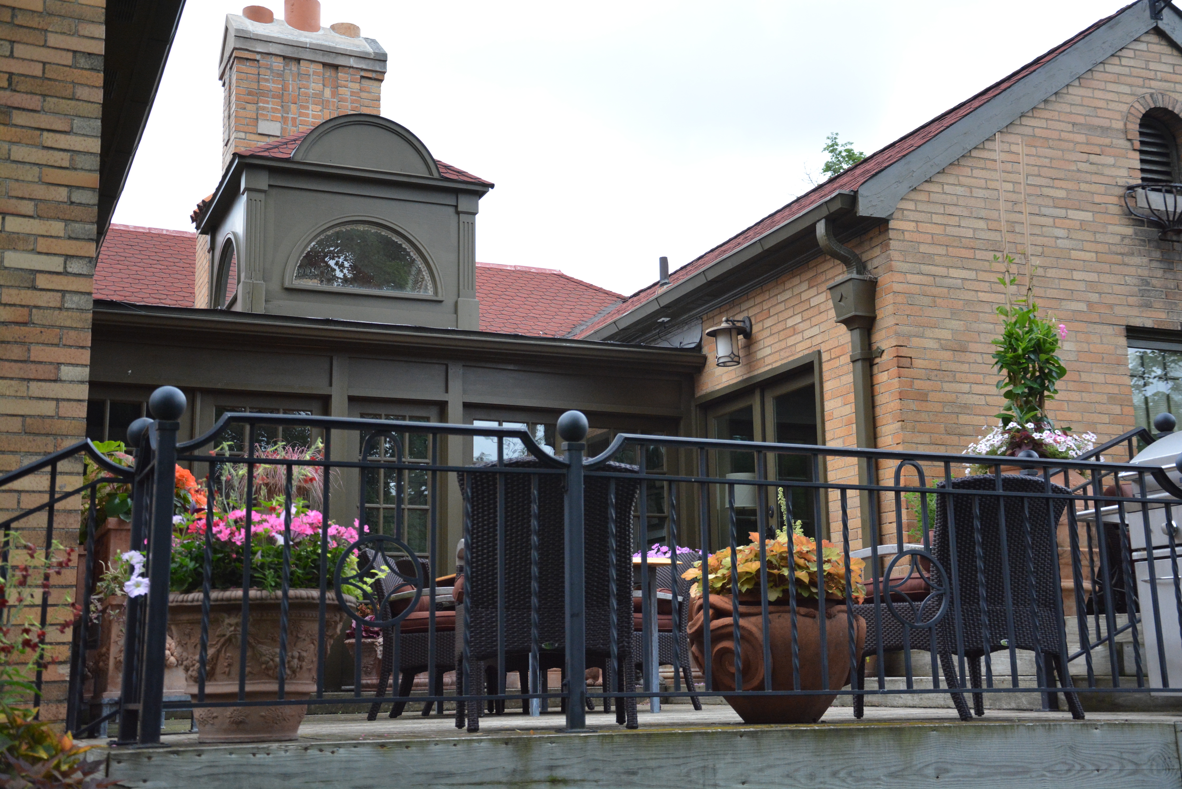
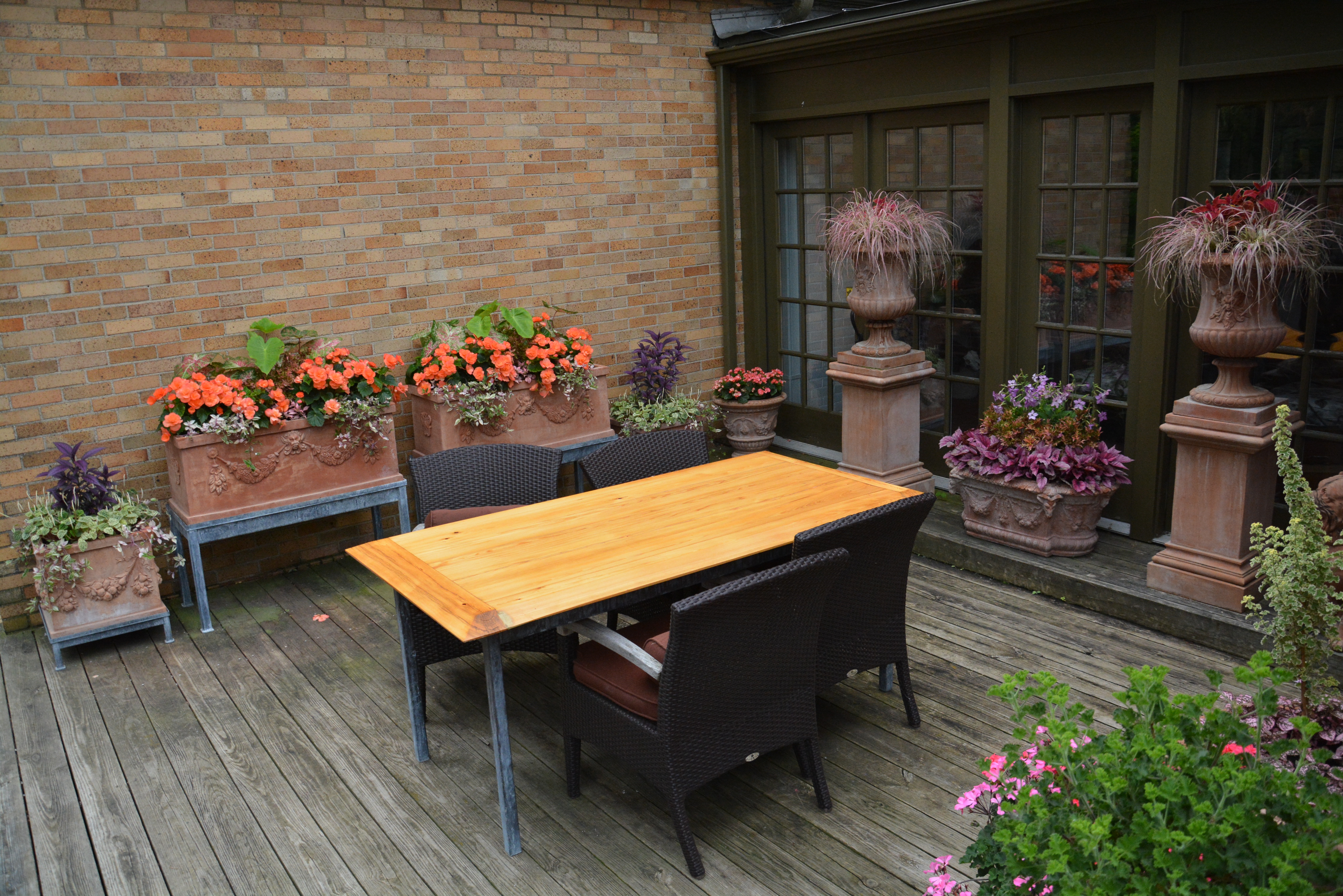
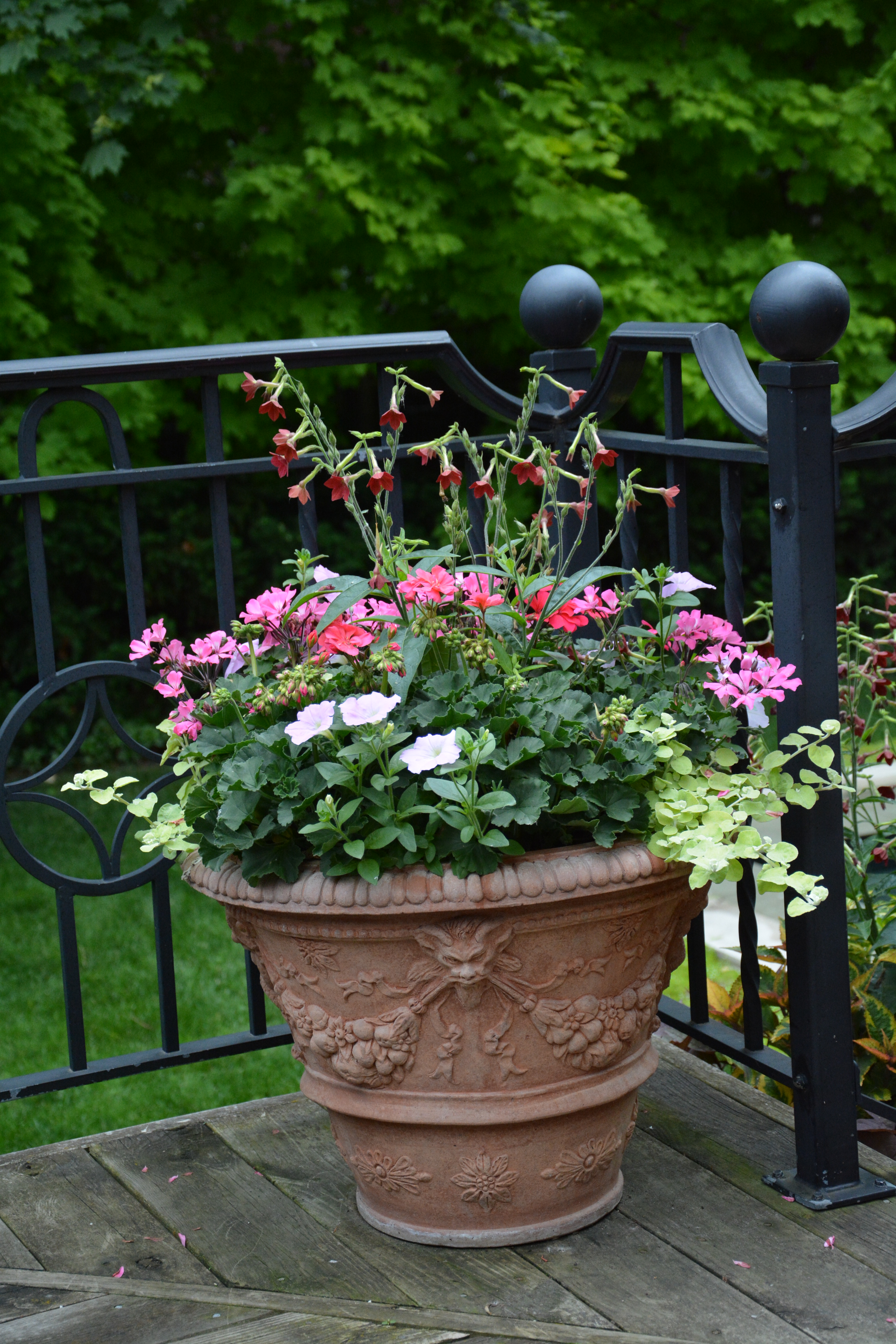
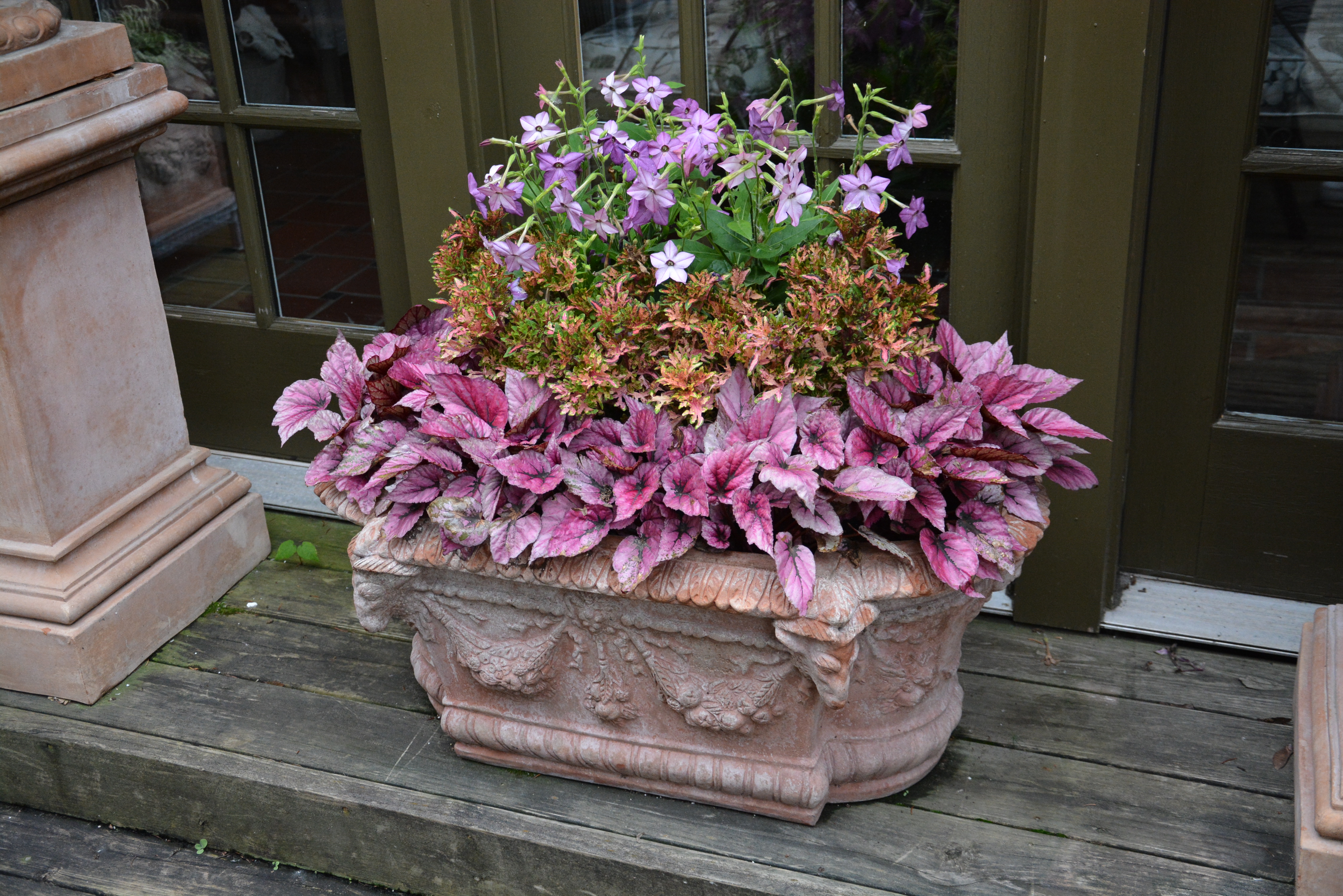
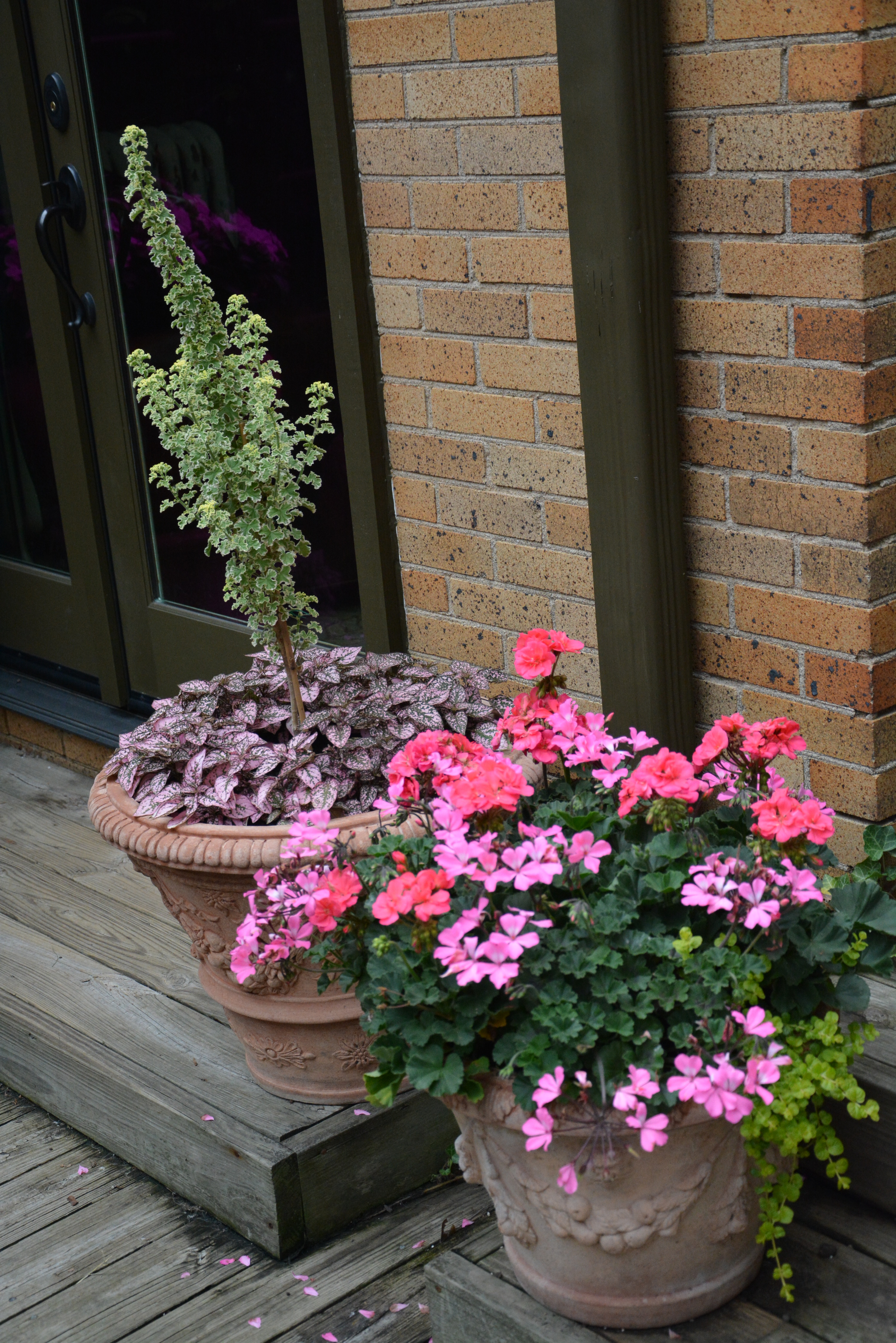
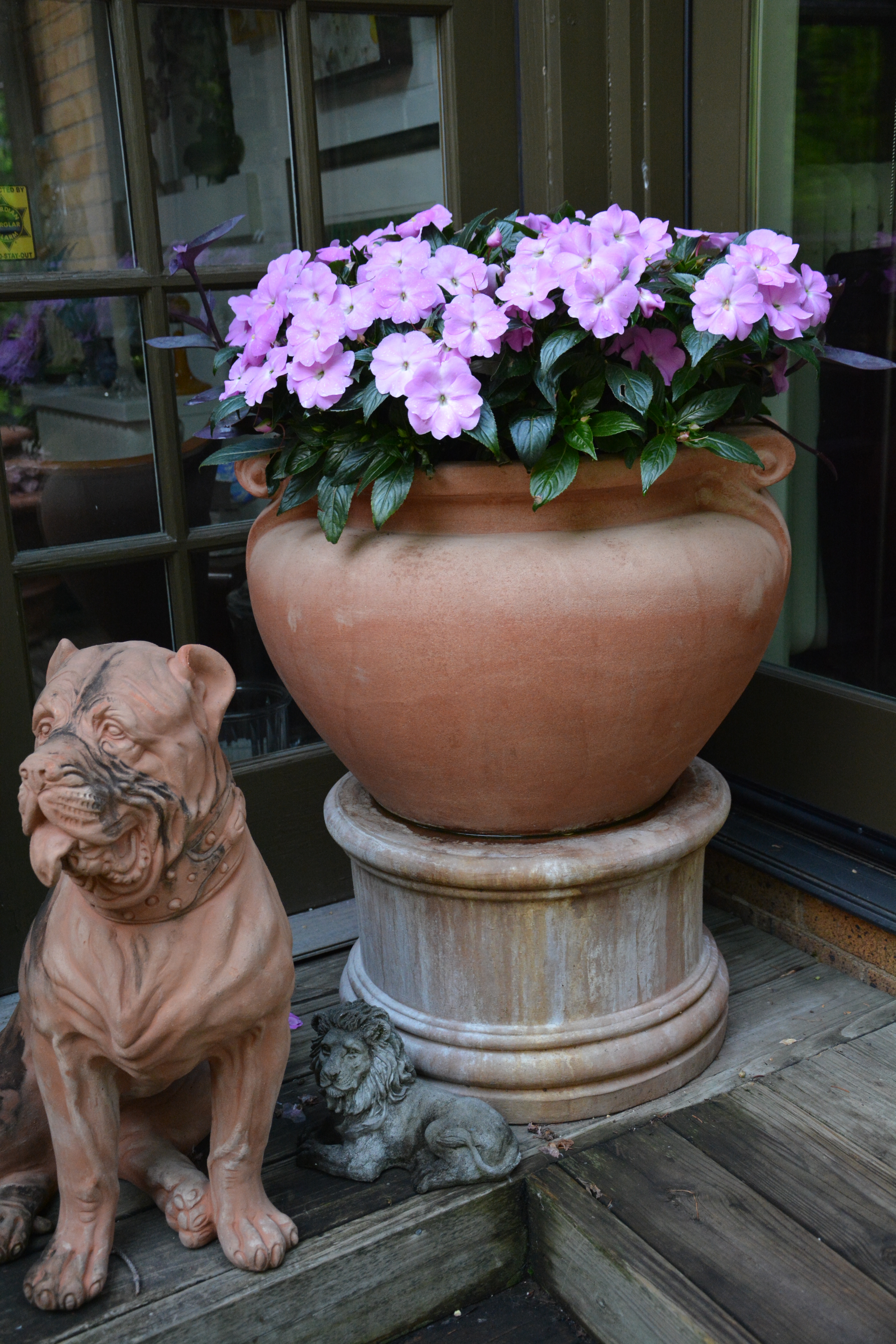
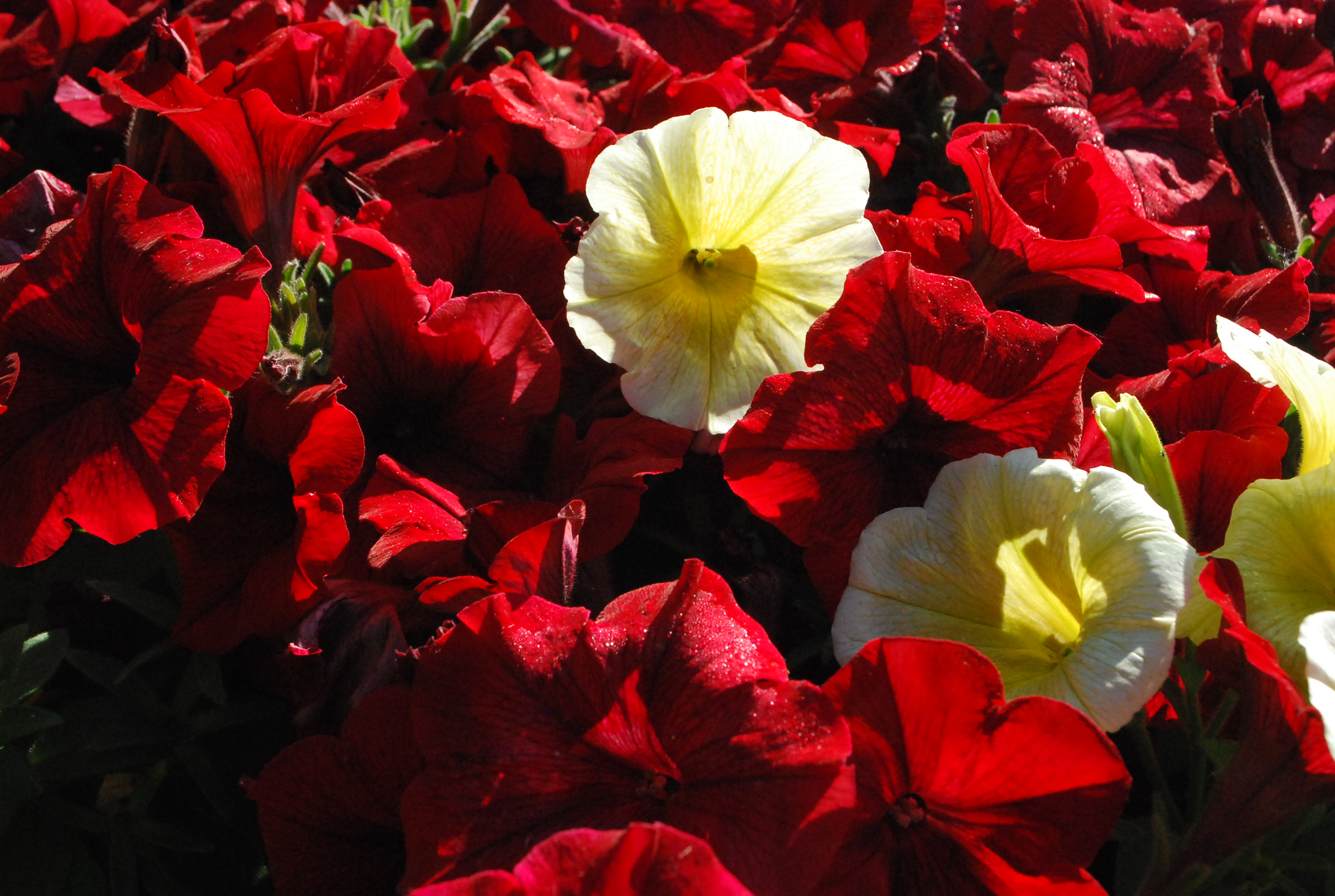
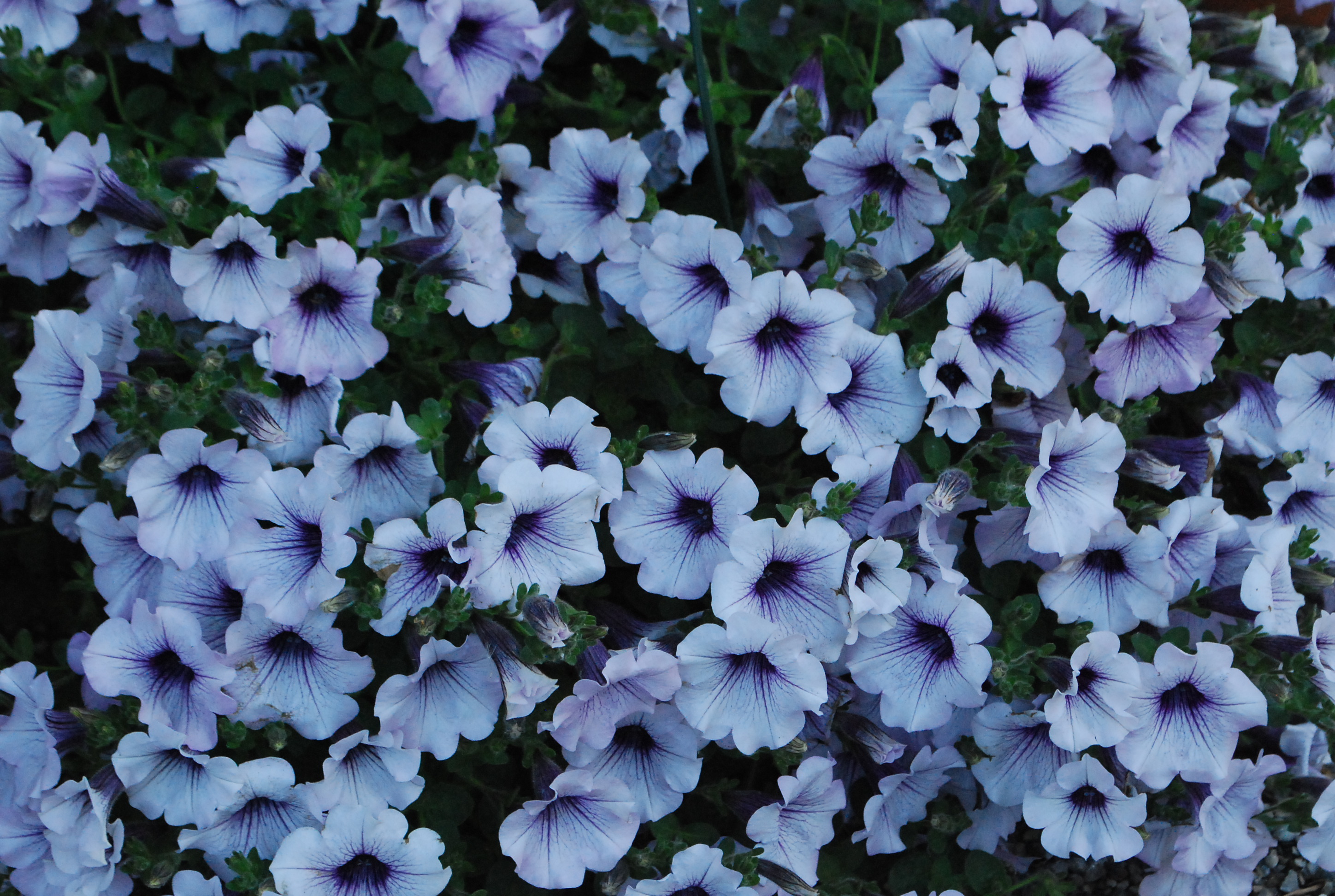
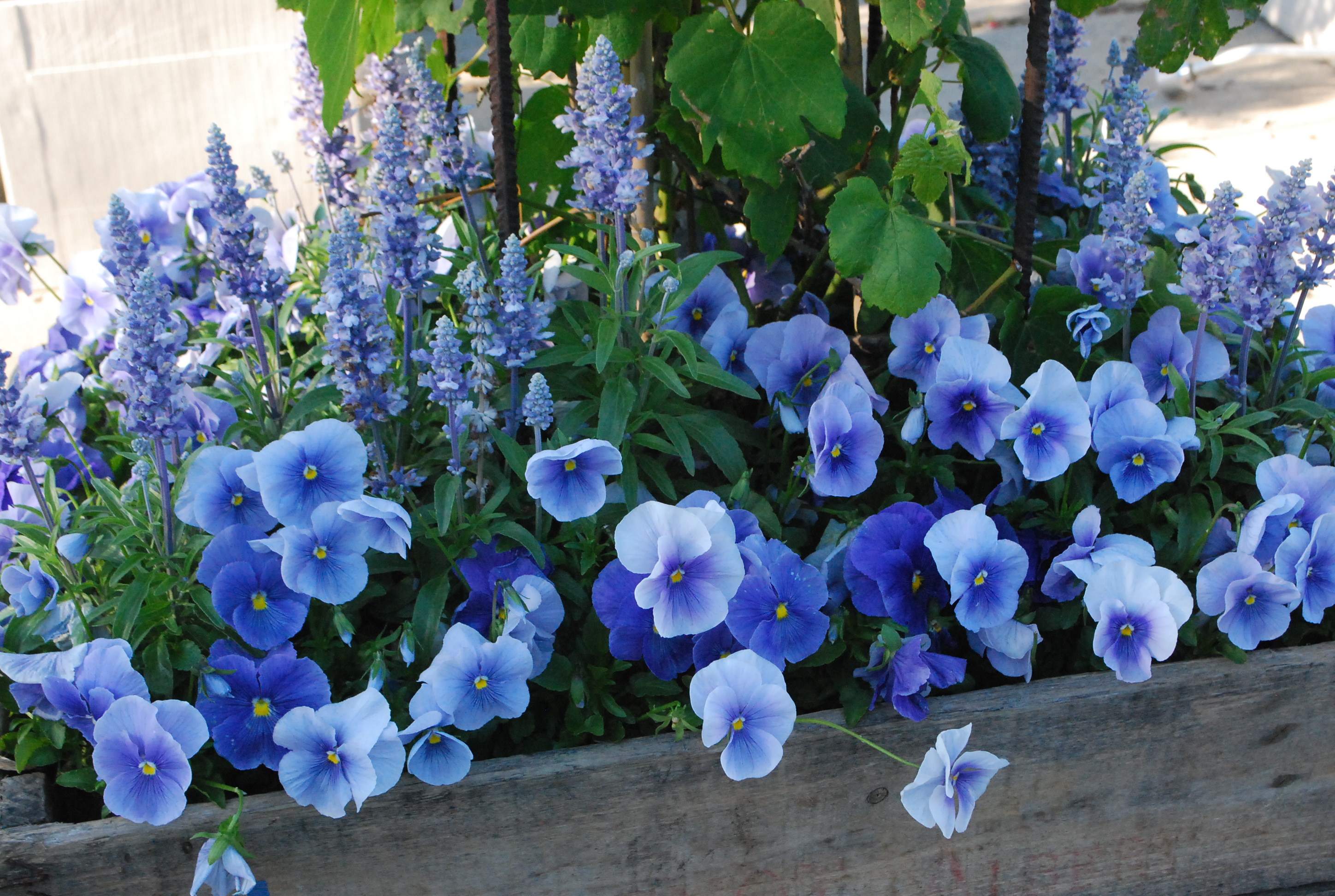
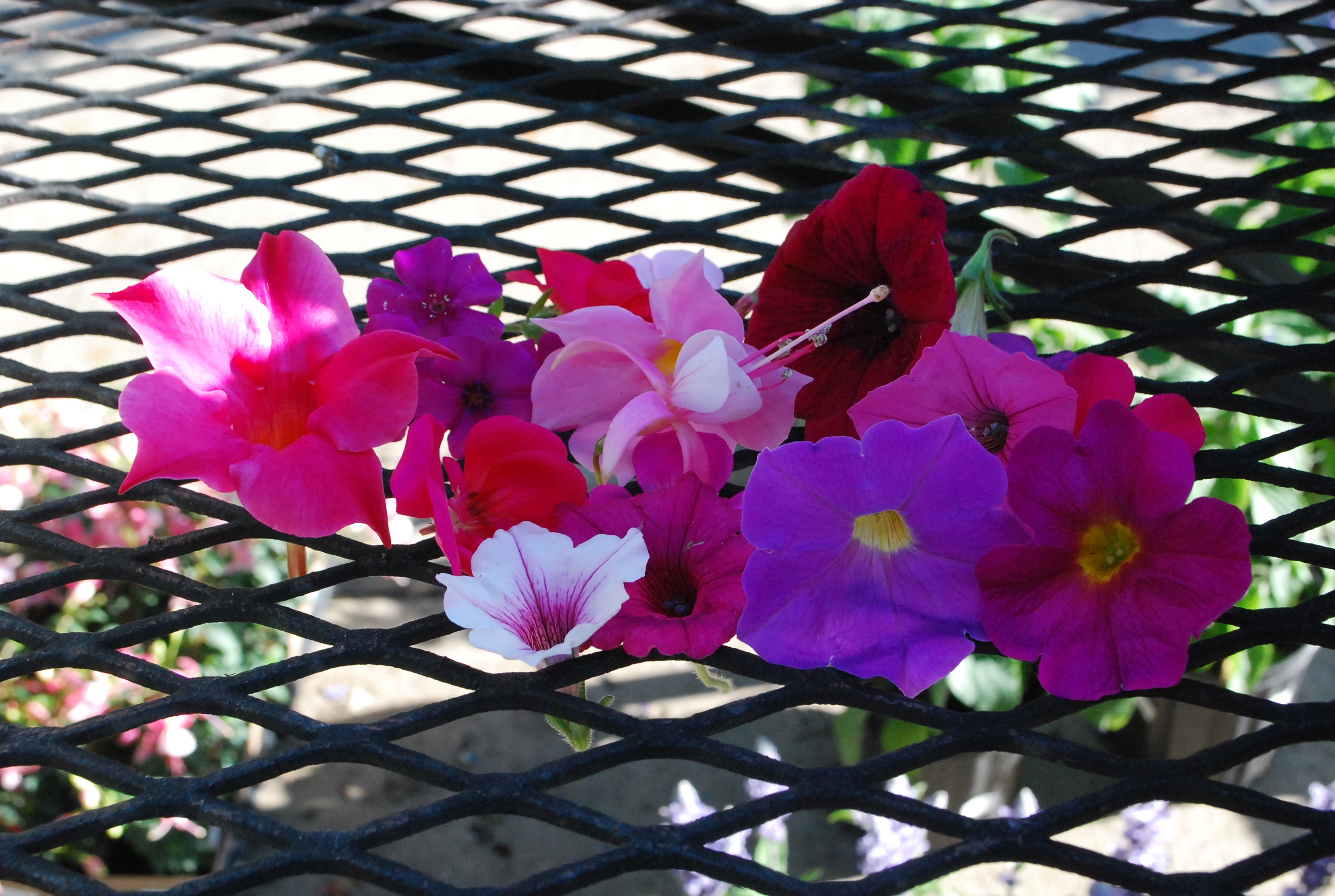
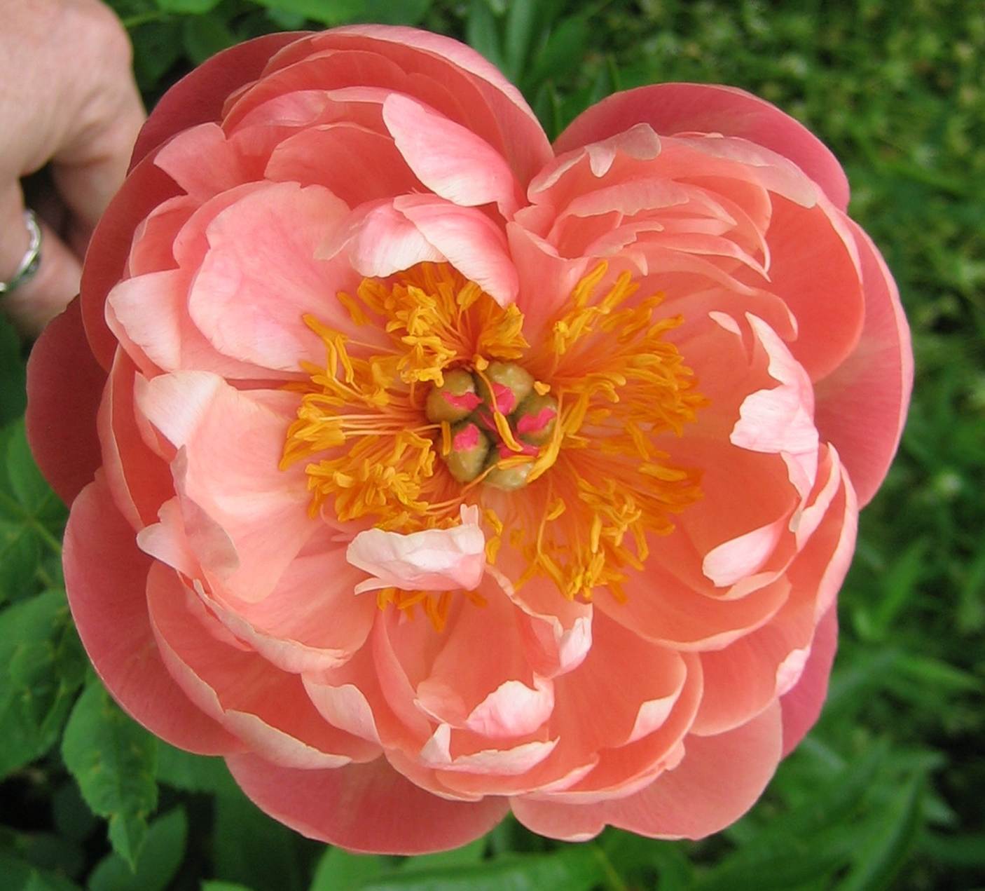
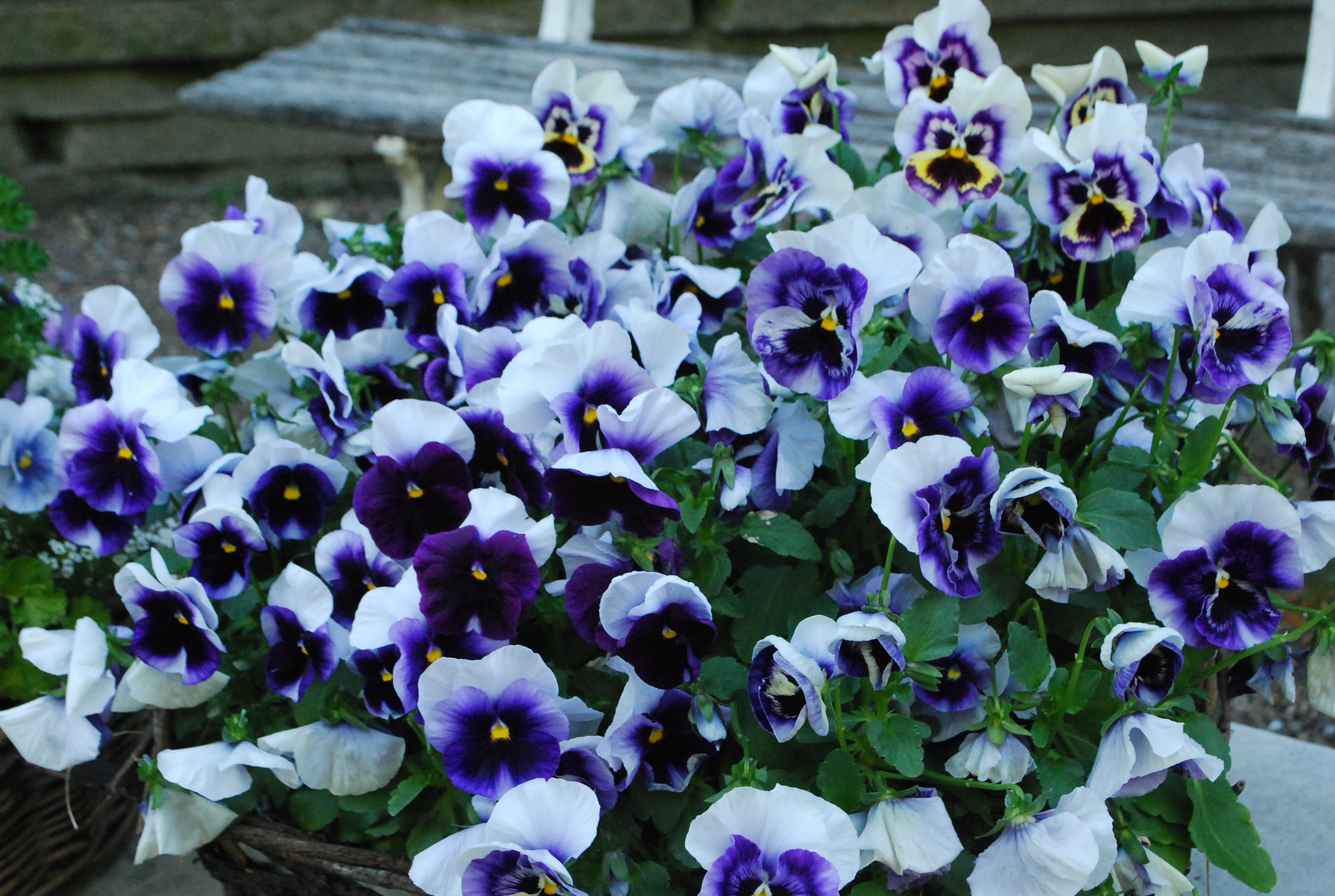
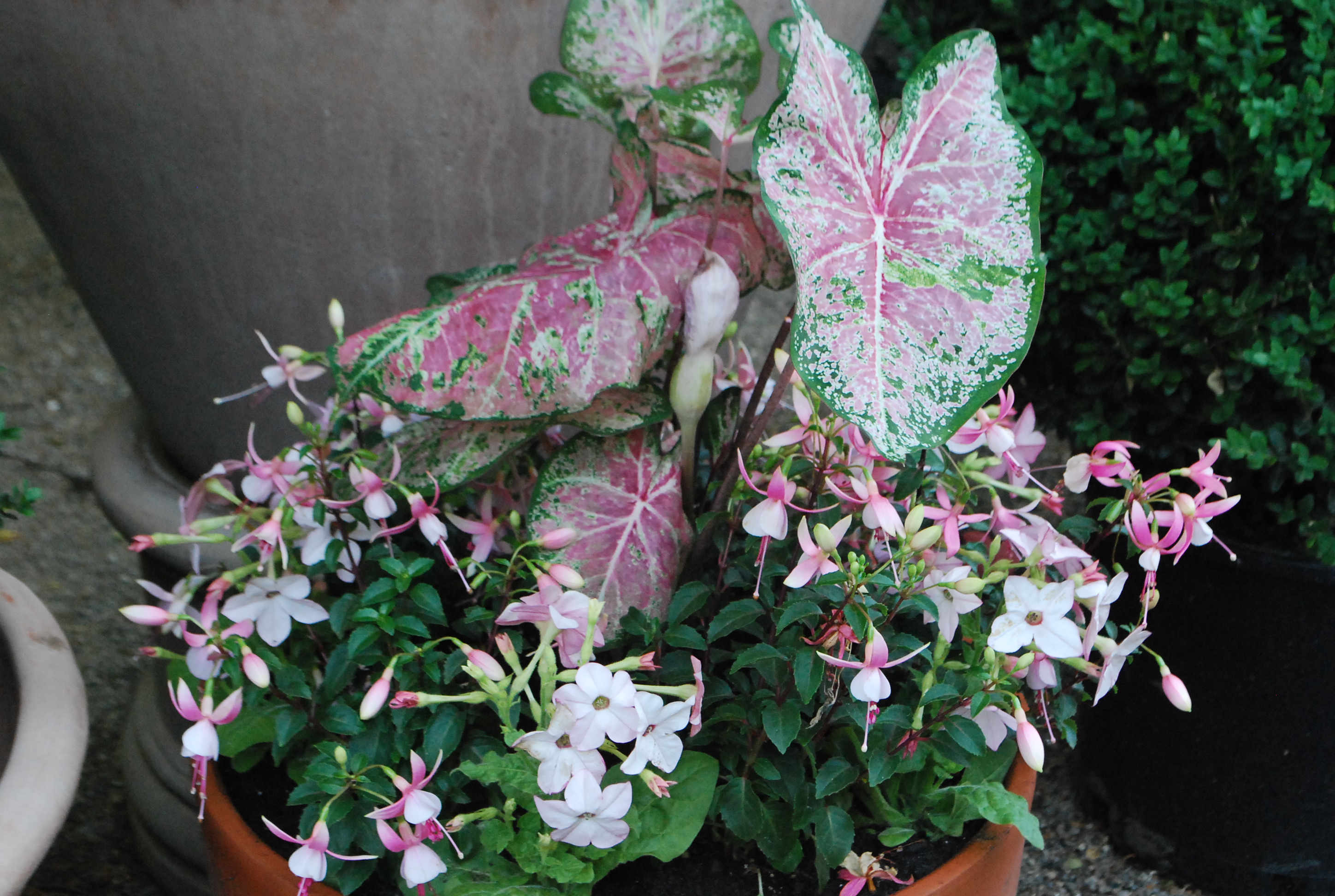
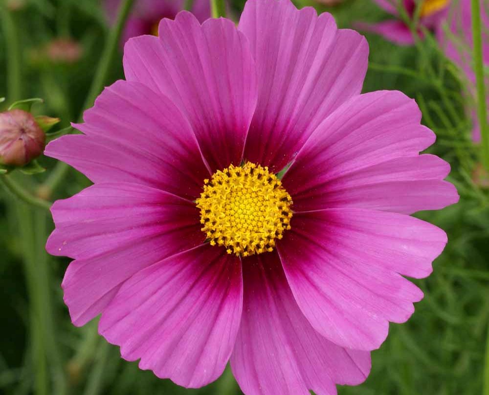
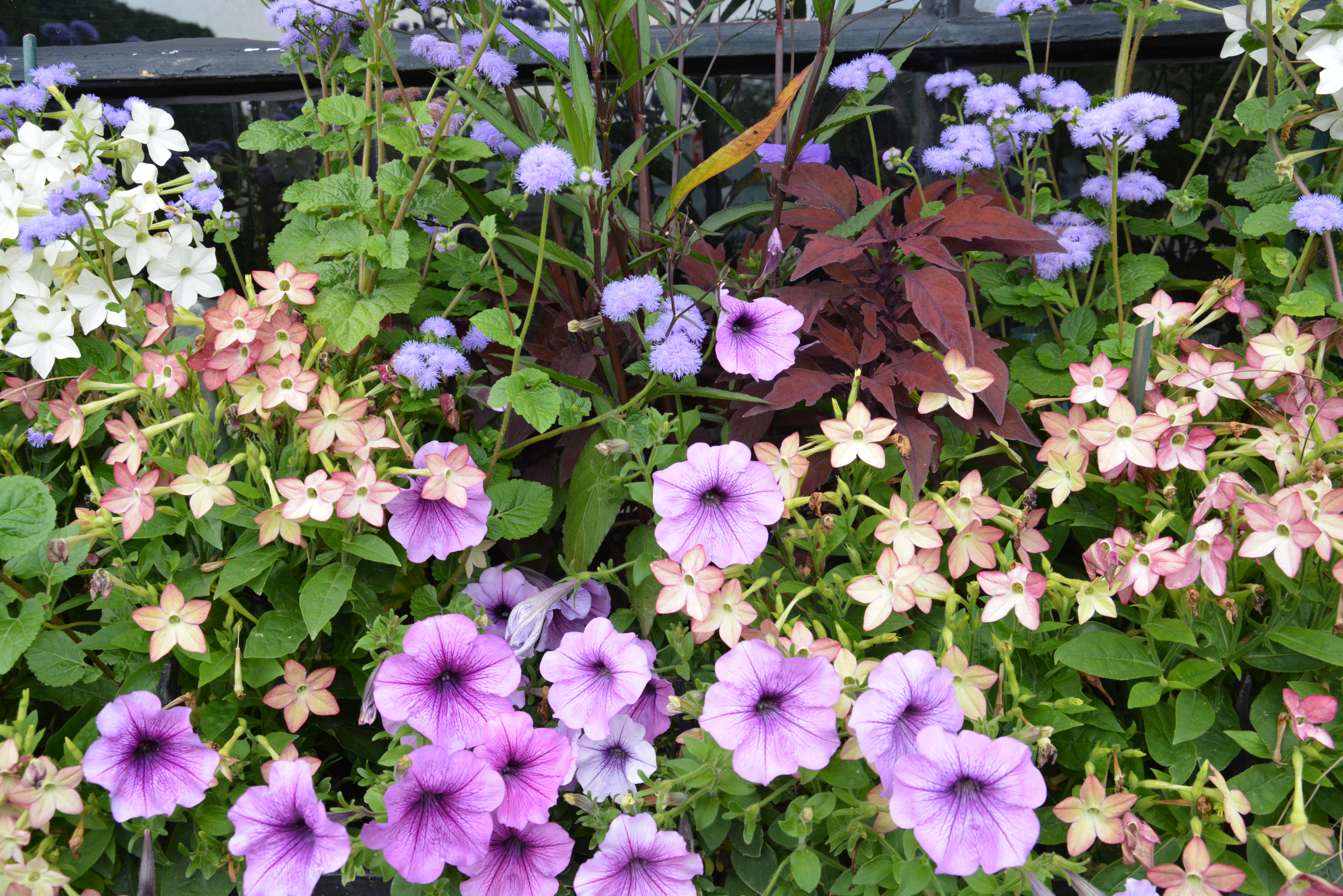
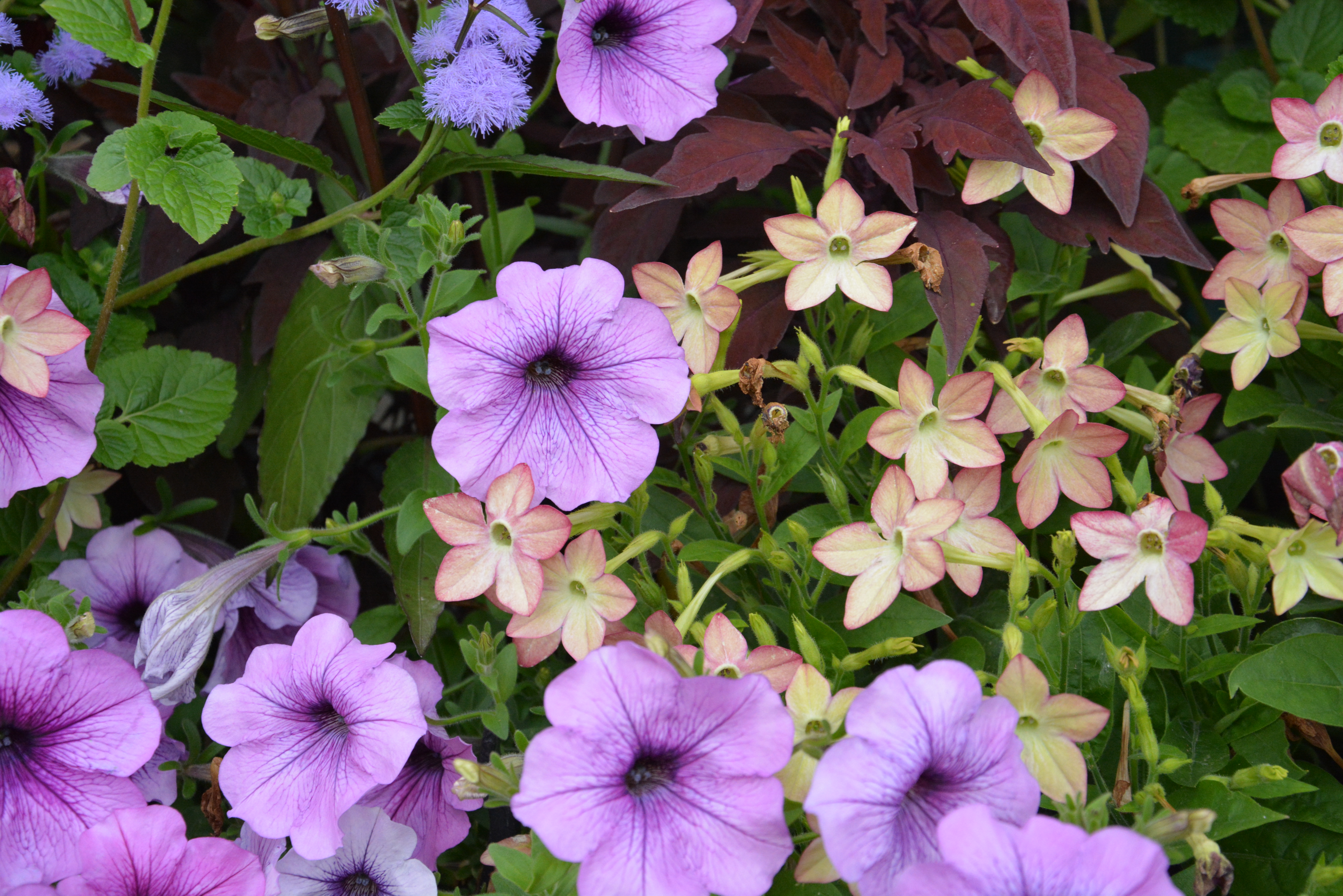
How people perceive color is very personal.  What appeals to my eye may not appeal to yours.  But that is not the point. Anything you see that interests or intrigues you may encourage you enough to learn what you need to know to express your own ideas. To understand what color relationships appeal to you as a gardener is all the fun of it.

July 14 2014 (15)Mr. Ito’s talk was very interesting.  Want to watch it for yourself?     http://www.wimp.com/wantinnovate/

The Deck Pots

June 25 2014 (1)Every year I think I will be able to finish planting annual containers for clients before the beginning of July.  Beginning of July? I do have clients who plant their pots for spring-they have no need of a summer planting until late June.  There are some clients who call the first week of June for pots.  It is late June until I can get to them.  I am hoping to finish all of my private clients this week, leaving a summer commercial installation for next week.  The container plantings I hope to have done by the 4th of July.   Given our cold and off putting spring, It is still taking all the time I have and then some to do the work I have booked. But no matter the work load, I make time to plant my pots at home.

June 25 2014 (3)I do plant lots of containers at home.  Coming home to planted pots is a good thing indeed.  Part of my end of the day routine is to tend to the watering  and maintenance of my pots. Just an hour ago I finished planting the last pot.  Given that I am planting into warm soil, that last pot should show signs of growth in just a few days. Looking at them and after them is relaxing for me.

June 25 2014 (4)I do plant my pots differently every year.  That is part of the challenge, and the anticipation of the summer season.  My trees are in the same place, doing the same thing, every year.  My perennials and roses and groundcover-I do not move these plants around, or change them regularly. Though I may waffle away the early spring planning for my containers, by the time that June comes, I have to commit.  I like that deadline.

June 25 2014 (5)I like that pressure. Too big a time frame gives me too much room to fret.  A short time frame encourages me to make decisions, and plant.  I am pleased with this year’s deck plantings.  Certain things influence my decisions. I have a 1930’s home with Arts and Crafts details that features a brick cladding that is a mix of yellow, cream, and pink.  White looks too chilly here. Silver foliage, as in gray, looks good here.  I will admit that after the consideration of scale and mass, I am very drawn to a discussion of color. Pink and orange, and all the versions thereof, may not interest you.  But those colors suit both me and my space.

June 25 2014 (11)I went on occasion far afield from a pink and orange scheme. The Persian Shield in my Italian terra cotta squares faced down with variegated pepperomia and variegated tradescantia seemed appropriate to the color of the brick, and the color of the Italian terra cotta pots.  I had no problem introducing some dark purple to my scheme.June 25 2014 (7)The pennisetum whose name I cannot remember,  and the orange coleus works with the color and the design of this pot.  I did entertain many other plantings for these terra cotta urns.  Pictured above-my decision. No one else has to be pleased about this decision but me.  That is half the fun of it.  I like this messy head of hair in contrast to the formal and classical style of the urn.  Once the coleus gets to growing, the look will change.

June 25 2014 (8)My terra cotta pots from Mital have  loads of detail.  I try to plant them with an eye to that detail. I try even harder to not to over think it.  I am a big fan of graceful. All the plants in this pot are quite ordinary-petunias, geraniums, lime licorice.  The terra cotta nicotiana is new to me-I like that brick orange color.

June 25 2014 (6)Pink and orange-I will admit my choices for my containers this summer were much about lively color.  The nicotiana “Blue Ice” is an interesting color variation I had not seen before.  I have planted this oval pot all green, with green nicotiana, for many years.  This year is different.

June 25 2014 (10)As for what I have planted in my deck pots this year, I like the relationships generated by color.  Not quite so obvious are my sun issues.  This space does not sit due east.  It sits southeast.  This particular spot gets incredibly hot and sunny for about 6 hours a day.  The brick, once it gets really hot, radiates more heat.  I have to pick plants that are happy in this environment.

June 24 2014 (42)This pot full of orchid pink new guinea impatiens looks swell.  Like the geraniums in the previous picture, this impatiens likes the heat, and a good amount of sun.  The pot is large enough that I am able to keep the soil at the proper moisture level.  Dry New Guineas will flop over dramatically.

June 25 2014 (9)The 1930’s English snake pot is a prized pot.  It does not need all that much in the way of dressing up.  The creme brulee heuchera leaves are big and simple, and compliment the shape of the pot. I can see over it into the garden beyond. The pot has a setting.

June 25 2014 (2)At the bottom of the stairs off the deck, one of the first boxes that my company Branch ever produced. I love this box every bit as much as my Italian terra cotta pots.  The color scheme is a mix of yellow, orange and brown. There is a lot going on, texture and color wise, as the pot sits in front of a big section of brick.

I would share anything I could about my process for planting containers with any gardener.  Why wouldn’t I?  That said, I did not think much about my process until the pots were done.  My container design has everything to do with the place- the architecture of that place.  Color.  Scale and proportion. Rhythm.  Texture, mass and line.  And of course, the maintenance. What can I plant that will be a pleasure to maintain?


A Few Thoughts About Color


red-nicotiana.jpg

Given that there are 3 primary colors, and three secondary colors, and infinite possible combinations and permutations of those 6 colors, makes the topic of color a big one.  Have you ever tried to pick a color for a room from 10,00 paint chips?  I will admit I buy a lot of quarts to try before I commit to gallons of a color.  Understanding and working with color is hard.  Annual and tropical plants provide a level and longevity of color I do not get from my trees, shrubs and perennials.  It could very well be that the reason that I so love container plantings is that they enable me to explore the element of color-over and over again. The relationship of one color to another, or a color scheme, is of interest to me as a garden designer.  Planting annuals is the best way to try a color scheme on-before you commit to it in the landscape.  Explaining why certain color combinations are attractive, interesting is not so easy.  Pictures make things easier.  This dark red nicotiana pops when it is paired with a contrasting color, and when it is placed so the light shines through the petals.  This scheme-electrically charged by the rays of the sun.

phlox-and-violas.jpgExplaining why certain color combinations work, and why some schemes are attractive and interesting to my eye-not so easy.  My approach to color is very personal and intuitive.  I am just like every other gardener.  Some schemes seem right-others seem off putting.  But there are some observations I can make about color that might abet your choices.  This picture makes it clear that pale colors appear to come forward, while dark colors appear to recede.  The idea here?  If I have a mind to plant dark colored flowers, I plant pale colored flowers behind them.  A light background helps a dark color to read.

yellow-orange-and-white.jpgHot colors-as in red, yellow, orange, and hot pink, light up a shadier spot.  Fancy leaved geraniums contribute to a color composition via their leaves.  The Skies of Italy geranium has leaves of red, burgundy, green and yellow.  The color of the leaves of this geranium can help knit a color composition together.

farfugium.jpgShiny green is a very different green than matte green. The surface of a color can influence how that color reads.  A dining room painted in red high gloss lacquer is a much different dining room than one painted in matte wine red paint.  Color provokes emotional and associative reactions.  The reaction that matters?  yours.  Look at  a lot of color combinations before you commit.  This makes good design sense. Emerald green is a combination of yellow and blue,  fairly evenly matched.  How does this emerald green look with the colors of the flowers you have chosen?  Choose your greens!

red-and-yellow.jpgRed can be dark and moody in the garden.  It can be royally rich-when paired with yellow.  Pale yellow with dark red is not quite the brass band that fire engine red and gold yellow makes.  Pasiring red and yellow has many possible interpretations.  A variation on a traditional color theme can be very striking.  My advice-if you are developing a color scheme, pick 3 colors.  Two colors is a story with not enough detail.  The third color facilitates the relationship between the first two.

a-shade-of-white.jpgHow many shades of white are there?  White white.  cream white.  blue white. rosy white.  Greenish white.  Even an all white color scheme asks for some attention to be paid to the particular shade of white that works.  Some white flowers have yellow centers.  This would suggest that a yellow green foliage would compliment that shade of white.  Blue-white flowers, such as this silverberry petunia-yellow flowers would contrast.  Dark purple flowers would harmonize.

millet-jester.jpgHarmonious colors tend to be quieter.  More serene.  Contrasting colors provide visual excitement.  Lime green foliage always looks fresh and spring like.  Red with lime-very pleasing.  Lime with white-fresh.  Lime and orange-provocative.  Lime and purple-don’t you like this?  Lime green in the sun?  oo la la.  Lime green in the shade-the lights are on in this garden.  Lime green and pink-so Coco Chanel or Lily Pulitzer.  Pale lime and pale pink-fragile, ephemeral-breathtaking.  Wildly lime-a light fantastic version of green.

the-blues.jpgI will admit I like planting containers with plants all of the same tone and color.  The exploration of a single color in a lot of different plants makes a strong visual statement.  It focuses the eye on texture-another important design element.   If you are a big fan of texture, stay steady as you go with the color.  Contrast the texture.

pink.jpgAre you a fan of pink?  Which pink?   Carmine pink.  blue pink.  coral pink?  pale pink?  Dark carmine pink?  Blue pink?  Not all pink flowers harmonize.  If you are hoping to stir things up, plant a variety of pinks, and let the chips fall where they may. More interested in a strong and harmonious statement about a blue pink-you eye will tell you when a yellow based pink is gumming up the works.  Put lots of plants in your cart.  Put back those plant whose flowers threaten to dilute your idea.  As for right and wrong-that applies only to moral questions.  This is gardening.  Enjoy it.  Just take the time to sort through the color relationships.

coral charm peonyI have had this photograph of a Coral Charm peony on my computer for a long time-I do not know the photographer. If this is your photograph, please write me. I am posting it, as the color of this peony is so striking and unique, that it surely would inspire a color scheme-a spring color scheme-that would pay tribute to such an extraordinary color.

light-and-dark.jpgLight and dark colors-the contrast is lively.

related-colors.jpgPale pinks with blue green foliage-a great scheme for semi shady places.

carmine.jpgThe carmine pink of this cosmos flower is all the more visually dramatic-given the yellow center, and the burgundy red corolla.  The contrast of the yellow and red center makes that carmine pink shine.

orange.jpgOn the left in this picture-an orange begonia heavy on the yellow.  On the right, an orange tipping towards blue.  There is orange.  There is another version of orange.

bok-choy.jpgThe blue green foliage of the bok choy clearly compliments the color of the blue violas..  The addition of white makes the scheme all the more crisp and fresh.  Cool and clean-this scheme.

purple.jpgLavender and purple-you have choices.  The sun will make its own statement about your choices.  Light and dark purple both colors can be the star of the show.  Both colors can be a supporting cast that makes your central idea shine.  Purple is a color that fits into a lot of different color schemes.

sunny-yellow.jpg

Sunny yellow-there is nothing quite like it.  Yellow is the color of the light that every garden thrives in.  Have a place for something yellow?  I recommend this level of garden cheer.  Your idea bout color is a good idea.  Another good idea-follow through on your sense of color.  Make the colors work just the way you want them to.

Scheming

This is the time of year I start planting annual plants for clients.  I am hoping we are at the tail end of the third rainiest spring on record; I planted all week last week in the cold rain.  It is a good thing I really like to do this; it kept my mind off my wet feet.  I have other things to think about besides being wet-like a color scheme, for instance.  I just planted one small garden at the shop, in illustration of the idea of scheming.  Scheming can refer to some underhanded activity-I prefer to think of it as an orderly way of working, or a way of working where all the pieces fit together in a satisfying way.  The concept of a color scheme for a garden is easy to understand.  Putting plants together where all of the respective colors workwell together-not always so easy.  

Color schemes that feature contrast will be lively.  The wild card of course is that every flower comes with a plant that has leaf color. The heliotrope pictured above has intensely purple flowers.  The leaf color is a medium green.  Flower color may be your primary interest-but there is a green scheme that needs attention too.  The lime licorice in this pot is a green that contrasts well with both the flowers and the leaves of heliotrope.   

Both the lime and variegated licorice are invaluable in planning a color scheme.  This lime green will read yellow, when planted next to yellow flowers.  It will read very lime green when paired with red flowers.  Red geraniums and lime licorice is a color combination that reinvents the red geranium.

This lantana topiary has several shades of yellow in the flowers.  Both lemon yellow and deep yellow are represented.  Why did I choose variegated licorice in this pot?  That more blue green leaf relates better to the deep bluey-green of the lantana foliage.  The alyssum chosen here is called “citron”.  In a composition featuring yellow, it reads cream yellow.   All of the greens featured here are related.  All of the yellows relate.  

The third element in the lantana pot is a yellow potunia.  Potunias are a series of petunias developed  for a compact habit of growth, making them perfect for a container planting that does not necessarily ask for a trailing element. The lantana pot has a piecrust rim and band at the top-I would not want to completely cover that interesting detail.  The pot is not that large-I would not want it to be overwhelmed by the planting.  But the best part are the two tone yellow flowers-a perfect element for a yellow and green scheme so strongly suggested by the lantana standard.  

Persian Queen geraniums have brilliantly lime green leaves; I value this about them more than their hot pink flowers.  The lavender trailing verbena is a cool and striking foil for both the Geranium, and the scotch moss (sagina subulata aurea). Purple and lime green is a great place to start scheming. 

Variations on a color create visual interest.  Heliotrope can vary from deep dark purple, to lavender.  Sky Blue petunias are a very pale version of Royal Velvet petunias.  Yellow petunias with Sky Blue and  Royal Velvet petunias- a color scheme begins to tune up.  Add some white petunias for bright, and some lime licorice to the green scheme makes for a series of color relationships that create visual interest.

The scheme for this small anuual garden is as follows.  Lavender verbena bonariensis, lime and white nicotiana alata are my tall elements.  Mixes of three plants mix more evenly overall than mixes of 2 plants.  My mid level plant-bicolor angelonia-white and purple in the same flower.  Vanilla Butterfly marguerite is the pale cream yellow verson of the intense lemon yellow “Butterfly”.  Purple heliotrope and yellow potunias finish up that level.  On the border, white, sky blue/lavender and dark purple putunias mixed with lime licorice.  This color scheme-white/purple and lime, with a dash here and there of yellow.  If you think you see petunias and licorice planted from back to front between my tall flowers, you are right.  The big growing annuals take a long time to come on.  I like a bed of flowers that engages my eye from the start as well as the finish.  We’ll see if my scheming amounts to something good looking; I have my fingers crossed.  All is in the hands of the plants, and how they grow, now.