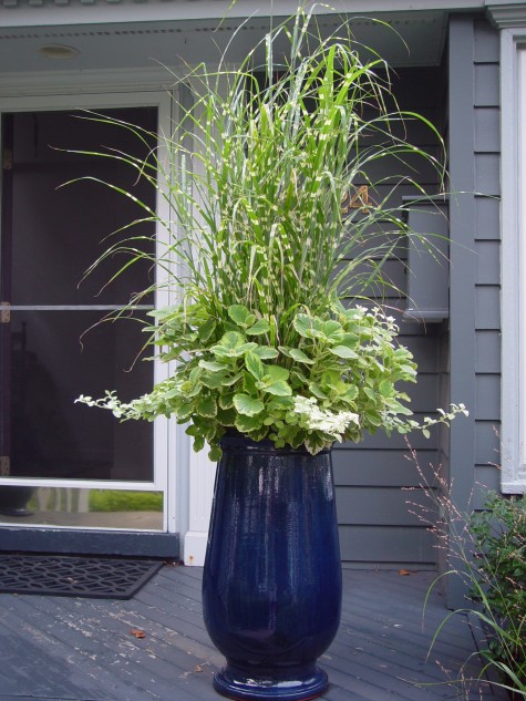
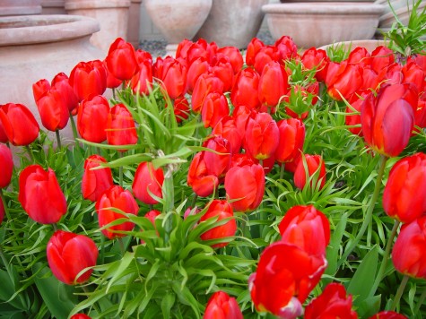
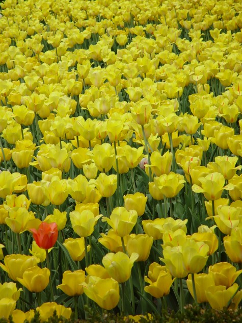
 A mass of red tulips in the spring is enough to get any gardener’s juices flowing again. That red is as densely saturated as a brand new lipstick. Lit from the front, these red tulips read vibrantly for another important reason-their companion color is green. The primary color red, and the secondary color green, are opposite each other on the color wheel. This opposition translates as maximum contrast. Red will never seem redder than when it is viewed next to green. Black/red and lime green-a great color combination.
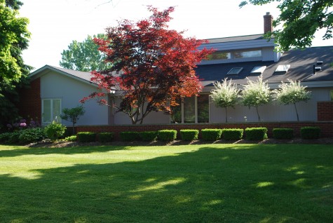
Red foliage in the landscape is an entirely different experience. The red pigment in leaves has green pigment underneath, or in conjunction with that red. Though contrasting red and green make for visual fireworks, mixing red and green makes at best dark red, and at worst mud. Though this landscape is in sore need of renovation, the placement of this standard size acer palmatum is better than most I see. The tree is placed with a white or sky background and in a fairly sunny area; the red leaves read red. Notice that the foliage in shade, or backed up by the grey roof has gone brown. Backlit locations where red and green foliage are mixed and overlaid also produces a muddy appearance.
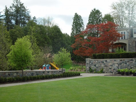 Not that muddy can’t be pleasing; the subdued red leaves of this very old Japanese maple make for an interesting variation in this landscape. The red is mixing and relating to other greens in the landscape in a subtle, not a jarring way. What is it about a dwarf red Japanese maple that makes it de rigueur in so many suburban landscapes? If it is the red color, then I see many plantings that do not present that red in a striking or thoughtful way.
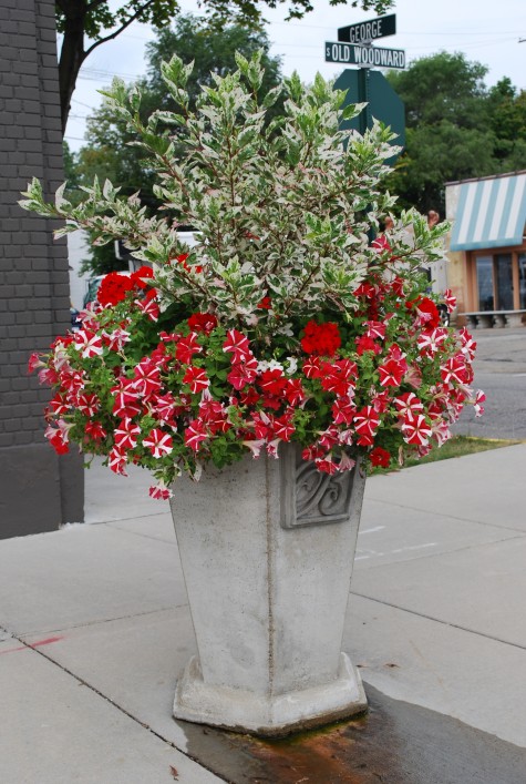 How red reads gets a big boost from white, or gray. Pale companionship or background helps red to hold its own. This green and white variegated hibiscus is grown primarily for its foliage. I used it as a centerpiece in this pot primarily to showcase the red. A thriving planting of petunias is much more about the flowers than the foliage-not much petunia foliage showing here. The white variegation on the hibiscus similarly reduces the amount of green. The red color is the star of the show. A red Japanese maple underplanted with Lamium “White Nancy”, or a dwarf low white variegated hosta might benefit in a likewise way.
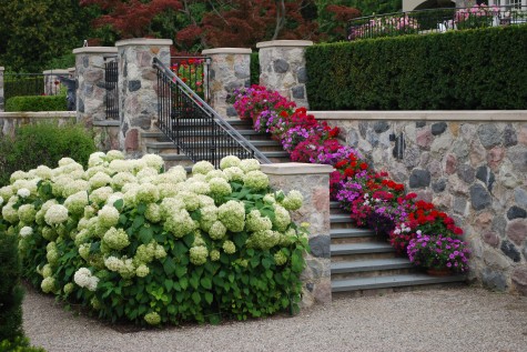 Mixing red with hot or magenta pink can add dimension, and sparkle, when the intent is to wow with red. The white of these Annabelle hydrangeas doesn’t hurt; the color all around seems lively.
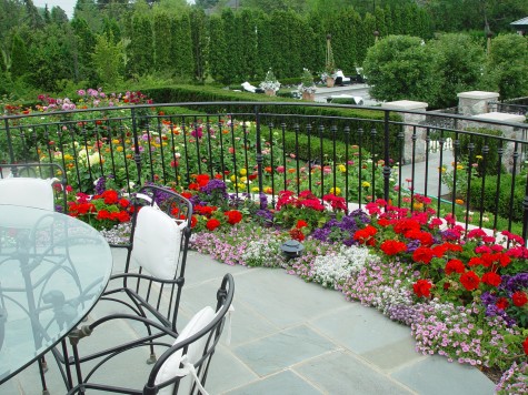 Intense or dark colors read best up close. To me, every composition has a foreground, a mid ground-and the background. These red geraniums are fiery, up close to the eye. The red dahlias in this mid ground-they seem much muted, even though they are the same red color as the geraniums. Lighting conditions and distance greatly influence the effect of color.
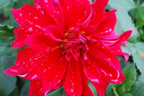 Dinner plate dahlias are something else-whether you love them or reach for your sunglasses, they are the most dramatic representation of red in the garden I can imagine. Were I interested in taking that red as red as I might manage, I would tuck them in between plants in a stand of arundo donax variegata. Red and white-so striking.
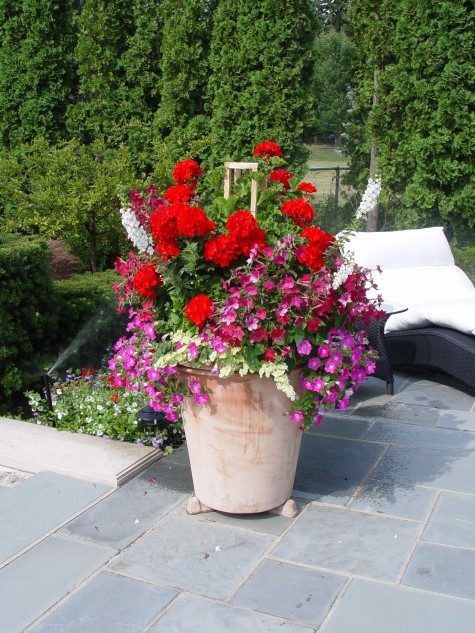 Some of my clients turn their noses up and roll their eyes should I use the word geranium. I look at them at the little black dress of the annual world; they can be stunning, in an expected way-but nonetheless, stunning. What you pair with red geraniums makes all the difference in the world. Whether by way of contrast, or by way of intensifying that fiery color, the idea here is to be purposeful. Whatever effect is in your heart or mind’s eye, understanding how color works will help make your idea visual.
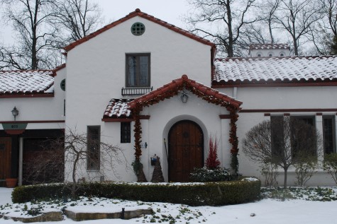
Not all the red in a landscape comes from plants. This red/orange clay tile roof makes a big statement about color off the bat. Some homes are red orange brick, or have wood trim which is mahogany red. Any element of design only works if you are looking and thinking it through. Dealing with red in the landscape can seem like a full time job some days-but who would want to do without red?
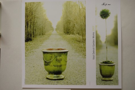
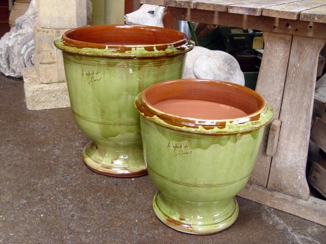 I have been importing garden pots handmade at a number of French potteries since 1992-I am as crazy about them today as I was 18 years ago. My very first purchase-a pallet of gorgeous cream colored clay pots from the Poterie Provencale in Biot. I am convinced a mutual love of beautiful objects for the garden overcame our language difficulties; I was so thrilled to get those pots. Les Enfant de Boisset does not produce an olive green pot. It was entirely Rob’s asking and their willingness to make a collection especially for us in this great color.
 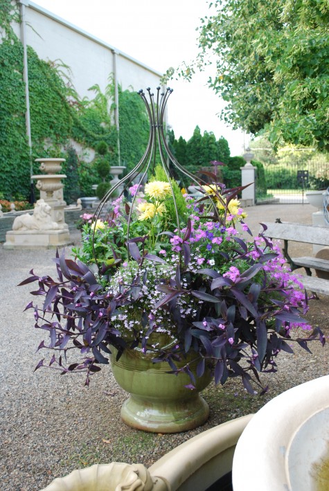 Planted up, these pots make for an entire landscape in a very small space. French garden pots are made today in much the same way, and with many of the same designs that have existed for centuries. They clearly show evidence of the human hand, and speak to their long history of landscape and garden. Some French poteries have added more modern designs, to round out their collections.
 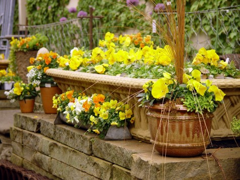 This yellow/brown glazed pot came from the Poterie De Cliousclat, a French pottery whose beginnings date back to the 16th century. Rob once brought me a small book detailing the history of the pots; the pages of the book had absorbed the smell of the clay from the dirt floors of the pottery. Though Cliousclat is no longer, I will never forget their pots, or the smell of the poterie inseparable from that book.
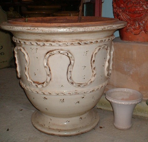
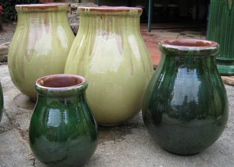
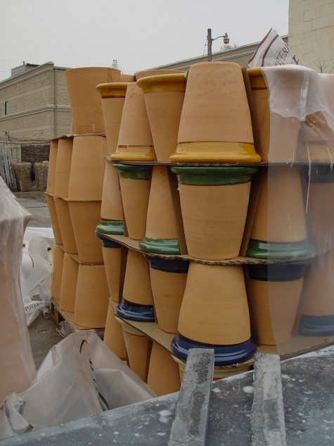
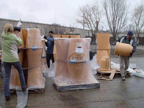 Arrival of a shipment of pots from the Poterie Ravel
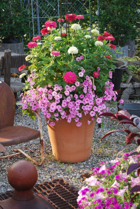 Large Ravel pot, planted
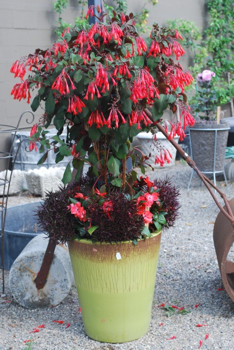
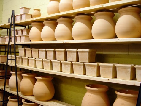
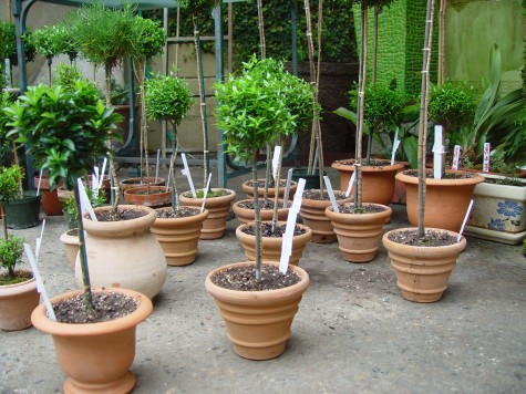
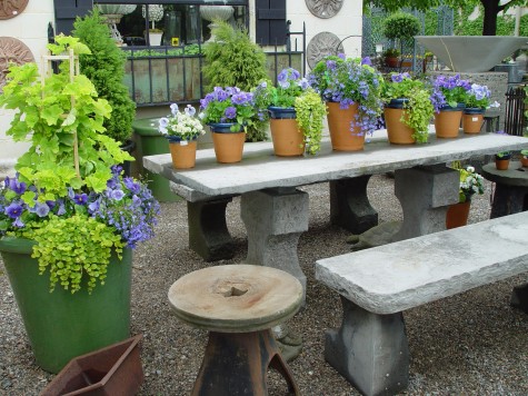 Planted Violetta pots
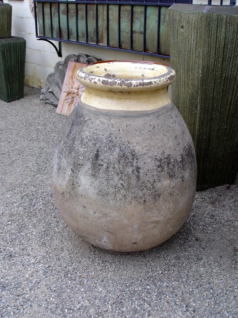
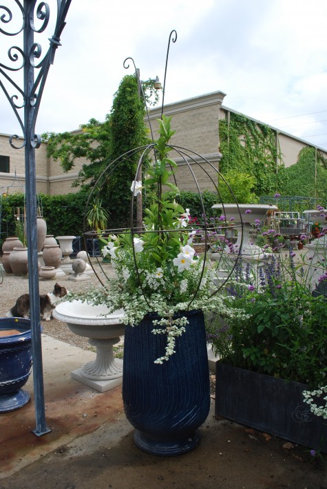 blue strie huile, from the Poterie de la Madeleine, in Anduze, planted
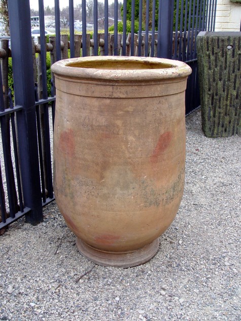 French huile, circa 1920
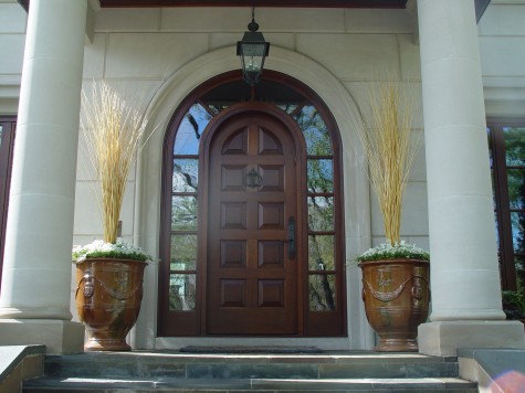 Classic Anduze pot, Poterie de la Madeleine, in the flamme finish
 Amazingly enough, it was my fifth grade science teacher that taught me the color basics. I remember that she covered individual panes of some of the classroom windows with sheets of red, yellow and blue acetate. Her explanation of the term “primary colors” was simple-these three colors come standard issue in nature-they cannot be made from any other colors. She had a stack of giant acetate rectangles every color imaginable, and we did spend a lot of time trying to overlay sheets in some form that would produce yellow. We never made any yellow, but we did make lots of other colors-the secondary colors. Secondary, meaning the result of the mix of any two primary colors. Then we made tertiary colors-any mix of three colors.
  This may have been science, but it was pure fun. Once we had green from mixing blue and yellow, and orange from yellow and red, and purple from blue and red, we pasted these combos on the windows. Over a period of days, every window in the room had a distinctly different color. In the center, the single sheets of the primary colors. At the edges, stacks of acetate sheets that looked like the color of mud. I remember how enchanted I was with all that color; to this day a set of pastels, markers, yarn samples,colored pencils, paints and the like interest me. I did not so much grasp the relationship of color to light, but I could see it. The quality of light greatly influences the appearance of color-anyone who has loved a paint chip at the store, and put it on a wall at home to disastrous effect understands this.
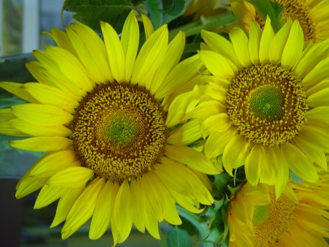
 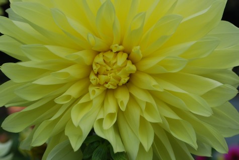 Color in the landscape functions the same way. The primary colors have an electricity that comes with the territory, but where and how color gets placed determines how it looks. Yellow reads brilliantly at a distance; use it in places far away from your eye, or to back up other darker or more subtle colors that would otherwise fade from view. The transparency of yellow makes it a perfect choice for areas in the landscape that are back lit-it will look like the lights are on. The edges of these dahlias petals have gone green; they are too thick to transmit light well. The dark behind the dahlia turns the yellow dirty yellow-green.
 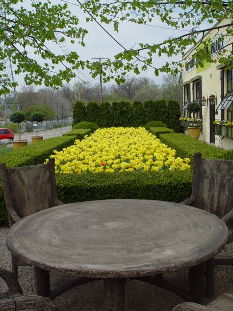 This composition is first and foremost about yellow. It draws your eye, and keeps your visual attention. It is secondarily about tulips, yews, boxwood, geometry-and so on. Notice how the color far away in this photo are subdued, muddy, and indistinct-but for the green of the emerging leaves. New leaf green has a lot of yellow in it-that yellow reads at a distance.
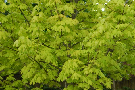 Princeton gold maple leaves are really yellow with a green cast when they first emerge.
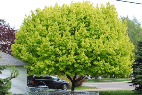 In a sunny spot, the leaves read yellow to the eye at the top, where they get the most light. As your eye looks at this tree from top to bottom, the color changes. The leaves with least exposure to light are the darkest. The change in value-or relative lightness or darkness-from the top of this tree to the bottom is considerable. The trunk of the tree looks black, given all the light behind it.
 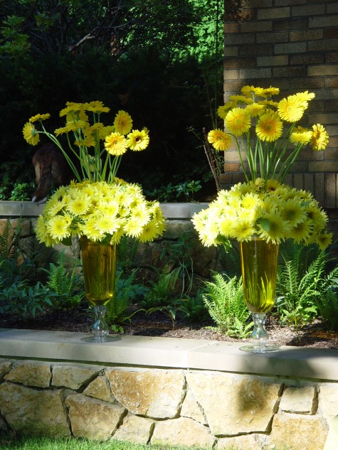 Yellow has the ability to light up a shady area. The gerberas at the top glow in front of the yews whose color almost appears black. Densely shady gardens can die visually if some effort is not made to introduce contrast. One landscape project involved a densely wooded area; cutting out the brush and sapling trees in a few selected areas created pools of light. The contrast of light and dark added visual interest, but also made it possible to see the more subtle colors of the plants in the ground.
  Likewise, painting the concrete floor of one room in the shop these grassy-shaped variations of chartreuse and yellow green made it easier to see everything that would be placed in the room. Milo’s coat color is known as “dark brindle”. All the individual colors present in his coat read much more clearly than they would should I have photographed him with a dark background.
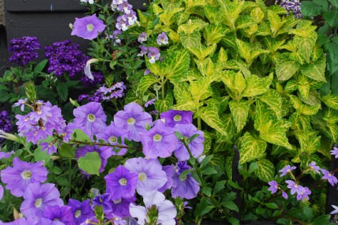
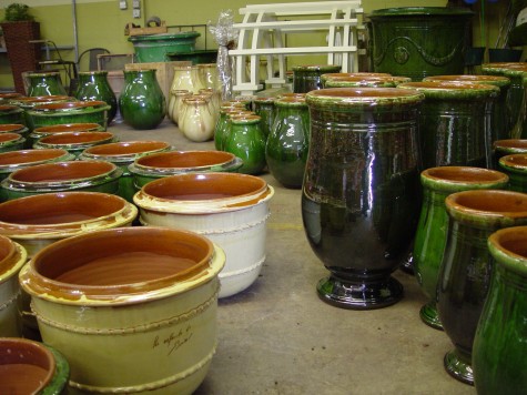 I reluctantly agreed to play ball with those dogs of mine yesterday-in spite of the 9 degree temperature. We were not outside for long, but long enough for me to see the color of my yews had gone so dark they almost looked black. This cold color could not be further from how those yews look dressed in their spring green foliage. This set me to thinking about color as a design element. The glazed terra cotta pots manufactured in France for hundreds of years make a big color statement. Their strong color has a very Mediterranean feeling to me; the color seems very much a product of the climate in which they are made. When I see a pink stucco house, I immediately think warm climate; no doubt I react to color with an entire set of pre-conceived notions hovering nearby.
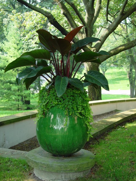
 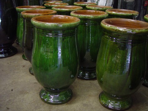 Though green is the dominant color of any landscape, this shiny green glaze is a color experience of a different kind. These pots have a much more formal appearance than a natural clay pot-whose natural and from the earth color is vastly more subdued than this. As glazed pots do not absorb water from the outside, the finish and color is as fresh in their tenth year as their first, provided none of the glaze has chipped. The vibrant color of these pots will strongly figure in how I would place and plant them.
 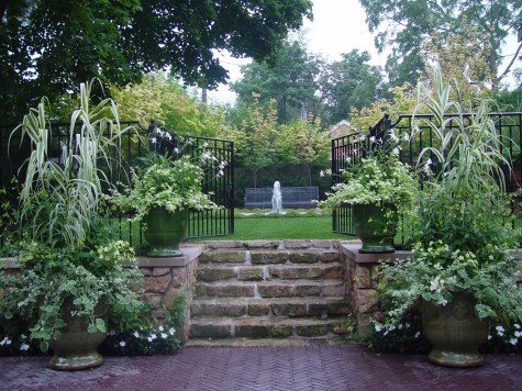 The color of these pots will always be a significant part of the planting composition. Unlike natural clay pots whose importance in the composition may be secondary or slight, the color of these pots attracts visual attention, and sets off the planting in a formal way. A green and white color scheme seems restrained and serene. Do these pots look out of their Mediterranean element? I think not. This leads me to think that before deciding a color won’t work, I should try it.
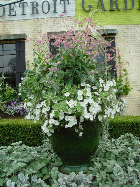 This color scheme branches out a bit into the pinks and greys. The pot is elevated on a concrete base, so the foot of the pot still reads even though the ground planting has grown in. The shiny green mass of the pot is a beautiful foil for the tiny naturally green leaves of the boxwood. Monochromatic, or one color schemes are quietly formal and restful in their simplicity.
 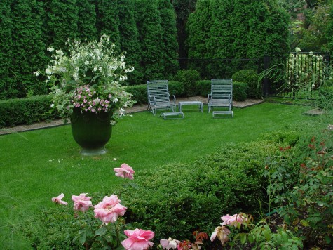 This pot is 12 years old. Mineral deposits from the water had dulled the shine of the glaze. It is remarkable how close the color is to the color of the existing evergreens and grass. This composition is more about texture, and mass, than color.
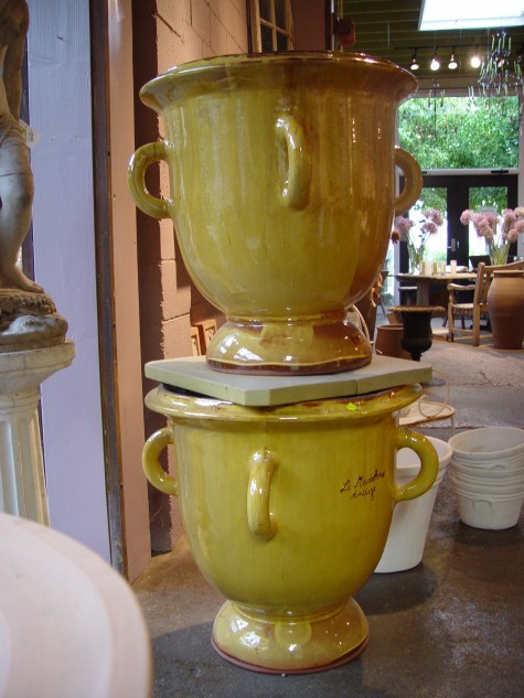 Yellow glazed French pots are perfect for places where any thing but neutral seems like a good idea. Shady gardens, or nondescript locations asking for a strong center of interest can get that from a splash of unexpected color.
 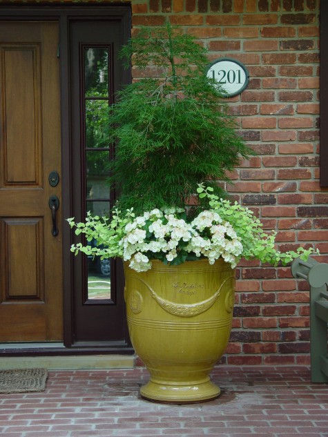 This pot is full of surprises; the yellow of the pot is just the beginning. A threadleaf Japanese maple makes an unusual centerpiece for the surrounding white begonias and lime licorice. The brick front porch, tough completely shaded by a second story balcony, has a fresh and striking appearance. Though delicate in color, these French pots are incredibly strong and durable. The clay of the large pots can be 3/8 of an inch thick or better, and they are high fired for extended periods of time.
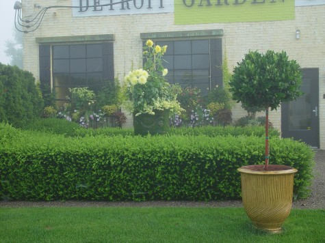 Some potteries have added more contemporary designs to their collections. This pot, known as a strie, refers to the striations formed from the pattern generated by the fingers of the potter; each pot is unique to the fingertips of the person who made it. The color of the pot helps to make it central to the entire composition of the garden. Simple color relationships read more clearly and strongly than mixed color compositions. Strong color relationships paired with more subtle color relationships is what creates rhythm in a composition.
 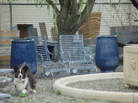 Blue glazed pots in the landscape can be tough to place. Though bluestone, acid washed steel, lead, water and sky all represent blue in one form or another, planting blue pots requires some thought. That glazed blue will be very influential in the look of the whole. Yellow flowers in a blue pot can look like a band uniform, or worse. Some shades of purple are deadly dull and irritating with this shade of blue; lavender and silver can be great.